
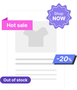
Enhance your WooCommerce product cards with custom labels like “Best Seller,” “On Sale,” and “Limited Edition” to grab customer attention and increase conversions. Easily customize label colors, fonts, and placement with a drag-and-drop editor—no coding needed!
General Information
↑ Back to topThe Label Builder plugin by Develux extends the default functionality of WooCommerce product cards and product pages, allowing you to display additional visual and informational elements that help attract customers’ attention and improve the shopping experience.
In a standard WooCommerce store, product cards are typically displayed in the following locations:
- Shop and category pages
- Product pages (Upsells)
- Cart page (Cross-sells)
- Other pages, depending on your active WooCommerce theme
If your WooCommerce theme uses the default product card structure, the plugin’s full functionality will be available. If the theme significantly modifies the product card layout, some features may be limited.
Key Features
↑ Back to topWith the Label Builder plugin, you can:
Take advantage of the plugin’s additional tools and utility features to efficiently manage product labels across your entire store.
Create fully customizable labels or use professionally designed labels from the built-in library.
Upload and display your own label designs created in external graphic editors. Supported formats include JPG/JPEG, PNG, and SVG.
Place labels anywhere on the product card or product page.
Display additional informational elements in various positions on the product card, making important product details more visible.
Use the Bulk Manager to assign labels to multiple products based on WooCommerce categories and tags, while also including or excluding individual products when needed.
Build and manage your own reusable library of custom labels.
Installation
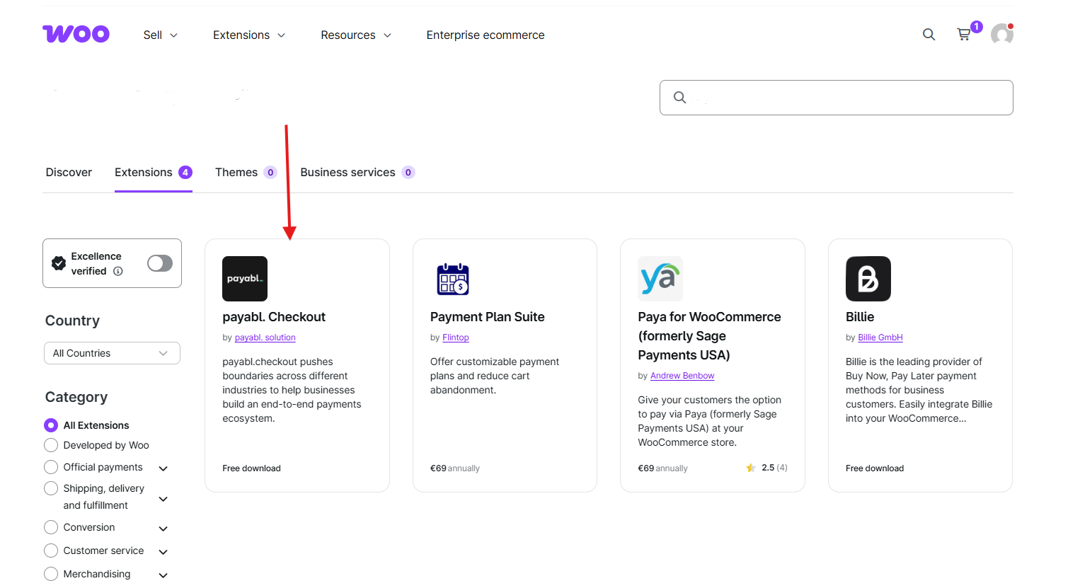
↑ Back to topTo start using a product from WooCommerce.com, you can use the “Add to store” functionality on the order confirmation page or the My subscriptions section in your account.
- Navigate to My subscriptions.
- Find the Add to store button next to the product you’re planning to install.
- Follow the instructions on the screen, and the product will be automatically added to your store.
Alternative options and more information at:
Managing WooCommerce.com subscriptions.
Setup and Configuration
↑ Back to top- Go to: WooCommerce > Settings > Label settings.
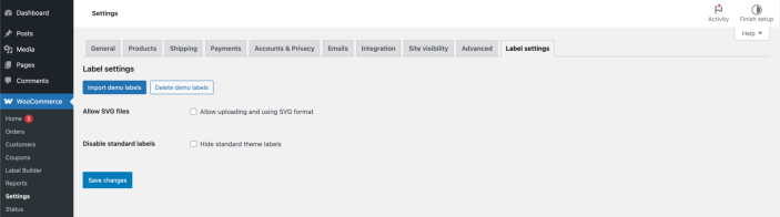
On this page, you can find general help functions.
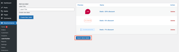
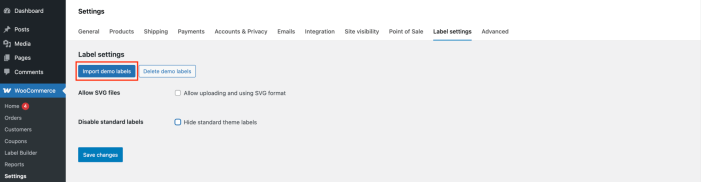
Import demo labels – uploading demo labels on the ‘Label builder’ page.
Delete demo labels – delete uploaded demo labels on the ‘Label builder’ page.
Allow SVG files – here you can enable support for working with svg files.
By default, support for this extension is disabled.
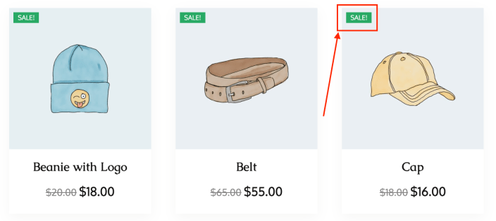
Disable standard labels – here you can disable the standard labels that are displayed in most WooCommerce themes.
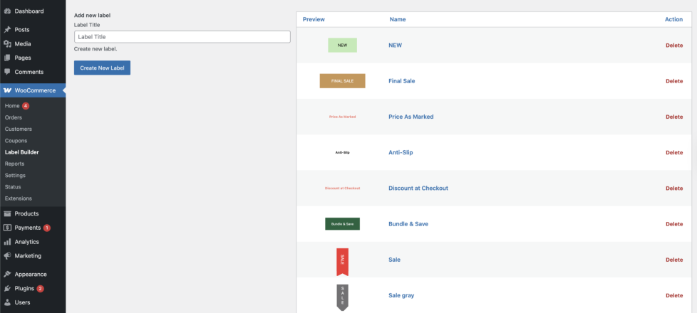
On the Label Builder page, there is an Import Demo Page button. It redirects you to the Label Settings page, where you can import demo labels.
Getting started
↑ Back to top2. Go to: WooCommerce > Label Builder > choose an existing label or create a new one.
Create and Customize Unique Product Labels
With the Label Builder plugin, you can create fully customized product labels that perfectly match your store’s branding and marketing strategy.
Choose from two types of labels:
- Custom Labels – Create fully editable labels using the built-in visual editor. Customize colors, typography, shapes, borders, shadows, backgrounds, animations, and positioning without writing a single line of code.
- Image Labels – Upload your own professionally designed labels created in any graphic editor. The plugin supports JPG/JPEG, PNG, and SVG formats, allowing you to use existing brand assets or create completely unique designs.
Whether you prefer to build labels from scratch or use your own artwork, the plugin gives you complete freedom to create eye-catching product badges that attract customer attention and increase product visibility.
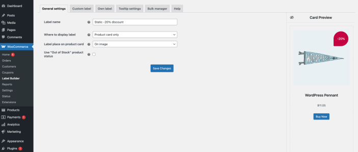
It must be enabled using the ‘Display label’ switch for the label to appear on the product card
General settings tab
Label name – field for entering the label name
Where to display label – the list of options allows selecting whether to show the label on the product card or the single product page.
- Product card only – the label will be placed exclusively on the product card
- Product page only – the label will be placed exclusively on the product page
- Product card and page – label will be placed on the card and product page
Label place on product card – sets the location for displaying the label on the product card/ product page (on image/ before title/ after title/ after price)
Use ‘Out of Stock’ product status – indicates that the product is currently unavailable in stock
The ‘Out of Stock’ product status option is displayed only if the product has the Stock Status set in the Products settings.
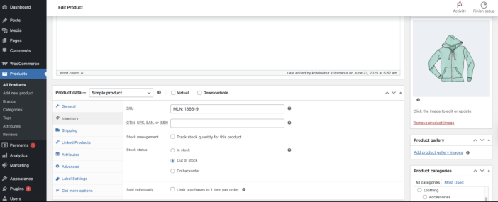
For the option to work correctly, the following conditions must be met:
- The checkbox for Use ‘Out of Stock’ product status is activated
- The product is assigned in the Bulk Manager
Important! When the product status in Products is changed from ‘Out of Stock’ to any other status, the label stops being displayed on the product card in the store.
Custom label tab
Label name – field for entering the label name
Display label – allows displaying the label on the card
Label text styling
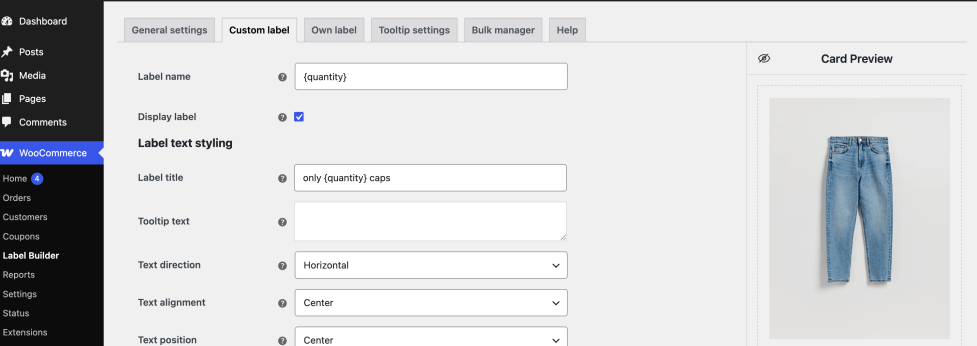
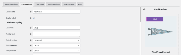
Label title – allows entering the label text or {percentage}, {discount_value}, {quantity}, {sku} placeholders.
The {percentage} placeholder displays the discount amount in %.
For correct display, you need to set the Regular Price and Sale Price for the product.
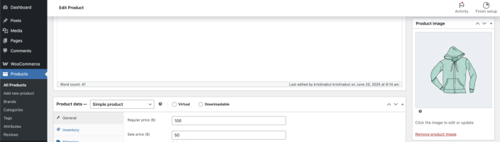
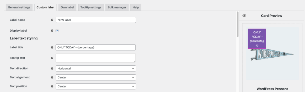
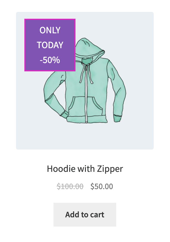
The {discount_value} placeholder displays the discount amount in currency.
For correct display, you need to set the Regular Price and Sale Price for the product.
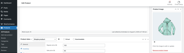
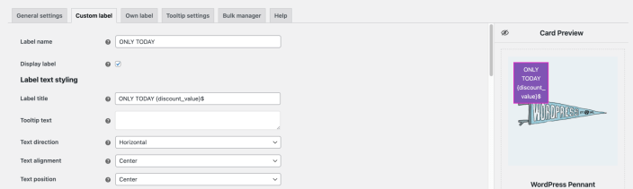
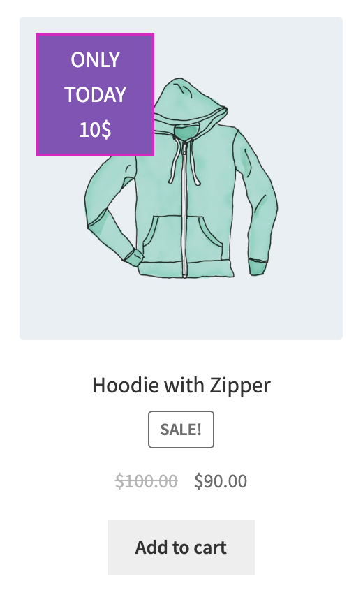
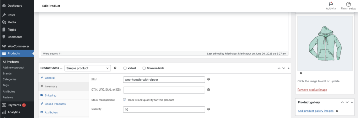
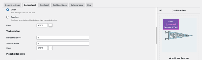
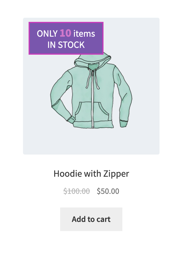
The {quantity} placeholder shows how many products are in stock.
For correct display, you need to set the stock quantity in the Products tab under stock management.
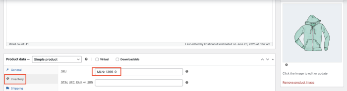
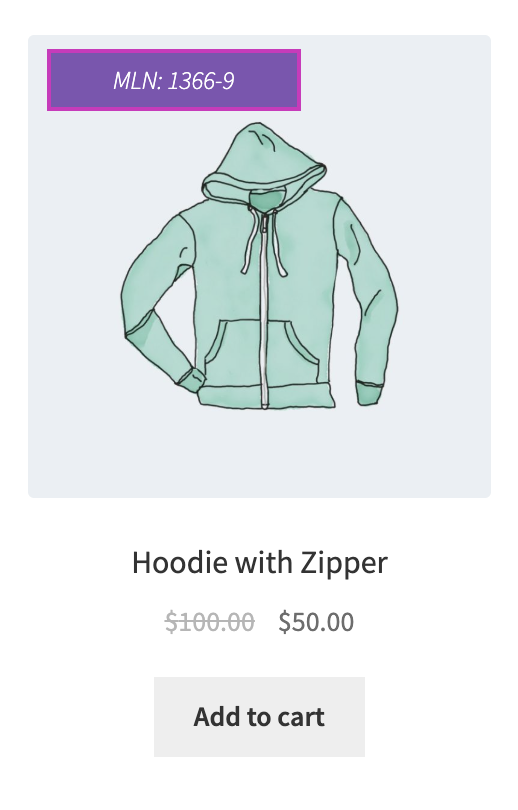
The {sku} placeholder shows the product SKU name.
For correct display, you need to set SKU name in the Products tab.
Tooltip text – field for entering the tooltip text
Text direction – Sets the direction for the text
Text alignment – sets the text alignment in the label
Text position – sets how the text is aligned vertically within the label
Text size – sets the font size for text
Text size unit – refers to the units of measurement that will be used for the text size
Text weight – sets the font bold
Space between rows – sets the spacing between lines of text
Text style
Normal – applies the default text style
Italic – makes the text slanted for emphasis or style
Text color
Color – sets a single color for the text
Gradient – applies a smooth transition between two colors to the text
Start color – sets the first color for the gradient
End color – sets the last color for the gradient
Direction – sets the direction of the gradient color in the text (top, bottom, left, right)
Placeholder style
Placeholder size – sets the size of the placeholder text
Placeholder weight – sets the font bold of the placeholder text
Placeholder color – sets the color of the placeholder text
Label movement
Position – sets the left, center, or right placement on the product card
Vertical offset – sets the label’s vertical alignment on the product card
Horizontal offset – sets the label’s horizontal alignment on the product card
Bottom outer space – sets the space below the label and the surrounding elements
Label layout settings
Color – sets a single background color for the label
Gradient – applies a smooth transition between two colors for the label background
Start color – sets the first color for the gradient
End color – sets the last color for the gradient
Gradient types – sets the style of the gradient applied to the label background
- Fades left to right – creates a smooth transition of colors starting from the left edge and blending toward the right edge
- Diagonal top-left to bottom-right – applies a gradient that runs diagonally, blending colors from the top-left corner to the bottom-right corner
- Diagonal top-right to bottom-left – applies a diagonal gradient that transitions colors from the top-right corner down to the bottom-left corner
- From center outward – starts the gradient in the center of the element and radiates the colors outward toward the edges, creating a burst effect
- Circular rotation of color – creates a circular gradient where colors rotate around a central point, forming a swirl-like or wheel effect
Gradient opacity – sets the level of transparency of the background
Label width – sets the width for the label
Label width unit – sets the measurement used to define the width of the label
Label height – sets the height for the label
Label height unit – sets the measurement used to define the height of the label
Horizontal inner space – sets space between the content and the left and right edges inside a label’s border
Vertical inner space – sets space between the content and the top and bottom edges inside an element’s border
Label opacity – sets the level of transparency for the label background
Layer order – sets the order of the element (used when multiple labels or elements appear on a product card)
General border styles
Border color – sets the color for the border
Rounding – sets the roundness of the label’s corners
Border width – sets the width of the border
Border style – sets the style for the border
Custom borders – sets the style individually for each side
Label shadow
Shadow color – sets the color for the shadow
Horizontal offset – sets the distance the shadow is moved left or right from its original position
Vertical offset – sets the distance the shadow is moved top or bottom from its original position
Dispersion – sets the density of the shadow
Opacity – sets the level of transparency for the shadow
Label icon styles
Label icon – allows uploading the image for the label
Icon size – sets the size of the image
Icon size unit – sets the units of measurement that will be used for the icon ( px, %)
Icon top offset – sets the distance the icon is moved top or bottom from its original position
Before text – allows placing an icon in front of the text
After text – allows placing an icon after the text
Geometrical shapes
Left side/ Right side/ Bottom side/ Top side – set the geometrical shape on the left/ right/ bottom/ top sides
Shape type – allows selecting the shape’s form
Background – set the background color for the geometrical shape
Opacity – set the level of transparency of the background geometrical shape
Height – set the width of the geometrical shape
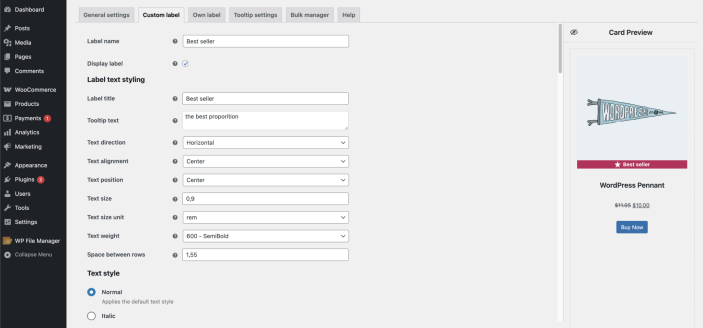
Own label tab
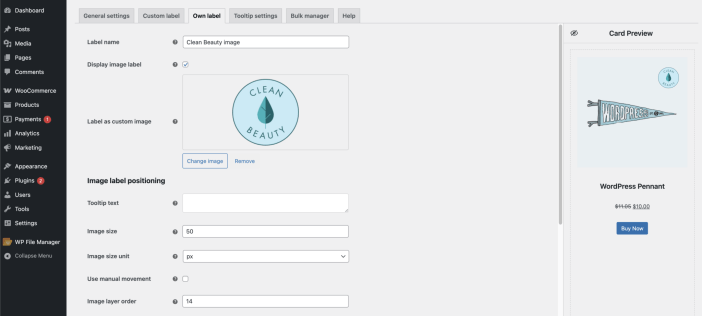
Label name – field for entering the label name
Display image label – allows displaying an image on the card
Label as custom image – allows uploading own image
Image label positioning
Tooltip text – field for entering the tooltip text
Image size – sets the image size
Image size unit – refers to the units of measurement that will be used for the image size
Position – sets the left, center, or right placement on the product card
Vertical offset – sets the label’s vertical alignment on the product card
Horizontal offset – sets the label’s horizontal alignment on the product card
Bottom outer space – sets the space below the label and the surrounding elements
Image layer order – sets the order of the element (used when multiple labels or elements appear on a product card)
Shadow settings
Shadow color – sets the color for the shadow
Horizontal offset – sets the distance the shadow is moved left or right from its original position
Vertical offset – sets the distance the shadow is moved top or bottom from its original position
Dispersion – sets the density of the shadow
Opacity – sets the level of transparency for the shadow
Tooltip settings
↑ Back to top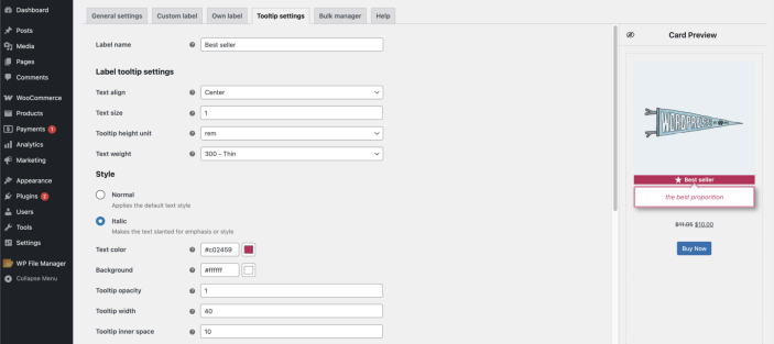
Label name – field for entering the label name
Label tooltip settings
Text align – sets the text alignment in the tooltip
Text size – sets the font size for text
Tooltip height unit – sets the measurement used to define the height of the tooltip
Text weight – sets the font bold
Style
Normal – applies the default text style
Italic – makes the text slanted for emphasis or style
Text color – sets the font color
Background – sets the color of the background
Tooltip opacity – sets the transparency level of the tooltip background
Tooltip width – sets the width of the tooltip
Tooltip inner space – sets space between the content and the left and right edges inside a label’s border
Border color – sets the color for the border
Border size – sets the width of the border
Border style – sets the style for the border
Border rounding – sets the roundness of the tooltip’s corners
Shadow settings
Shadow color – sets the color for the shadow
Horizontal offset – sets the distance the shadow is moved left or right from its original position
Vertical offset – sets the distance the shadow is moved top or bottom from its original position
Dispersion – sets the density of the shadow
Opacity – sets the level of transparency for the shadow
Bulk manager
↑ Back to topThe Bulk manager is used to assign labels to multiple products at once.
You can use:
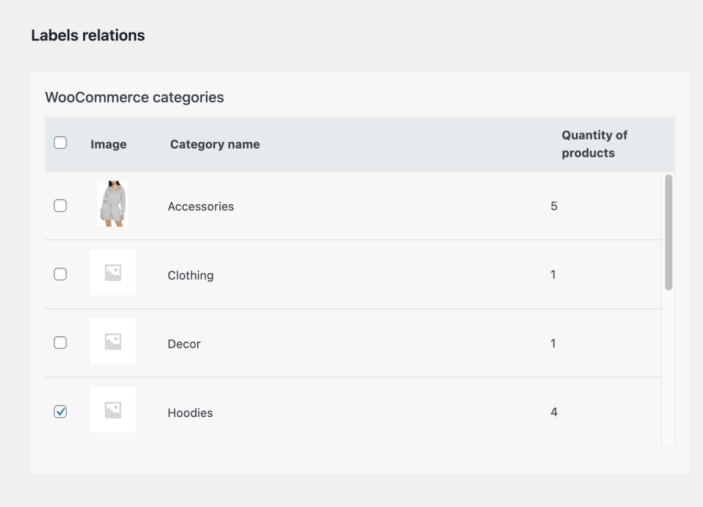
- Categories
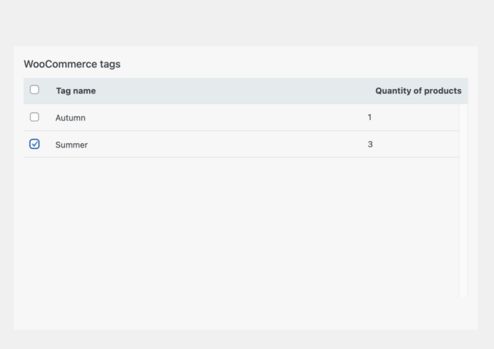
- Tags
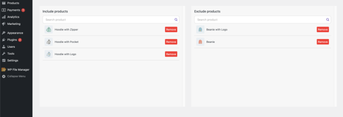
- Include or exclude specific products
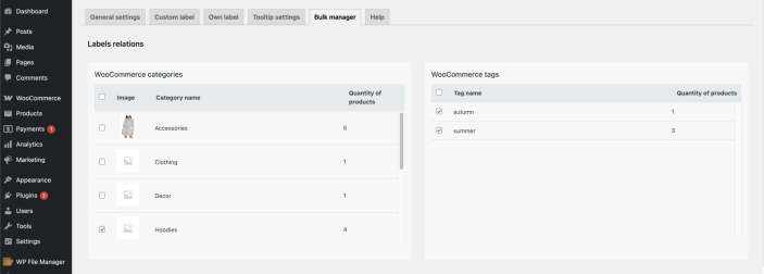
WooCommerce Categories – a label will be displayed on all products within this category.
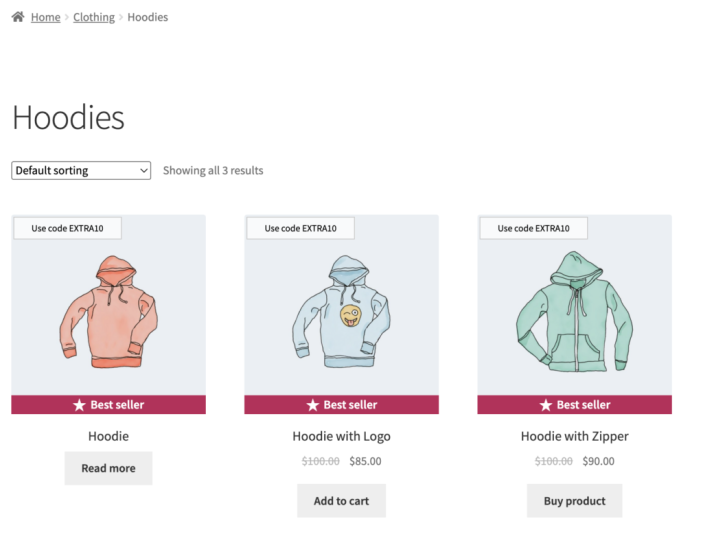
WooCommerce Tags – a label will be displayed on all products with this tag.
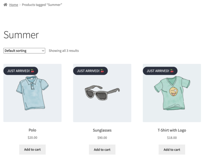
Include products – adding the element (label, timer, custom block) to a specific product.
Exclude products – excludes the element from these products (the element will not be displayed on these products).
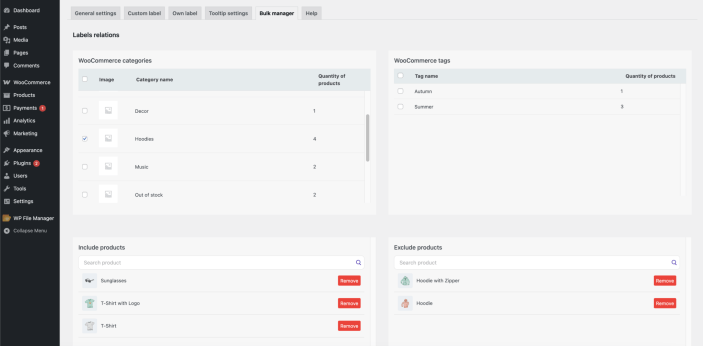
Label template assignment for a product in Products
↑ Back to topYou can also assign a label to a product through Products.
To do this, you need to:
- Create a label in the Label Builder
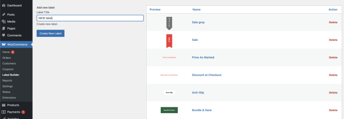
2. Open the desired product in Products
3. Go to the Label Settings tab, select the required template in Label Template, and save the changes
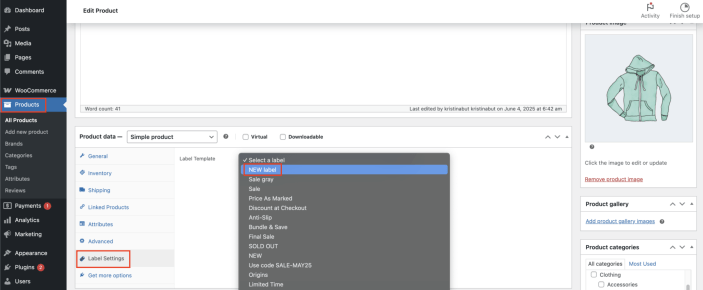
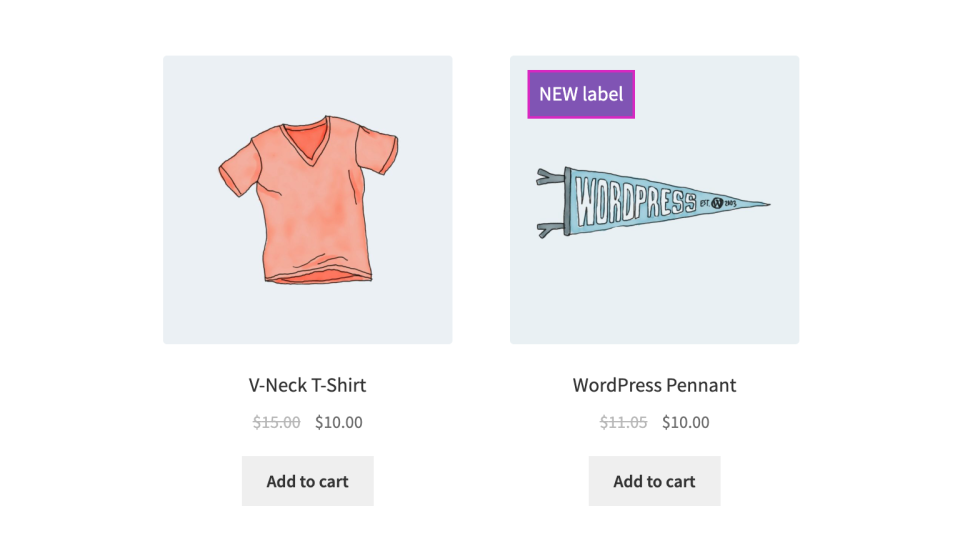
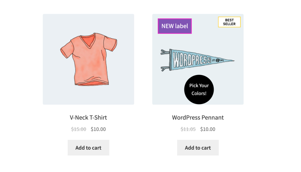
It is also possible to combine multiple labels on a product card:
1. custom label
2. own label
3. label template from the Products
Auxiliary functions of the plugin #
Label settings
Most themes developed for WooCommerce display the default label. To disable these default labels, use this feature.
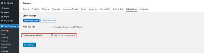
Important! ‘Disable standard labels’ option may not work, it depends on the theme.
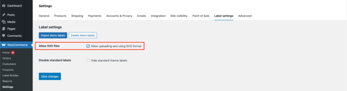
Enabling permission to use SVG files
By default, WordPress does not support SVG file format. Here, you can enable support for these files.
Use the Import Demo Labels option to upload ready-made label templates.
- Click ‘Import demo labels’
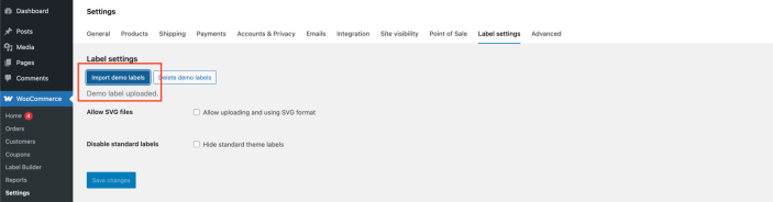
2. After the ‘Demo label uploaded’ notification appears, the demo labels will be available on the Label Builder page.
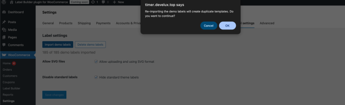
Important! If you click the ‘Import Demo Labels’ button again, duplicate label templates will be uploaded to the Label Builder page.
Delete demo labels option allows deleting the uploaded demo labels
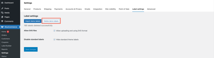
Delete demo labels on the Label Settings page
Troubleshooting
↑ Back to topPlugin Compatibility
The Label Builder plugin is specifically developed for WooCommerce and is not compatible with other e-commerce platforms.
The plugin is fully compatible with WordPress themes that follow the official WooCommerce and WordPress development standards and use the default WooCommerce architecture for generating product cards and product pages.
Compatibility Notes
Important!
The plugin relies on the standard WooCommerce and WordPress hooks, filters, and template structure. If your active theme or any third-party plugin overrides or significantly modifies the default WooCommerce behavior, some plugin features may not function correctly or may become unavailable.
Important!
The plugin uses the standard jQuery and jQuery UI libraries included with WordPress. If these libraries are disabled, replaced, or modified by your theme or another plugin, the plugin’s functionality may be affected.
To ensure maximum compatibility and stable operation, we recommend using a well-developed WooCommerce-compatible theme and avoiding plugins that replace or heavily customize the default WooCommerce rendering process.
Recommendations and Troubleshooting
Since every WooCommerce theme is developed differently, the appearance and behavior of certain plugin elements may vary depending on the theme’s implementation.
CSS Units (rem and em)
Some themes use different CSS units for font sizes and spacing, which may affect the appearance of labels and informational elements.
em
The em unit is relative to the font size of its parent element. As a result, its value changes depending on the styling applied by the active theme.
rem
The rem unit is always relative to the root (html) font size. Unlike em, it remains consistent regardless of the parent element’s styling, providing more predictable sizing across the website.
Important: The visual appearance of labels may vary depending on the CSS styles and measurement units used by your WooCommerce theme.
Geometric Shapes
Some WooCommerce themes apply custom CSS rules that may affect the display of geometric shapes used by the plugin.
If a selected geometric shape is not displayed correctly on the product card or product page, try one of the following solutions:
- Switch to a different geometric shape.
- Check whether your theme overrides or hides the corresponding CSS styles.
- Temporarily switch to a default WooCommerce theme (such as Storefront) to verify whether the issue is theme-related.
If the shapes display correctly with the default theme, the issue is most likely caused by custom CSS or modifications introduced by your active theme.
FAQs
↑ Back to top
Is the plugin compatible with all WooCommerce themes?
The plugin is compatible with most WooCommerce themes that follow the official WooCommerce and WordPress development standards. If your theme significantly modifies the default WooCommerce product card structure, some features may be limited.
Can I create my own product labels?
Yes. You can create fully customizable labels using the built-in visual editor or upload your own labels in JPG, JPEG, PNG, or SVG format.
Can I display multiple labels on a single product?
Absolutely. The plugin allows you to display multiple labels on the same product card or product page. Each label can have its own design, position, and display conditions.
Can I assign labels to multiple products at once?
Yes. The built-in Bulk Manager lets you quickly assign labels to multiple products using WooCommerce categories, tags, or by selecting specific products to include or exclude.
Can I customize the appearance of labels?
Yes. You can customize colors, fonts, typography, borders, backgrounds, shadows, shapes, sizes, positioning, and many other visual properties directly from the plugin interface.
Do I need any coding knowledge?
No. The plugin includes an intuitive visual editor that allows you to create and customize labels without writing any code.
Can I upload labels created in Photoshop or Illustrator?
Yes. You can upload labels created in any graphic editor as long as they are saved in one of the supported formats: PNG, JPG/JPEG, or SVG.
Where can labels be displayed?
Labels can be displayed on WooCommerce product cards throughout your store, including:
Shop pages
Category pages
Product pages
Upsell products (if the theme allows)
Cross-sell products (if the theme allows)
Other locations where your theme uses standard WooCommerce product cards
Is the plugin compatible with the latest versions of WordPress and WooCommerce?
Yes. The plugin is regularly updated and tested with the latest stable releases of WordPress and WooCommerce to ensure maximum compatibility.
Can I create a library of reusable labels?
Yes. You can build and manage your own library of reusable labels, allowing you to quickly apply the same designs across multiple products.
Can labels be displayed only for selected products?
Yes. Labels can be assigned to individual products, entire categories, product tags, or combinations of these using the Bulk Manager.
What happens if I change my WooCommerce theme?
In most cases, the plugin will continue to work normally. However, if your new theme significantly modifies the default WooCommerce product card templates or hooks, some functionality may require additional adjustments.
Can I receive support if I have questions?
Yes. If you encounter any issues or need assistance configuring the plugin, our support team will be happy to help you.

