Installation
↑ Back to top- Download the Chat Buttons.zip file for WooCommerce from your WooCommerce account.
- Go to Plugins, click on Add New, then Upload, and select the .zip file that you downloaded.
- Click on “Install Now” and then “Activate”.
More information at Install and Activate Plugins/Extensions.
Configuration
↑ Back to topAfter the plugin is installed, go to WooCommerce > Settings > Chat Buttons and configure the following settings.
General Settings
↑ Back to topIn the general settings section, you can configure the following. Go to WooCommerce > Settings > Chat Buttons > General Settings.
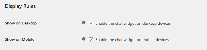
Display Rules
↑ Back to top- Show on Desktop: Enable the chat widget on desktop devices.
- Show on Mobile: Enable the chat widget on mobile devices.
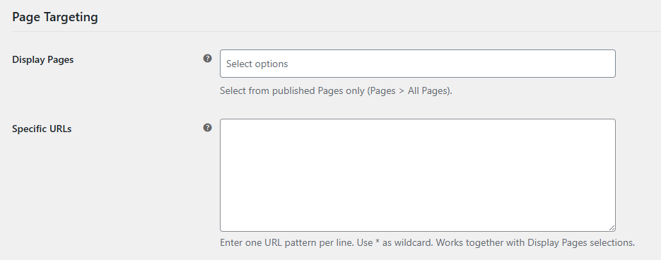
Page Targeting
↑ Back to top- Display Pages: Select the pages on which you want to display the chat widget. You can select all pages or specific pages.
- Specific URLs: Add a specific URL to show the widget. Enter one URL pattern per line. Use * as a wildcard. Works together with Display Pages selections.
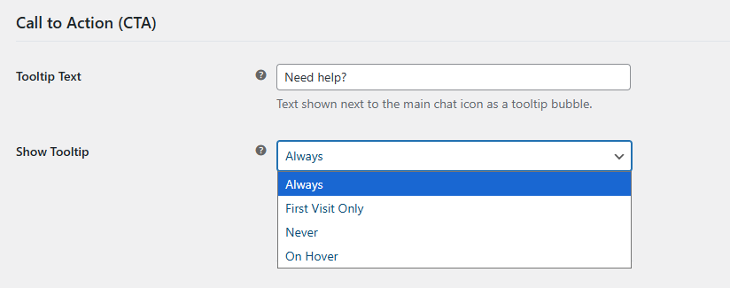
Call to Action (CTA)
↑ Back to top- Tooltip Text: Text shown next to the main chat icon as a tooltip bubble.
- Show Tooltip: Control when the tooltip should be shown. You can choose the following:
- Always
- First Visit Only
- Never
- On Hover
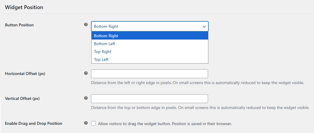
Widget Position
↑ Back to top- Button Position: Choose where the floating chat button starts on screen. You can select the following:
- Bottom Right
- Bottom Left
- Top Right
- Top Left
- Horizontal Offset (px): Add the horizontal offset, distance from the left or right edge in pixels.
- Vertical Offset (px): Add the vertical offset, distance from the left or right edge in pixels.
- Enable Drag and Drop Position: Allow visitors to drag the widget button. Position is saved in their browser.
Widget Icon Customization
↑ Back to top- Icon Source: Choose whether to use built-in icons or upload your own.
- Icon Library: Pick an icon family from the built-in set. You have the following options:
- Lucide Icons
- Dashicons
- Built-in Icon: Select an icon from the chosen built-in library. You can choose from the following options:
- Message Circle
- Message Square
- Messages Square
- Headset
- Life Buoy
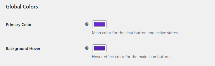
Global Colors
↑ Back to top- Primary Color: Main color for the chat button and active states.
- Background Hover: Hover effect color for the main icon button.
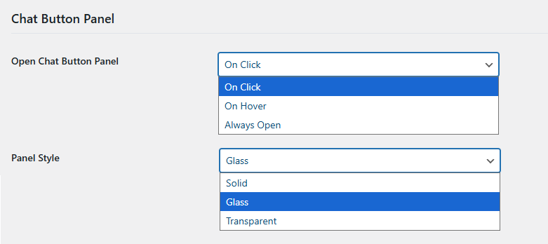
Chat Button Panel
↑ Back to top- Open Chat Button Panel: Control when the chat button list panel appears. You can choose the following:
- On Click
- On Hover
- Always Open
- Panel Style: Choose a visual style for the button list box. You will have the following options to choose from:
- Solid
- Glass
- Transparent
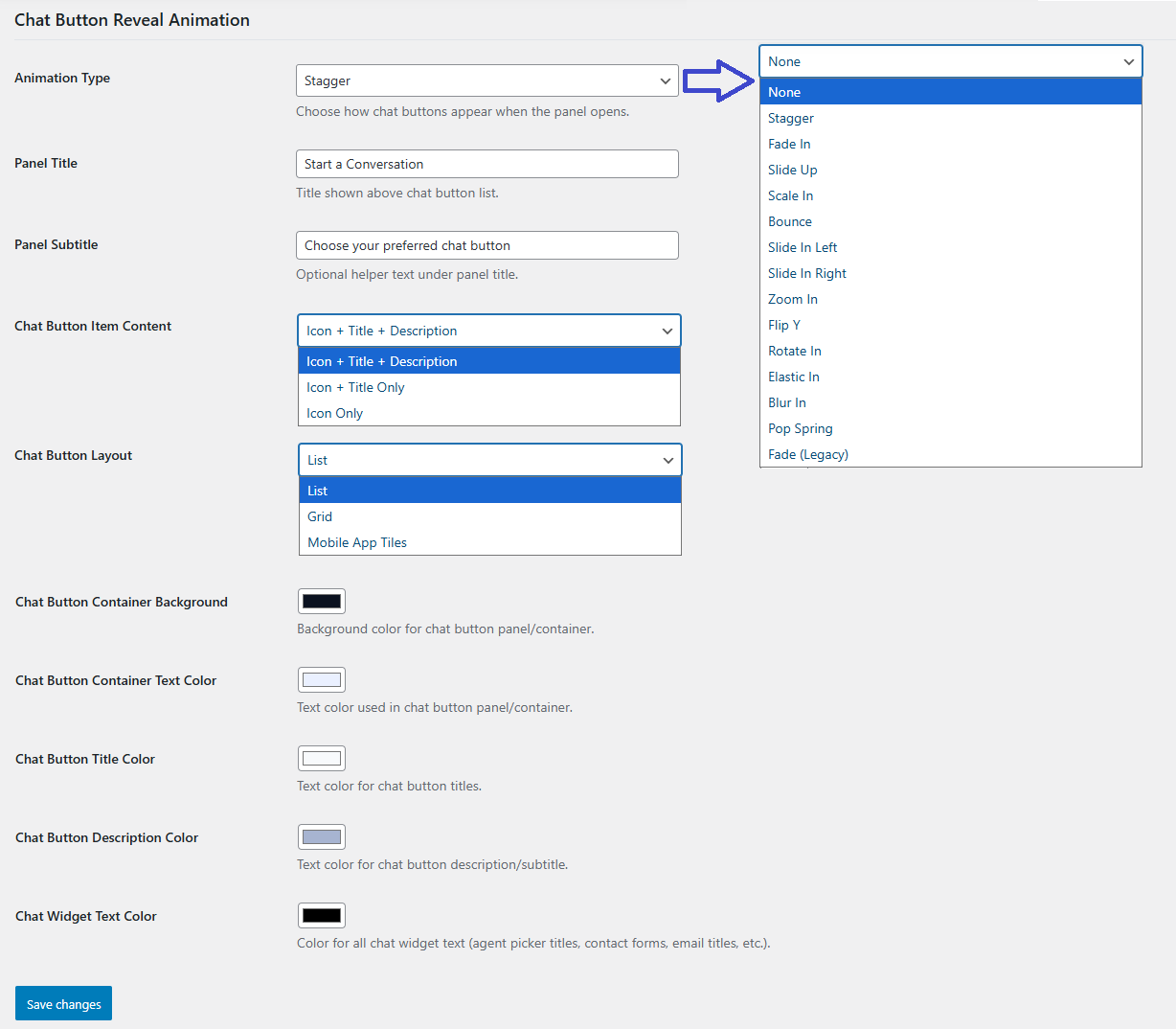
Chat Button Reveal Animation
↑ Back to top- Animation Type: Choose the animation style for how the chat buttons appear when the panel opens. You can choose the following options:
- None
- Stagger
- Fade In
- Slide Up
- Scale In
- Bounce
- Slide In Left
- Slide In Right
- Zoom In
- Flip Y
- Rotate In
- Elastic In
- Blur In
- Pop Spring
- Fade (Legacy)
- Panel Title: Title shown above chat button list.
- Panel Subtitle: Optional helper text under panel title.
- Chat Button Item Content: Show chat buttons as icon only, title only, or icon + description.
- Chat Button Layout: Choose the layout for the button. You can choose:
- List
- Grid
- Mobile App Tiles
- Chat Button Container Background: Background color for chat button panel/container.
- Chat Button Container Text Color: Text color used in chat button panel/container.
- Chat Button Title Color: Text color for chat button titles.
- Chat Button Description Color: Text color for chat button description/subtitle.
- Chat Widget Text Color: Color for all chat widget text (agent picker titles, contact forms, email titles, etc.). Leave empty to use default colors.
Chat Button Settings
↑ Back to topIn the general settings section, you can configure the settings for each chat platform available. Go to WooCommerce > Settings > Chat Buttons > Chat Button Settings.
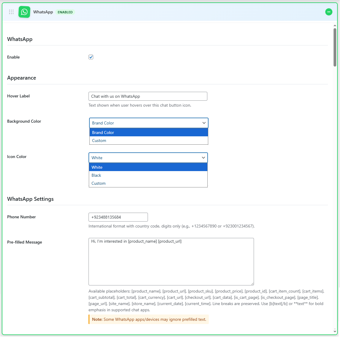
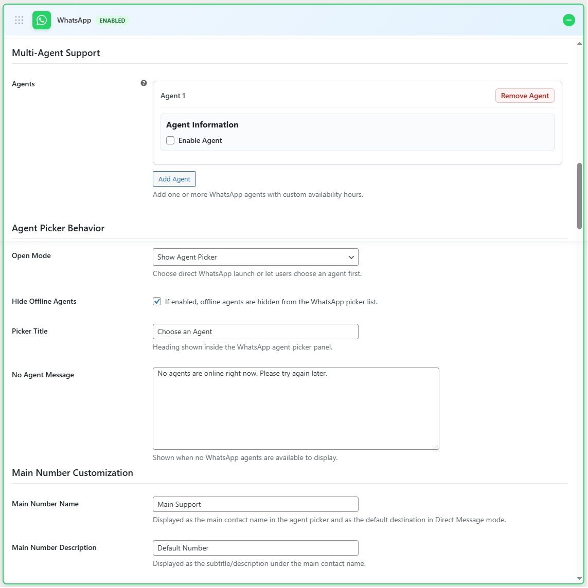
WhatsApp Settings
↑ Back to top- Enable: Enable WhatsApp chat option
- Hover Label: Text shown when the user hovers over this chat button icon.
- Background Color: Select the background color for the icon.
- Icon Color: Select the color for the icon.
- Phone Number: Enter the phone number for WhatsApp
- Pre-filled Message: Enter a pre-filled message. Use available placeholders to customize the message.
Multi-Agent Support
- Enable Agent: Enable mult-agent support.
- Avatar: Add an avatar for the agent
- Name: Enter the name for the agent
- Title: Title for the agent
- Phone Number: Phone number of the agent
- Availability Hours: configure the online/offline hours, timezone, and offline message.
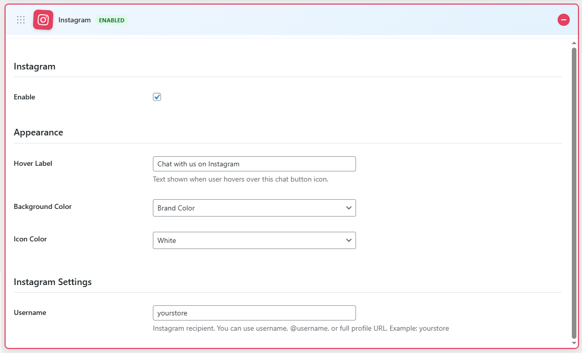
Instagram Settings
↑ Back to top- Enable: Enable Instagram chat
- Hover Label: Text shown when the user hovers over this chat button icon.
- Background Color: Select the background color for the icon
- Icon Color: Select the color for the icon
- Username: Enter the username for the Instagram account
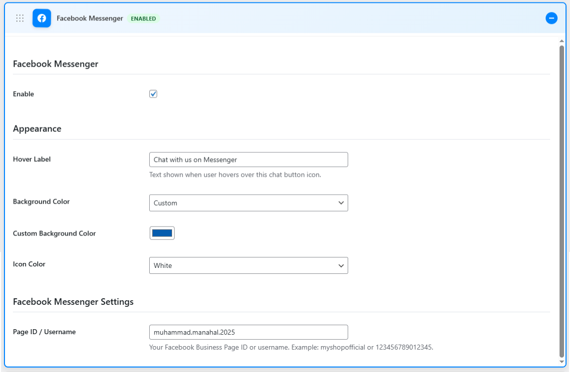
Facebook Messenger Settings
↑ Back to top- Enable: Enable the Facebook Messenger option
- Hover Label: Text shown when the user hovers over this chat button icon.
- Background Color: Select the background color for the icon
- Icon Color: Select the color for the icon
- Page ID / Username: Enter your Facebook Business Page ID or username
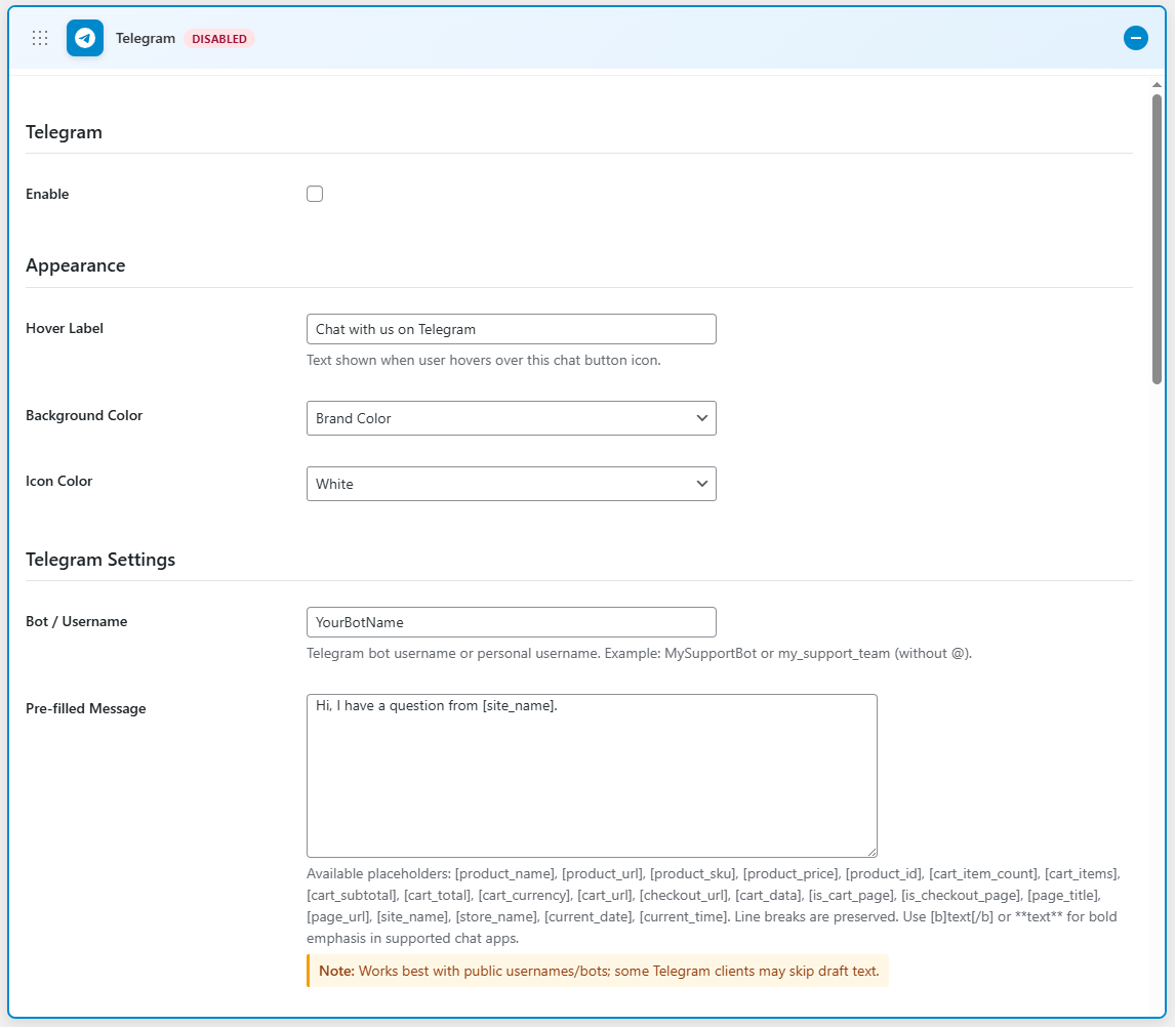
Telegram Settings
↑ Back to top- Enable: Enable the Telegram option
- Hover Label: Text shown when the user hovers over this chat button icon.
- Background Color: Select the background color for the icon
- Icon Color: Select the color for the icon
- Bot/Username: Enter the Telegram bot username or personal username
- Pre-filled Message: Enter a pre-filled message. Use available placeholders to customize the message
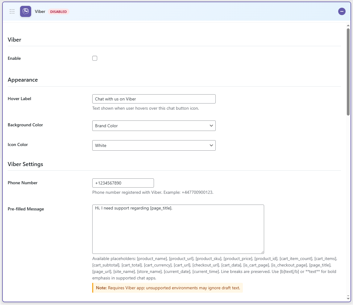
Viber Settings
↑ Back to top- Enable: Enable the Viber option
- Hover Label: Text shown when the user hovers over this chat button icon.
- Background Color: Select the background color for the icon
- Icon Color: Select the color for the icon
- Phone Number: Enter the phone number for Viber
- Pre-filled Message: Enter a pre-filled message. Use available placeholders to customize the message
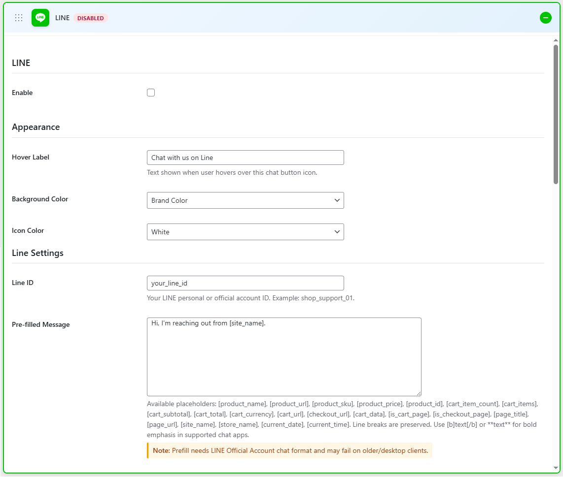
Line Settings
↑ Back to top- Enable: Enable the Line option
- Hover Label: Text shown when the user hovers over this chat button icon.
- Background Color: Select the background color for the icon
- Icon Color: Select the color for the icon
- Line ID: Enter your LINE personal or official account ID
- Pre-filled Message: Enter a pre-filled message. Use available placeholders to customize the message
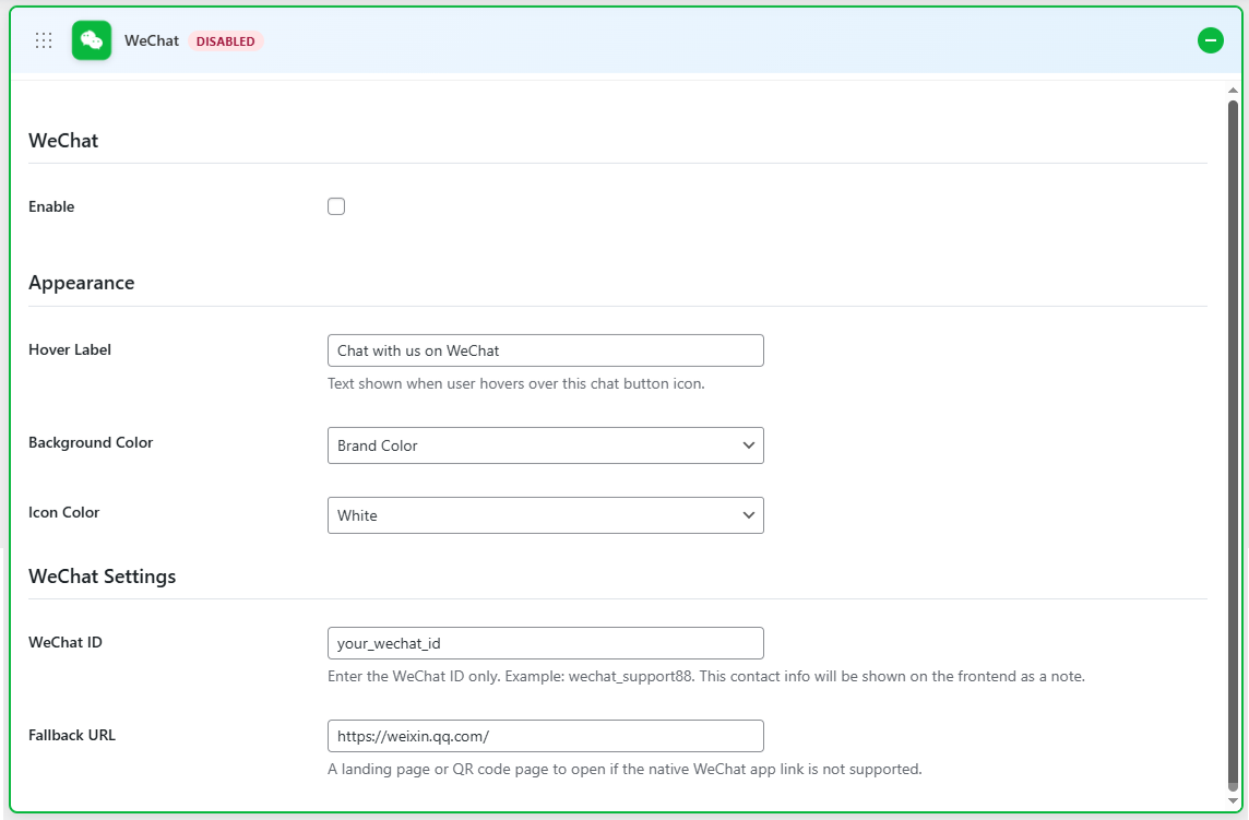
WeChat Settings
↑ Back to top- Enable: Enable the WeChat option
- Hover Label: Text shown when the user hovers over this chat button icon.
- Background Color: Select the background color for the icon
- Icon Color: Select the color for the icon
- WeChat ID: Enter your WeChat ID
- Fallback URL: A landing page or QR code page to open if the native WeChat app link is not supported.
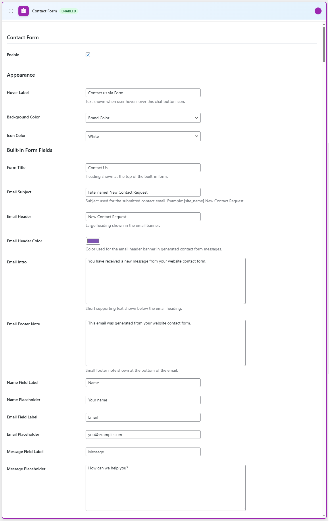
Contact Form Settings
↑ Back to top- Enable: Enable the contact form option
- Hover Label: Text shown when the user hovers over this chat button icon.
- Background Color: Select the background color for the icon
- Icon Color: Select the color for the icon
- Form Title: Heading shown at the top of the built-in form.
- Email Subject: Subject used for the submitted contact email. Example: [site_name] New Contact Request.
- Email Header: Large heading shown in the email banner.
- Email Header Color: Color used for the email header banner in generated contact form messages.
- Email Intro: Short supporting text shown below the email heading.
- Email Footer Note: A small footer note is shown at the bottom of the email.
- Name Field Label: Enter the label for the name field
- Name Placeholder: Enter the name placeholder
- Email Field Label: Enter the email field label
- Email Placeholder: Enter the email placeholder
- Message Field Label: Add the message field label
- Message Placeholder: Add the message placeholder
- Submit Button Label: Add the label for the submit button
- Success Message: Enter the success message
- Submit To Email: Enter the email where form submissions are sent
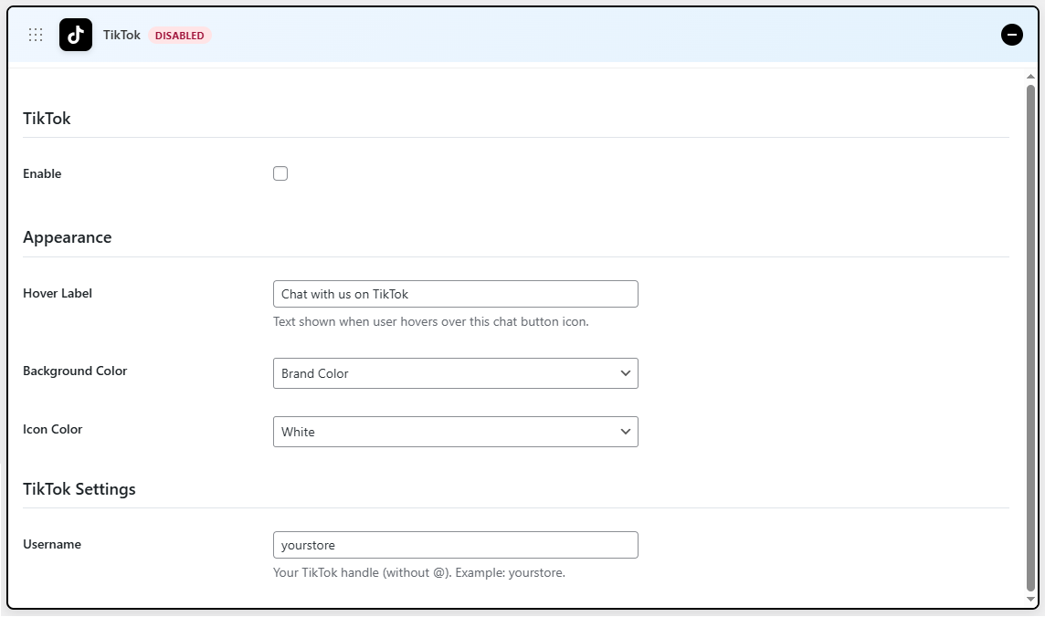
TikTok Settings
↑ Back to top- Enable: Enable the TikTok option
- Hover Label: Text shown when the user hovers over this chat button icon.
- Background Color: Select the background color for the icon
- Icon Color: Select the color for the icon
- Username: Enter your TikTok username
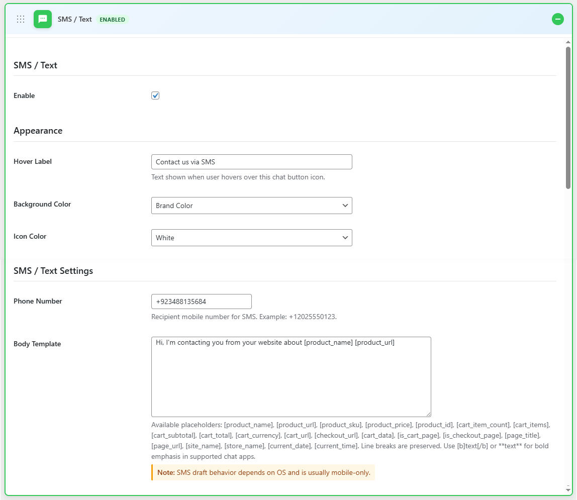
SMS/Text Settings
↑ Back to top- Enable: Enable the SMS/Text option
- Hover Label: Text shown when the user hovers over this chat button icon.
- Background Color: Select the background color for the icon
- Icon Color: Select the color for the icon
- Phone Number: Enter your phone number
- Pre-filled Message: Create a body template for the SMS. Use available placeholders to customize the message
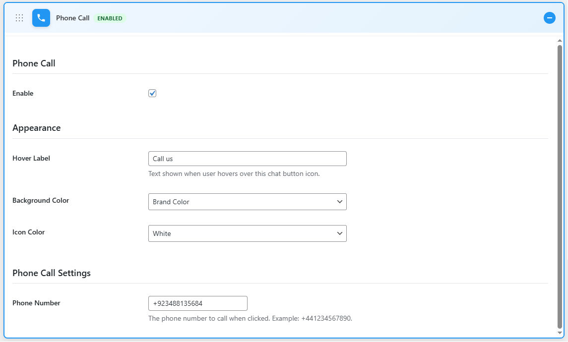
Phone Call Settings
↑ Back to top- Enable: Enable the phone call option
- Hover Label: Text shown when the user hovers over this chat button icon.
- Background Color: Select the background color for the icon
- Icon Color: Select the color for the icon
- Phone Number: Enter your phone number
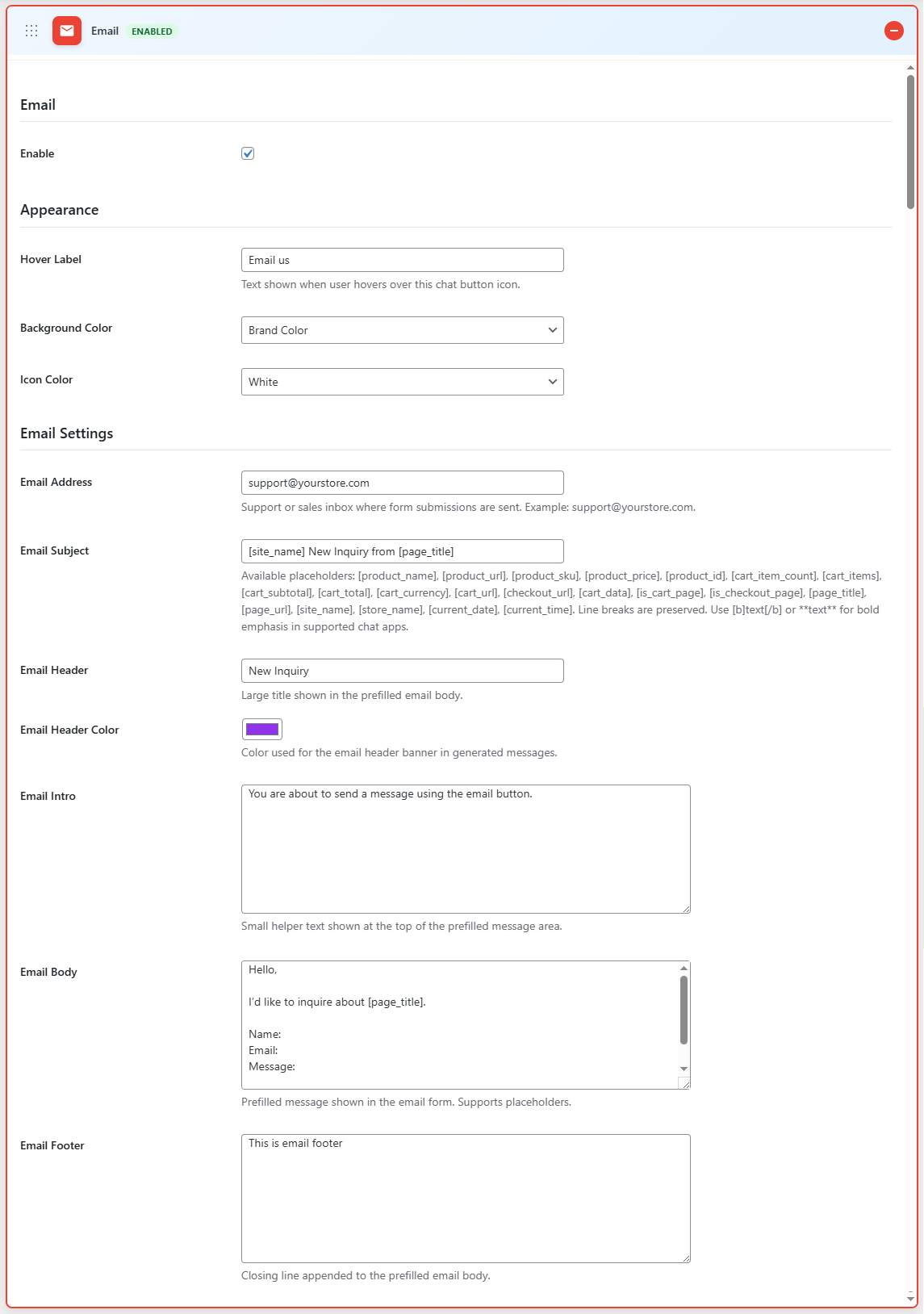
Email Settings
↑ Back to top- Enable: Enable the phone call option
- Hover Label: Text shown when the user hovers over this chat button icon.
- Background Color: Select the background color for the icon
- Icon Color: Select the color for the icon
- Email Address: Enter the email address for the support or sales inbox where form submissions are sent.
- Email Subject: Enter the subject of the email
- Email Header: Enter the header for the email
- Email Header Color: Choose the color for the email header
- Email Intro: Enter an intro for the email
- Email Body: Add body text for the email
- Email Footer: Add the footer for the email