Display custom badges and labels on your WooCommerce products using text, image, and countdown formats to highlight promotions and drive conversions.
Installation
↑ Back to top- Download the Product Badges and Labels for WooCommerce .zip file from your WooCommerce account.
- Go to WordPress Admin > Plugins > Upload Plugin and choose the plugin .zip file.
- Then install and activate the plugin.
Configuration
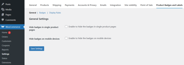
↑ Back to topWithin the WordPress admin panel, go to WooCommerce > Settings and click on the Product Badges and Labels tab. Here you will find the following sections: General, Badges, and Display Rules.
General Settings
↑ Back to top- Hide badges on single product pages: Enable this option to prevent badges from appearing on individual product pages.
- Hide badges on mobile devices: Enable this option to hide all badges when the store is viewed on a mobile device.
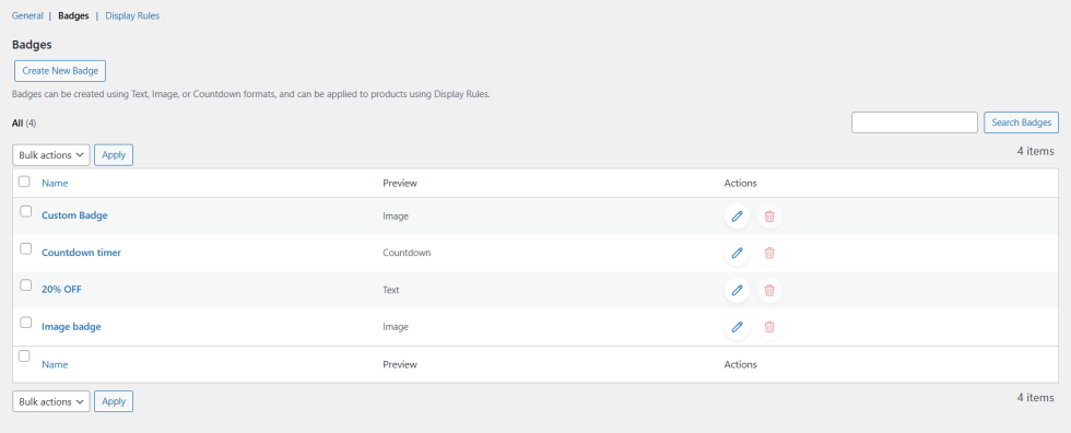
Badges
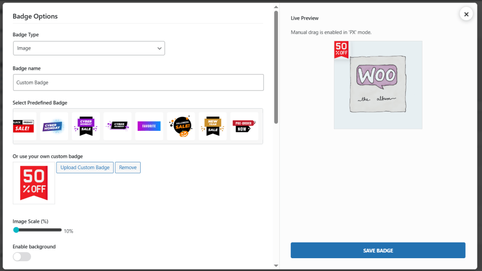
↑ Back to topClick on the Badges tab to view and manage all created badges. From here, you can create new badges, edit existing ones, or delete them using the available actions.
Click Create New Badge to open the badge options pop-up. Badges can be created in three formats.
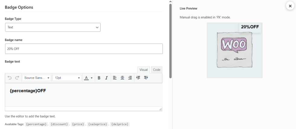
Text Badge
- Badge Type: Select Text from the dropdown.
- Badge Name: Enter a name to identify this badge.
- Badge Text: Use the rich text editor to write the badge label. The following dynamic tags are available: {percentage}, {discount}, {price}, {saleprice}, and {delprice}. These automatically pull live product pricing data into the badge text.
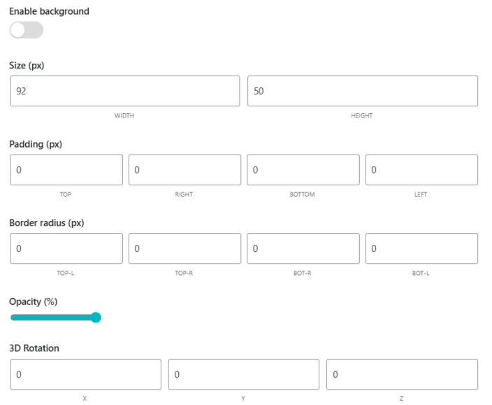
- Enable Background: Toggle to enable a background behind the badge text.
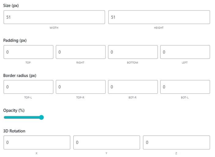
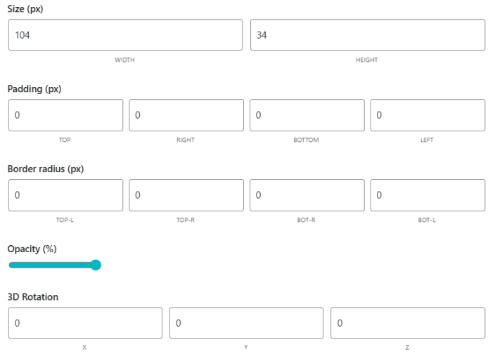
- Size (px): Set the width and height of the badge in pixels.
- Padding (px): Set the top, right, bottom, and left padding values.
- Border Radius (px): Set the corner radius for each edge of the badge.
- Opacity (%): Adjust the transparency of the badge using the slider.
- 3D Rotation: Set the X, Y, and Z rotation values for advanced styling.
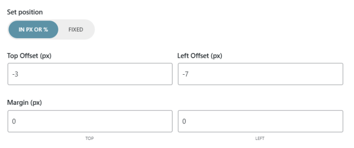
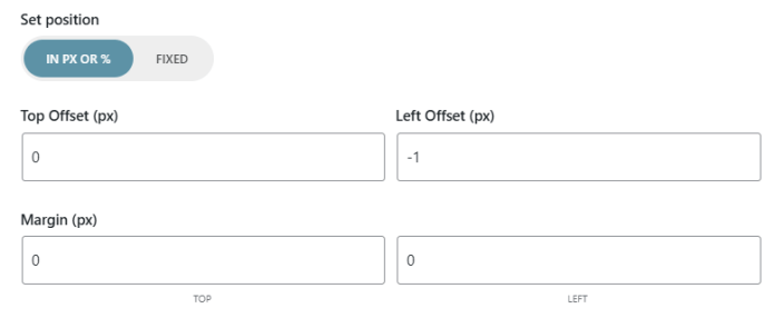
- Set Position: Choose between In PX or % mode and Fixed mode. Enter the Top Offset and Left Offset values, or drag the badge directly on the live preview.
- Margin (px): Set the top and left margin values.
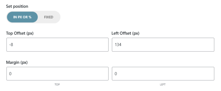
Image Badge
- Badge Type: Select Image from the dropdown.
- Badge Name: Enter a name to identify this badge.
- Select Predefined Badge: Choose a ready-made badge from the built-in library, which includes formats like Buy 1 Get 1 Free, BOGO Sale, 2×1, 3×2, and more.
- Upload Custom Badge: Click to upload your own badge image from the media library.
- Image Scale (%): Adjust the display size of the badge image using the slider.
- Enable Background: Toggle to enable a background behind the badge image.
- Size (px): Set the width and height of the badge in pixels.
- Padding (px): Set the top, right, bottom, and left padding values.
- Border Radius (px): Set the corner radius for each edge of the badge.
- Opacity (%): Adjust the transparency of the badge using the slider.
- 3D Rotation: Set the X, Y, and Z rotation values for advanced styling.
- Set Position: Choose between In PX or % mode and Fixed mode. Enter the Top Offset and Left Offset values, or drag the badge directly on the live preview.
- Margin (px): Set the top and left margin values.
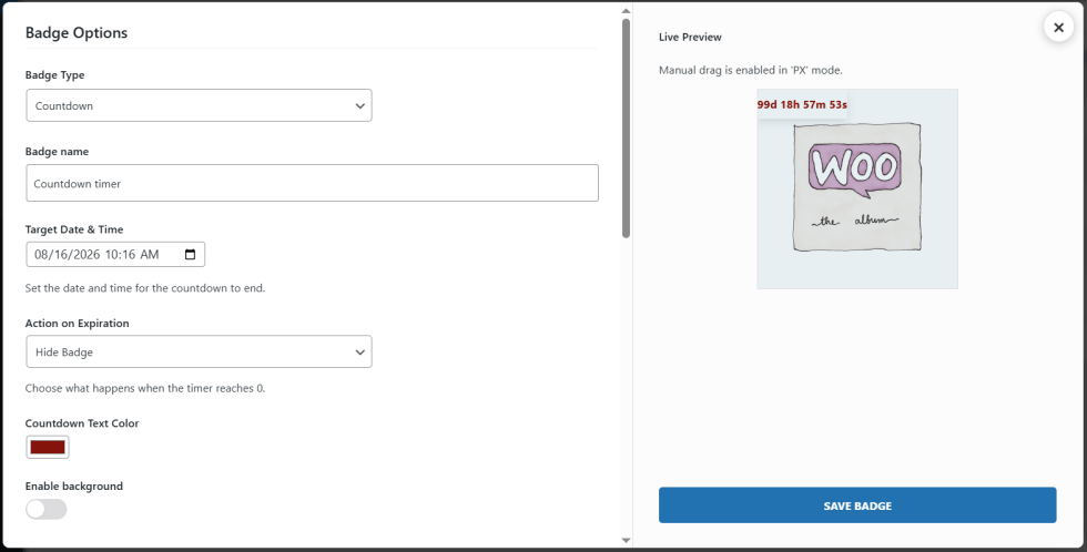
Countdown Badge
- Badge Type: Select Countdown from the dropdown.
- Badge Name: Enter a name to identify this badge.
- Target Date and Time: Set the date and time for the countdown to end.
- Action on Expiration: Choose what happens when the timer reaches zero. Options include Hide Badge.
- Countdown Text Color: Select the color for the countdown timer text.
- Enable Background: Toggle to enable a background behind the countdown timer.
- Size (px): Set the width and height of the badge in pixels.
- Padding (px): Set the top, right, bottom, and left padding values.
- Border Radius (px): Set the corner radius for each edge of the badge.
- Opacity (%): Adjust the transparency of the badge using the slider.
- 3D Rotation: Set the X, Y, and Z rotation values for advanced styling.
- Set Position: Choose between In PX or % mode and Fixed mode. Enter the Top Offset and Left Offset values, or drag the badge directly on the live preview.
- Margin (px): Set the top and left margin values.
The live preview panel on the right side of the badge options screen updates in real time as you configure each setting. Manual drag-and-drop positioning is available when the badge position is set to PX mode.
Display Rules
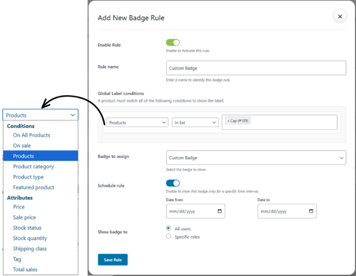
↑ Back to topClick on the Display Rules tab to manage which badges appear on which products and set conditions.
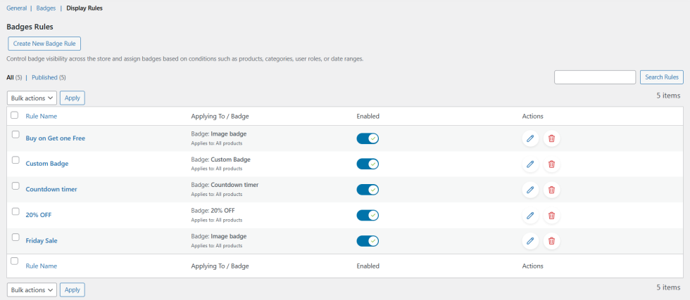
Click Add New Badge Rule to open the rule configuration panel.
- Enable Rule: Toggle to activate or deactivate this rule without deleting it.
- Rule Name: Enter a name to identify this display rule.
- Global Label Conditions: Set one or more conditions that a product must match for the badge to display. Available condition types include:
- On All Products
- On Sale
- Products
- Product Category
- Product Type
- Featured Product
- Price
- Sale Price
- Stock Status
- Stock Quantity
- Shipping Class
- Tag
- Total Sales
- Badge to Assign: Select the badge from your library that should display when this rule’s conditions are met.
- Schedule Rule: Toggle to enable date-based scheduling. Set a Date From and Date To to limit the badge to a specific time period.
- Show Badge To: Choose to display the badge to All Users or restrict it to Specific Roles by selecting the relevant customer roles.