The Additional Variation Images Gallery for WooCommerce lets you add and manage multiple images for each product variation. Use it to display variation-specific galleries, customize sliders, thumbnails, captions, and navigation arrows, and give customers a clearer, more engaging product browsing experience. It works seamlessly with your existing WooCommerce product data and layouts.
Installation
↑ Back to top- Download the WooCommerce Additional Variation Images Gallery .zip file from your WooCommerce account.
- Go to Plugins, click on Add New, then Upload, and select the .zip file that you downloaded.
- Click on “Install Now” and then “Activate”.
More information at Install and Activate Plugins/Extensions.
Configuration
↑ Back to topAfter the plugin is installed, go to WooCommerce > Settings > Additional Variation Images Gallery and configure the following settings.
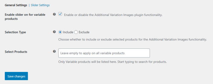
General Settings
↑ Back to topIn this section, you can configure the core functionality of the Additional Variation Images Gallery. Go to WooCommerce > Settings > Additional Variation Images Gallery > General Settings and set up the following:
- Enable Slider for Variable Products: Tick the checkbox to enable or disable the plugin functionality for your variable products.
- Selection Type: Choose whether to include or exclude specific products from using the Additional Variation Images functionality.
- Select Products: Pick specific products to assign variation images to, or leave empty to apply to all variable products by default.
These settings give you control over which products the plugin affects, ensuring that your variation galleries are applied only where needed.
Click on the “Save Changes” button to apply the configured settings.
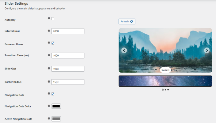
Slider Settings
↑ Back to topGo to WooCommerce > Settings > Additional Variation Images Gallery > Slider Settings to configure the behavior and appearance of your variation image slider:
- Autoplay: Enable or disable whether the slider should play automatically.
- Interval (ms): Set the time (in milliseconds) between each slide when autoplay is enabled.
- Pause on Hover: Choose whether the slider should pause when a customer hovers over it.
- Transition Time (ms): Set the duration of the slide transition in milliseconds.
- Slide Gap (px): Adjust the spacing between each slide in pixels.
- Border Radius (px): Set the border radius for the slides to control rounded corners.
- Navigation Dots: Enable or disable the navigation dots beneath the slider.
- Navigation Dots Color: Select the color of inactive navigation dots.
- Active Navigation Dots Color: Select the color for the currently active navigation dot.
Arrow Settings
↑ Back to topGo to WooCommerce > Settings > Additional Variation Images Gallery > Slider Settings and scroll down to Arrow Settings to configure this feature
- Enabled/Disabled: Enable or disable the slider arrows.
- Size: Set the size of the arrows in pixels.
- Background Color: Choose a background color for the arrows.
- Radius: Adjust the border radius as a percentage to control the roundness of the arrows.
- Shadow: Customize the arrow shadow with the following options:
- X Offset: Set the horizontal offset of the shadow.
- Y Offset: Set the vertical offset of the shadow.
- Blur: Control the blur radius of the shadow.
- Spread: Adjust how far the shadow spreads.
- Opacity: Set the transparency level of the shadow.
- Color: Choose the color of the shadow.
- Reset Shadow: Restore the shadow settings to their default values.
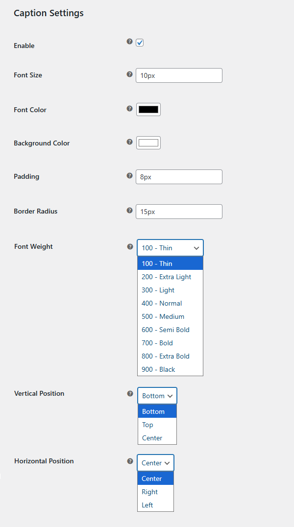
Caption Settings
↑ Back to topGo to WooCommerce > Settings > Additional Variation Images Gallery > Slider Settings and scroll down to Caption Settings to configure this feature:
- Enable: Turn image captions on or off.
- Font Size: Set the font size of captions in pixels.
- Font Color: Choose the text color for captions.
- Background Color: Select a background color for captions.
- Padding: Adjust the space inside the caption box in pixels.
- Border Radius: Set the border radius of the caption box in pixels.
- Font Weight: Choose the weight of the caption text (e.g., 400 – Normal).
- Vertical Position: Set the vertical placement of the caption (e.g., Bottom, Top).
- Horizontal Position: Set the horizontal placement of the caption on the image.
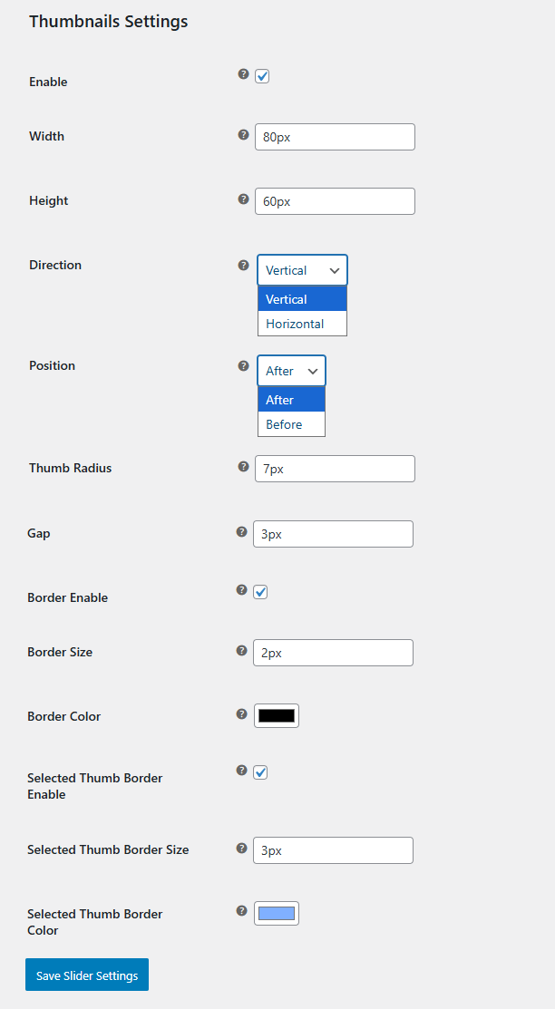
Thumbnail Settings
↑ Back to topGo to WooCommerce > Settings > Additional Variation Images Gallery > Slider Settings and scroll down to Thumbnail Settings to configure this feature:
- Enable: Turn variation thumbnails on or off.
- Width: Set the width of thumbnails in pixels.
- Height: Set the height of thumbnails in pixels.
- Direction: Choose the thumbnail layout direction (Horizontal or Vertical).
- Thumb Radius: Adjust the border radius of thumbnails in pixels.
- Gap: Set the spacing between thumbnails in pixels.
- Border Enable: Enable or disable borders around thumbnails.
- Border Size: Set the thickness of thumbnail borders in pixels.
- Border Color: Choose the color of thumbnail borders.
- Selected Thumb Border Enable: Enable or disable a border for the selected thumbnail.
- Selected Thumb Border Size: Set the thickness of the selected thumbnail border in pixels.
- Selected Thumb Border Color: Choose the color of the selected thumbnail border.
Click on the “Save Changes” button to apply the configured settings.