When you enable Product Input Fields – All Products setting under All Products link, added input fields settings will apply to all products.
These Product Input Fields Settings are displayed as All Products: #Field 1 link, All Products: #Field 2 link etc depending upon the number added under Product Input Fields Number setting on All Products page.
In this post we shall discuss all the settings under All Products: #Field 1 link, assuming that Product Input Fields Number is set to 1.
Hence the default All Products: #Field 1 will appear as below:
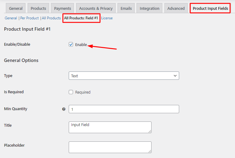
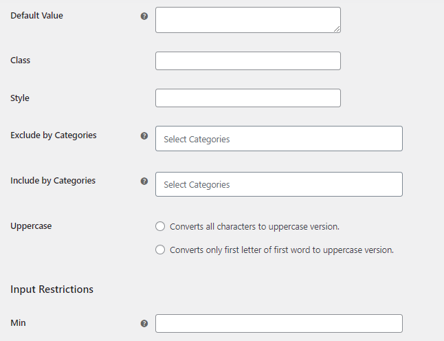
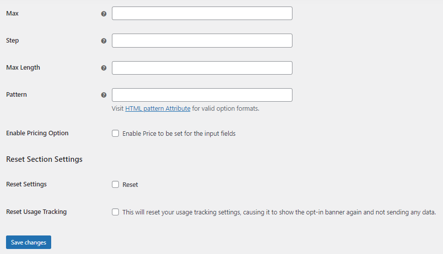
Depending on the Input Field Type selected, these settings will appear:
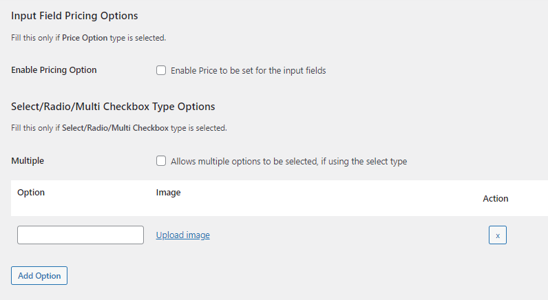
This page consists of 6 sections:
- Product Input Field #1
- General Options
- Input Restrictions
- Product Input Field Type
- Input Field Pricing Option
- Reset Section Settings
Let us understand how these options are used for displaying product input fields on the front end.
1. Product Input Field #1
To display selected product input field on the front end, you need to first enable the Product Input Field #1 option on WooCommerce -> Settings -> Product Input Fields -> All Products: Field #1.

By default, Enable checkbox is unticked which means this setting is disabled. Product Input Field #1 option will allow you to add all settings for selected input field.
You need to select one input field type from the Type dropdown for each Product Input Field links. If you want to display more than one input field on the front end, then you need to add that number in the Product Input Fields Number setting.
For instance, if you want to display the Text and File input fields on the front end then add 2 in Product Input Fields Number setting. This will show 2 links – All Products: Field #1 and All Products: Field #2 under Product Input Fields tab. So select Text input field under All Products: Field #1 and add settings for it & select File input field under All Products: Field #2 and add settings for it separately.
Note – You can select only one input field for each All Products input field links.
2. General Options
The different settings under General Options which are used for various product input fields. Let us understand each of these settings.
2.A.Type
↑ Back to topThe options for different input fields are displayed in the dropdown for Type setting.
There are 19 different input types available in the dropdown namely Text, Textarea, Number, Checkbox, Color, File, Datepicker, Weekpicker, Timepicker, Select, Radio, Password, Country, Email, Phone, Search, URL, Range and Multi checkbox.
To get in-depth information about these different types, go to the section Product Input Field types.
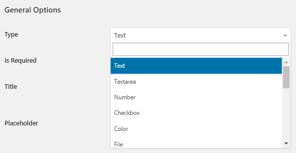
When you select Text option from the Type dropdown, you need to add other settings under General Options for Text input field to get displayed on the front end. Text input field is used when you want customer to add specific information before adding the product to the cart on the front end.
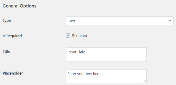
2.B. Title and Placeholder
↑ Back to topWhen you want to display Text input field on the front end, you need to add Title and Placeholder settings.
Therefore Title is added as Input Field and Placeholder is set as Enter your text here. So considering product Chocolate Cake, this input field will appear on its single product page as shown below:
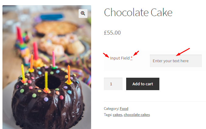
This setting is used for all product input field types to enter title and placeholder text so that customer can understand what needs to be done.
2.C. Is Required setting
↑ Back to topYou can see an ‘*’ sign next to Input Field title if you have ticked the Required checkbox of Is Required setting.

If customer forgets to enter text in the Text field before clicking the Add to cart button, a message will be displayed notifying him that this field is mandatory.
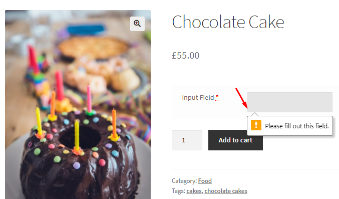
Again, this setting is used for all product input field types for making that input field mandatory.
2.D. Message on Required setting
↑ Back to topWhen product input fields are displayed outside the Add to cart button form or if ‘Add HTML Required Attribute‘ option in plugin’s General -> Frontend Options settings is disabled, then message added in the Message on Required setting is used.

You can use mergecodes to display this message where its actual value will be replaced on the front end. By default, the message added is Field “%title%” is required!.
2.E. Class and Style settings
↑ Back to topBoth these settings are used for appearance of the input fields. You need to add HTML tags for Class and Style settings as shown below:

Therefore on the front end, you will see that these settings are applied.
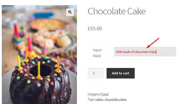
When these settings are not applied, the front end will appear as shown below:
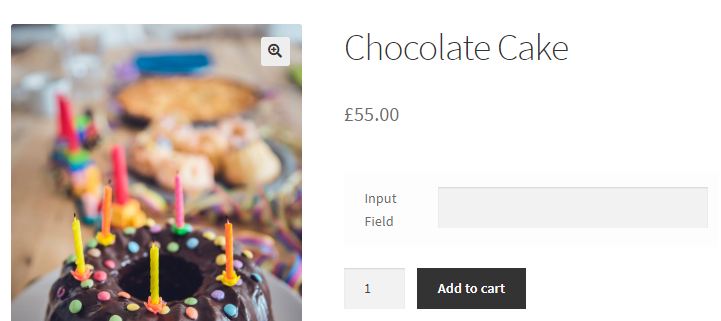
These settings will be applicable for all product input field types.
Note – Using the class id you can customize the CSS in the functions.php file of the currently active theme or any custom code can also done by the developer.
2.F. Default Value setting
↑ Back to topThis setting is mainly used for input fields like Checkbox, Color, Select, Radio, Multi checkbox etc where you have to select one from the given options. So Default Value setting will allow you to enter the option in the back end which will be displayed as a default selection on the front end.
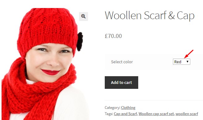
For instance, say you want to display Select input field on the front end for the customer to select from 3 color options – Red, White and Black. You want to show Red color as a default color selection on the single product page of product Woollen Scarf & Cap, so you need to add Red in the Default Value setting.

So when you check the Woollen Scarf & Cap product on the front end, you will see Red as a default selection as shown below:
Note – For Checkbox input field type, enter Yes or No in Default Value setting. If you leave it blank, it will not be considered.
2.G. Uppercase setting
↑ Back to topThis setting is disabled by default. When you enable Uppercase setting, the characters are converted to uppercase version whenever possible.

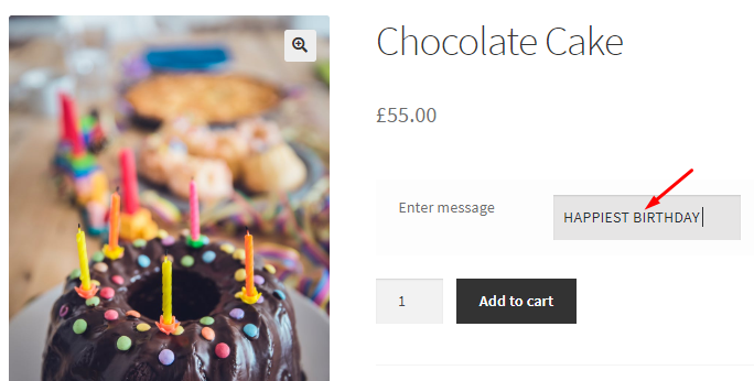
Uppercase setting is mainly used for Text, Textarea, Country, Password etc input fields. Consider an instance where customer has to enter a birthday message for Chocolate Cake product and you have enabled the Uppercase setting. Hence the characters in the message will appear in uppercase version.
3. Input Restrictions
The settings under this section is mainly used for Number and Range input field type where you have to set the minimum or maximum number input or maximum length for the input field etc. Let us understand each of these settings separately.
3.A. Min
↑ Back to topFor this setting to work, make sure you select either Number or Range input type from the Type dropdown. This setting allows you to enter minimum value for product input field. Say for product Vineyard Visit you want the customer to atleast select minimum 2 adults for the booking, so you can add 2 in the Min setting.

So if you check the single product page of product Vineyard Visit and type the number 1, an error message will appear notifying that you need to enter number 2 or greater than that.
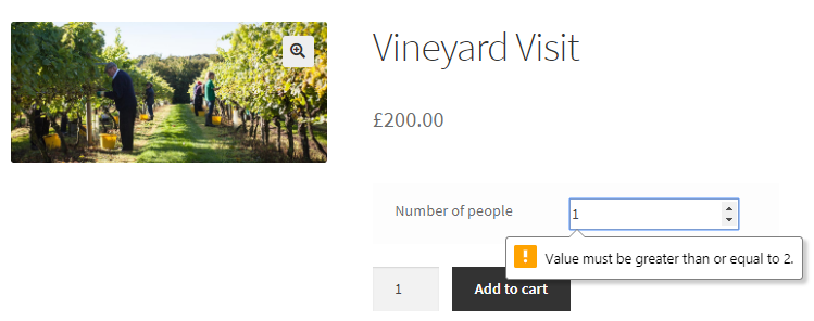
Leave this setting blank, if you do not wish to consider it.
2.B. Max
↑ Back to topSimilar to Min setting, Max setting will allow you to set the maximum value for the product input field. Considering the same example of Vineyard Visit product, say you do not want to allow booking of more than 5 people. So add 5 in the Max setting.

Now when you check on the single product page of Vineyard Visit product, you will be allowed to add only upto 5 people. If you try to add more than that, an error message will be displayed.
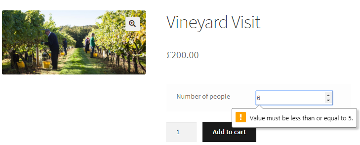
Leave this setting blank to disable it. Max setting is used for Number or Range input field types.
3.C. Step
↑ Back to topStep setting allows you to add intervals for an input field. This works with Number or Range input field types and when you leave it blank, it is disabled. This setting will only work when you have Min and Max value added. For instance say you add Step as 2, then the options on the front end will appear after every 2 intervals, e.g. 1, 3, 5, 7….will be considered.
Considering the same example of Vineyard Visit product, say you want to take the visitors in a group of multiples of 2 for the visit. Hence add Min value as 2, Max as 10 and Step as 2.
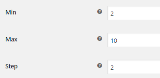
This will allow only 2, 4, 6, 8, 10 selection to be made on the front end as Step is set to 2. So if customer tries to select any number other than these, then an error message will be displayed as shown below:
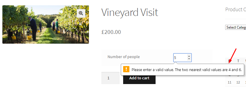
3.D. Max Length
↑ Back to topThis setting is useful to add a limit to the total number of characters/numbers allowed in the input field. Max Length setting is useful for Text, Textarea, Number, Country, Password and Search input fields.
Let us understand this setting using Text input field. Say you want to restrict the characters in the message for Chocolate Cake product to 20 characters, so enter 20 in Max Length.

So now when customer adds a message on the front end, he will be allowed to add upto 20 characters only.
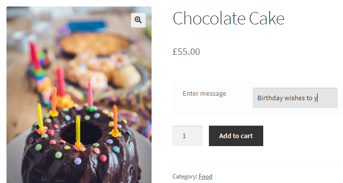
When you leave this option blank, it will be considered disabled.
3.E. Pattern
↑ Back to topThis setting allows you to set a pattern for Text, Textarea etc, against which the input value is checked. You can add the HTML pattern from the option format list under HTML pattern Attribute.
A sample HTML pattern will be something like this:

When you leave this setting blank, it will not be considered.
4. Product Input Type
This section will now share
- Checkbox/Select/Radio/Multi Checkbox Type Options
- File Type Options
- Datepicker/Weekpicker Type Options
- Timepicker Type Options
- Color Type Options
4.1. Checkbox/Select/Radio/Multi Checkbox Type Options
↑ Back to topThis option is used for input fields like Checkbox, Select, Radio, Multi Checkbox. If you wish to add a price to this field, then please scroll down to the bottom to find the ‘Input Field Pricing Option’ section.
Checkbox option
↑ Back to topThis will let you provide a checkbox on the product page.

For instance, say you want to give an option of Home delivery to the customer for product Chocolate Cake. So you add a checkbox input field as Delivery at Home? If customer ticks the checkbox, he wants the delivery of Chocolate Cake at home otherwise he doesn’t.
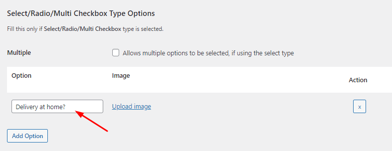
After saving this option, without selecting the checkbox for multiple, the home delivery option will be considered as shown below:
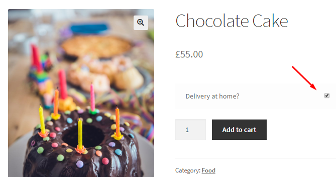
Note – The selected value by the customer on the front end will be saved in the database.
Select option
↑ Back to topThis setting will allow you to add the different options for displaying them on the front end so that customer can make a selection from it. By default, this setting is left blank. You need to add one option per line as shown below:
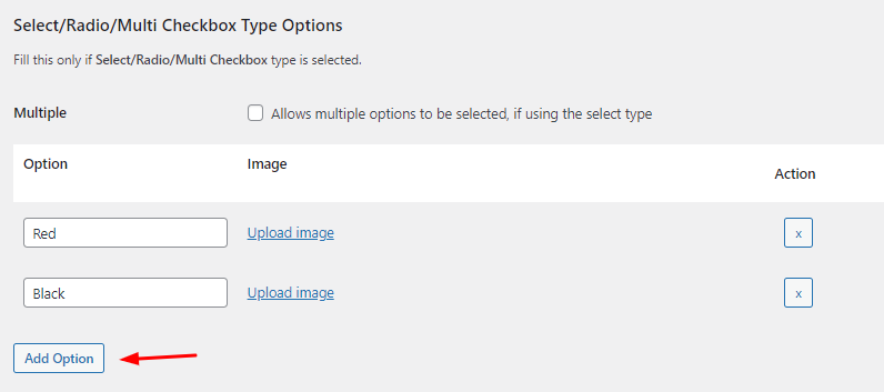
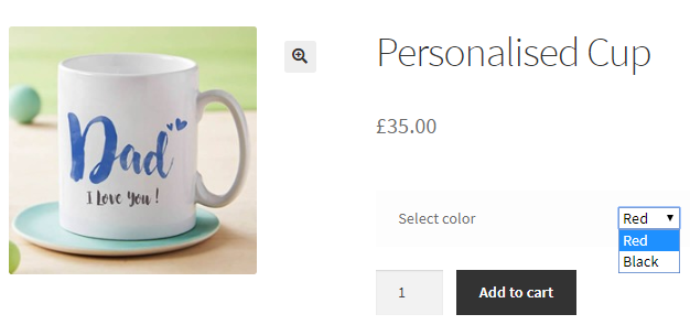
Use the Add Option Button to add more options. So now when you go to the front end, Select option which is selected for product input type will show these 2 options in the dropdown.
Radio option
↑ Back to topThis setting will let your options on the Product Page appear as radio buttons.

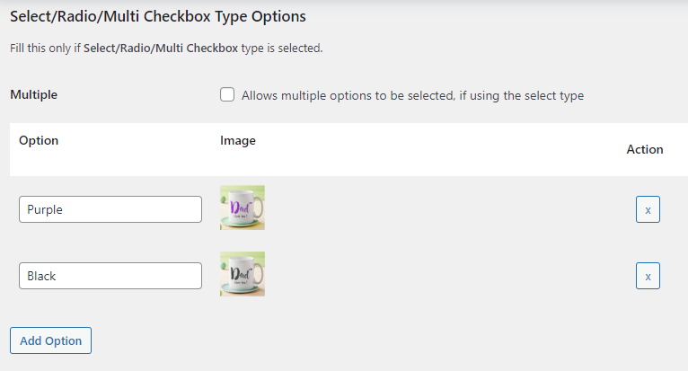
You need to add one option per line. You can also add images to these options as shown below:
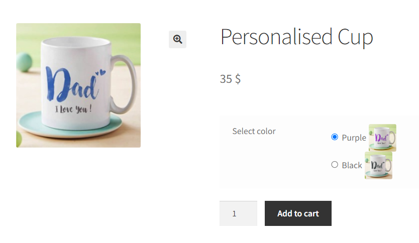
On the front end, you will see the radio buttons in this manner:
Multiple Checkbox
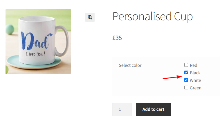
↑ Back to topThis setting allows you to make multiple selections on the front end.

It is disabled by default and will be enabled when you tick the Allows multiple options to be selected, if using the select type checkbox.
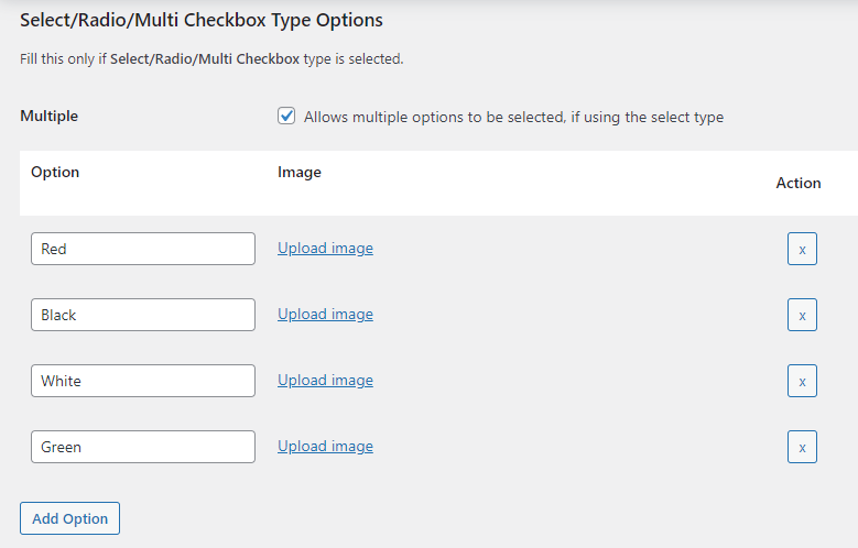
Multiple setting works only with Select input field type. So on the front end, customer will be able to make multiple selections as shown below:
4.2. File Type Options
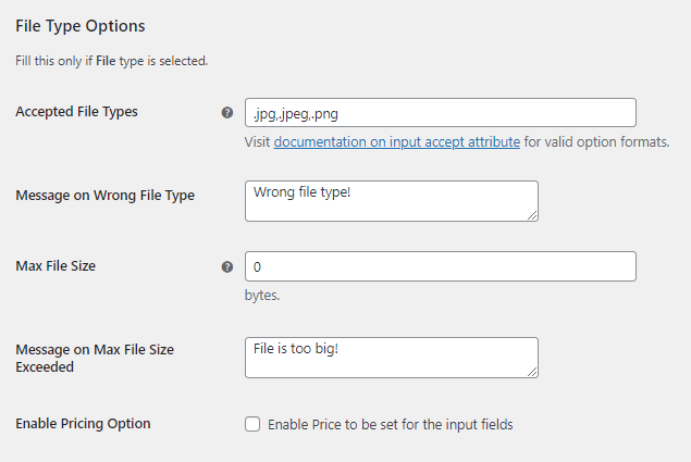
↑ Back to topThe settings under File Type Options section will be considered only if File is selected as the product input field type.
Accepted File Types and Message on Wrong File Type
↑ Back to topThe Accepted File Types setting will allow you to add the different file types which you want to allow to be uploaded by the customer. And Message on Wrong File Type setting will display the added message on the front end when a file other than the mentioned file type is uploaded.
By default the Accepted File Types added are .jpg,.jpeg,.png. You can add many other file types and select them from the valid option formats list available here. Also, The default message for Message on Wrong File Type option is Wrong file type!
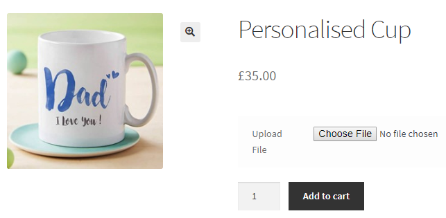
Let us understand these options using an instance. Say you want to allow only .jpeg or .jpg files for product Personalised Cup and if file of any other format is uploaded than a message Please upload a .jpeg or .jpg file should be displayed which is set in Message on Wrong File Type option.

Therefore the File input field will appear on the single product page of product Personalised Cup.
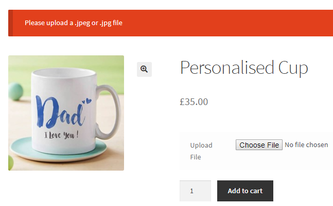
Now say a customer tries to upload .docx file and clicks the Add to cart button.

Hence a message will be displayed notifying the customer to upload .jpeg or .jpg file since the uploaded file was not the correct file format.
Leave the Accepted File Types option blank to accept all file types.
Max File Size and Message on Max File Size Exceeded
↑ Back to topIn these settings, you can add a maximum file size that can be accepted and add a message which will be displayed when file size exceeds the maximum file size.
The default Max File Size is 0 byte and default Message on Max File Size Exceeded option is set to File is too big!
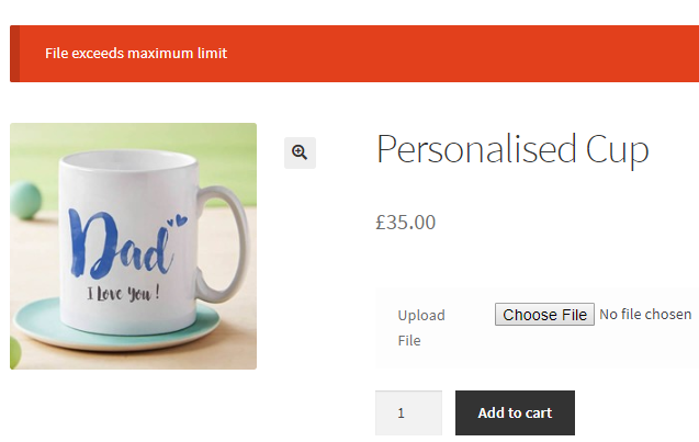
Let us consider the same instance of Personalised Cup product where Max File Size is set to 200 bytes and Max File Size Exceeded is set to File exceeds maximum limit.

Now say a customer uploads the file of 20 kilo byte on the single product page of Personalised Cup product and clicks on Add to cart button.
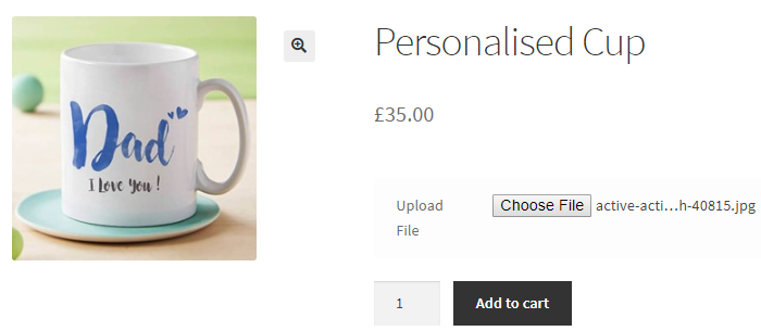
Since the file exceeds the maximum file size limit of 200 bytes, a message will be displayed as shown below:
Note: If you wish to add a price to this field, then please scroll down to the bottom to find the ‘Input Field Pricing Option’ section.
DIisplaying Thumbnail Previews
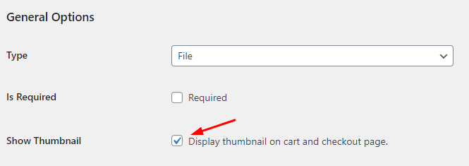
After selecting the Input Type as File, you will set the option to decide whether you want Thumbnail previews to be enabled for the customer or not.
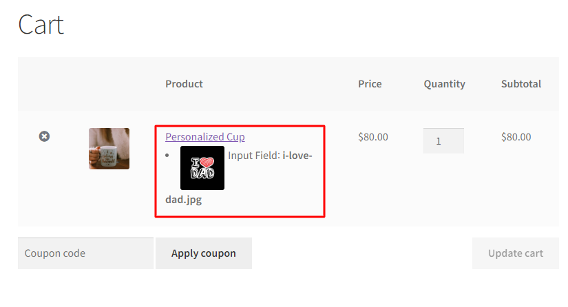
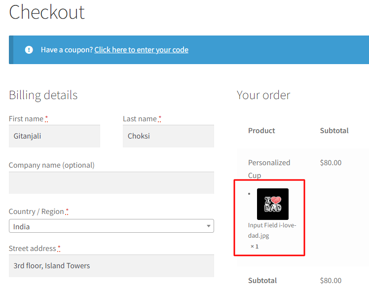
When the checkbox is ticked, the customers will get to see a thumbnail preview of the image they have uploaded in the input filed on the Cart and Checkout Page.
For instance, your customer has added the product Personalized Cup and uploaded a .jpg image in the input field. When they move to the Cart Page, the image will appear as such:
Similarly, when they move to the Checkout Page, the image will be displayed as a thumbnail preview as shown below:
4.3. Datepicker/Weekpicker Type Options
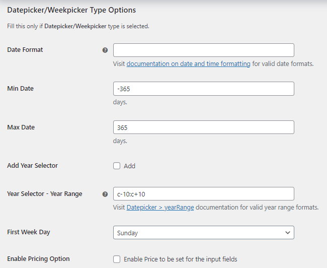
↑ Back to topThis section will display settings for Datepicker or Weekpicker Field Type. If you wish to add a price to this field, then please scroll down to the bottom to find the ‘Input Field Pricing Option’ section.
Date Format
↑ Back to topYou will be able to set the format for displaying date on the front end using the Date Format setting. Leave this setting blank if you wish to use the default WordPress format i.e. F y, j. To know the different valid date formats, click here. If you add F j, Y then the date will be displayed as September 20, 2018 on the front end.
For instance, say you add m/d/yy in Date Format setting.

So on the front end for product Personalised Cup, the selected date from the Datepicker will be displayed as 03/04/2019.

Min Date and Max Date
↑ Back to topThese settings allow you to add number of days before and after the current date to display them on the Datepicker. For example, for Min Date setting if you add -400 days then the Datepicker will show dates from 400 days before the current date. Similarly, for Max Date setting, if you add 400 days then Datepicker will show dates which are 400 days from the current date.
By default, Min Date and Max Date settings are set as -365 days and 365 days respectively.

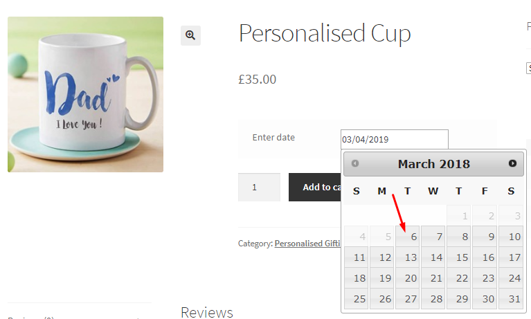
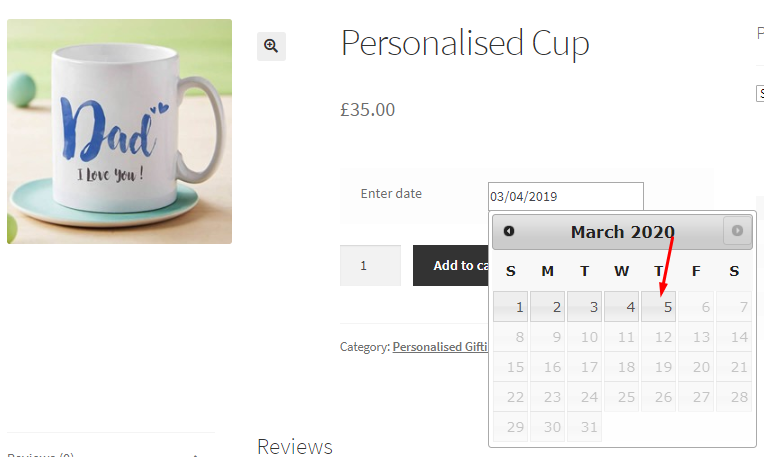
When these values are set in the back end, the Datepicker on the front end will show dates from 6th March, 2018 to current date which is 6th March, 2019. Also, it will show dates upto 5th March, 2020 because of the minimum and maximum values added in the back end.
Add Year Selector
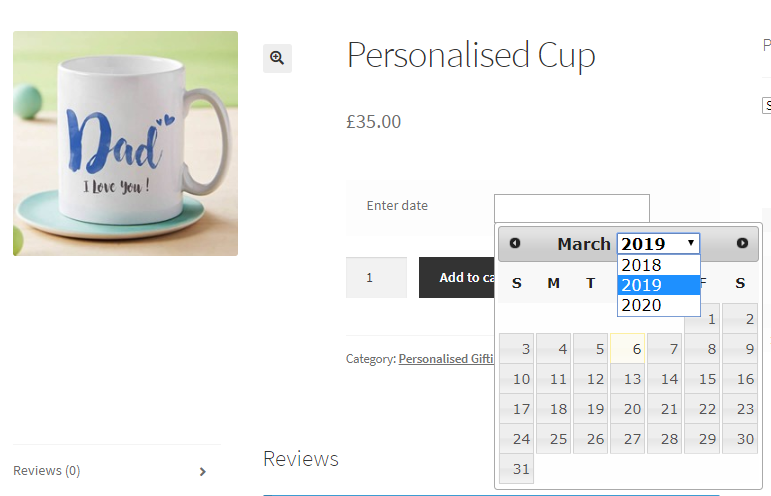
↑ Back to topThis setting will add a Year selector on Datepicker so that customer can select the year they want to view/select. By default, this setting is disabled. Tick the Add checkbox of Add Year Selector setting to enable it.

So on the front end, customer will be able to select a year from the year dropdown.
Year Selector – Year Range
↑ Back to topThis setting helps you to add the year range for selection on the Datepicker. By default, the value added is c-10:c+10 for Year Selector – Year Range setting.
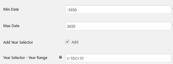
Hence the Year Selector on the front end will show 10 years before the current year and 10 years after the current year.
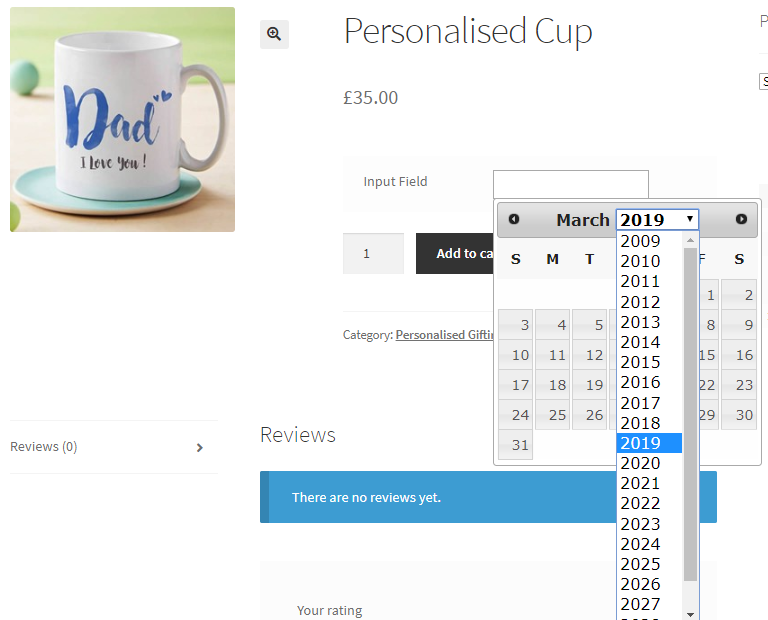
Now consider that same Min Date and Max Date is set which is -3650 and 3650 respectively and c-5:c+5 is added for Year Selector – Year Range setting.

This will display only 5 years before the current year and 5 years after the current year in the year selection on the front end.
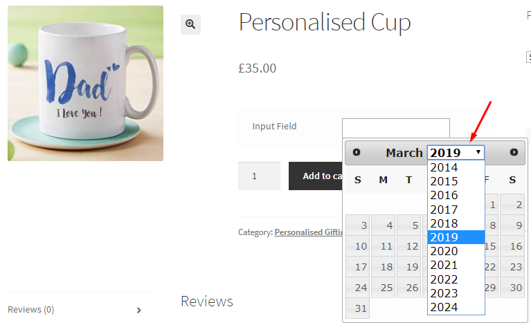
Note – It is important to add the Min Date and Max Date setting accordingly.
First Week Day
↑ Back to topThis setting will allow you to set the first day of the week for displaying it on the Datepicker. By default, Sunday is set as the first day of the week.

Hence the Datepicker on the front end will show Sunday as the first day of the week.
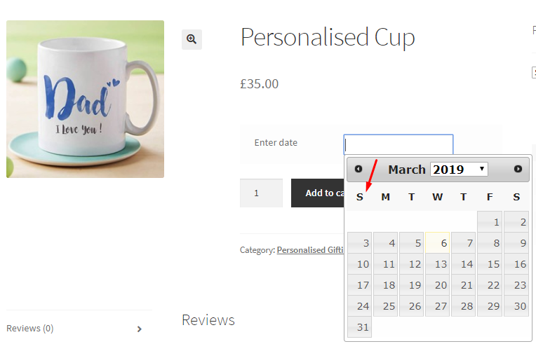
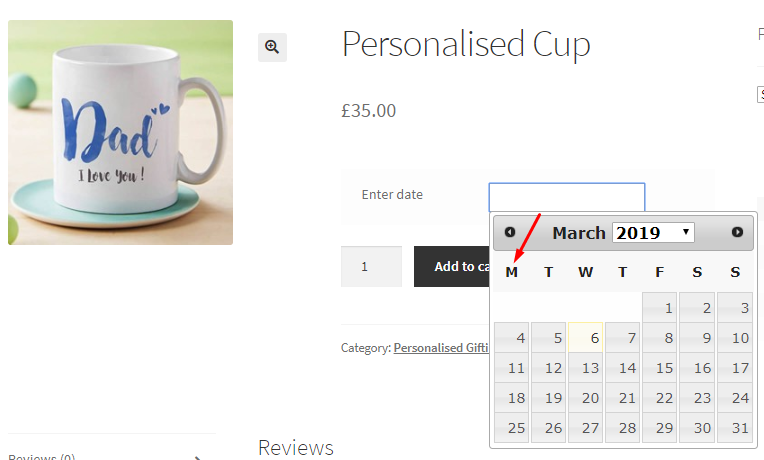
Now if you decide to display Monday as the first day of the week then you can select Monday from the weekday dropdown in the First Week Day setting. This will show Monday as the starting weekday on the Datepicker as shown below:
4.5. Timepicker Type Options
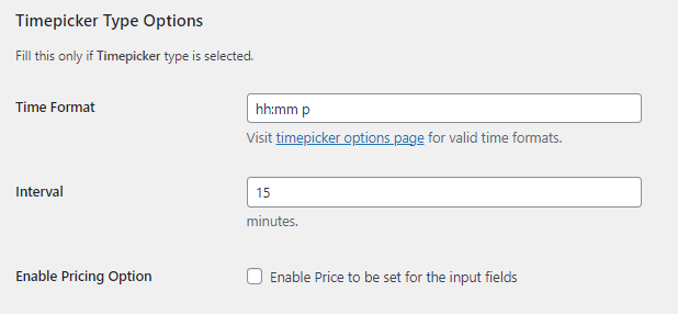
↑ Back to topSimilar to Datepicker setting, Timepicker Type Options section will display settings for Timepicker input field type. This setting will work only if Timepicker type is selected. If you wish to add a price to this field, then please scroll down to the bottom to find the ‘Input Field Pricing Option’ section.
Time Format
↑ Back to topHere you can set the format for displaying time on the front end. By default, Time format added is hh:mm p.

Therefore this will display time as on the front end as shown below:
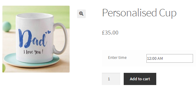
Thus time is displayed in time format selected. You can add different time formats from the list here.
Interval
↑ Back to top
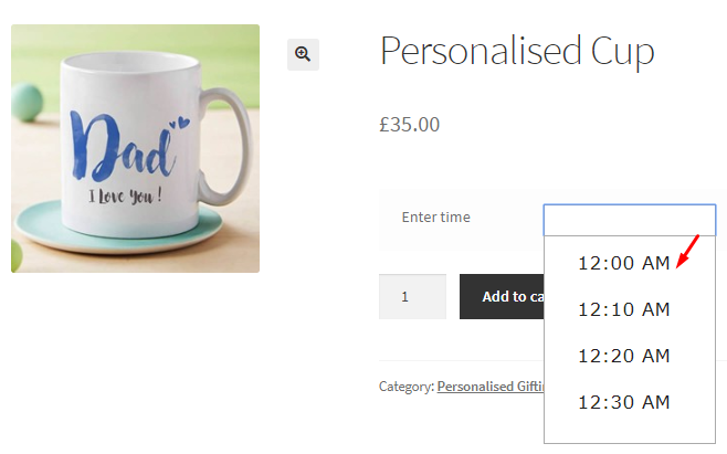
You can decide the time interval you want to set for displaying the timings on the front end. By default, the interval is set to 15 minutes.
Say you want customer to select timings that are set in the intervals of 10 minutes, so you change this to 10 minutes in the Interval setting. Hence, the front end will display Timepicker input field with times displayed in the interval of 10 minutes.
4.6. Color Type Options
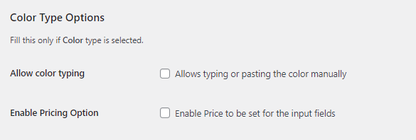
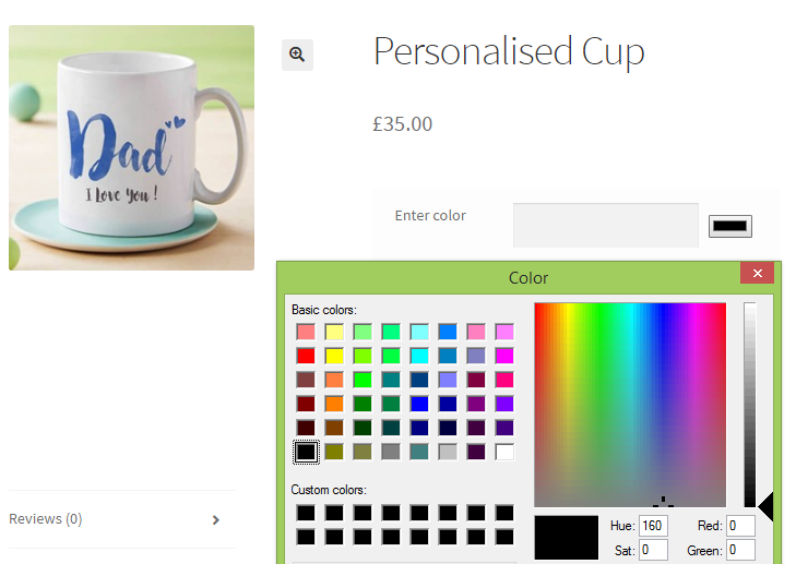
↑ Back to topThis setting will work only if Color input type is selected. By default, Allow color typing setting is disabled. When you tick the Allows typing or pasting the color manually checkbox, Color type option is enabled. If you wish to add a price to this field, then please scroll down to the bottom to find the ‘Input Field Pricing Option’ section.

This will allow you to either type the color code in the field on the front end or simply click on the color tab to select color from the colorpicker.
5. Input Field Pricing Option
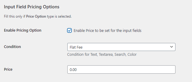
With v2.0.0 of our Product Input Fields for WooCommerce plugin, you can now set different prices for each input field.
Here’s how to go about it:
1. Enable Pricing Option
↑ Back to topIf you click the checkbox, it will enable the pricing option for your Input fields.

Please note that once you enable this option and add your prices, they will also be added to the product page. They won’t replace the product price (i.e the Base Price)
2. Condition
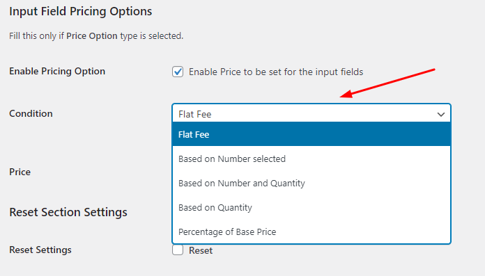
↑ Back to topWith this option, you can set the condition of the price that will appear in the input field.
Please note that the conditions for different input fields will be different.
Here’s a look at them:
A. For Checkbox, Select, Radio, and Multi Checkbox Input Field Type
↑ Back to top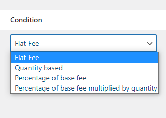
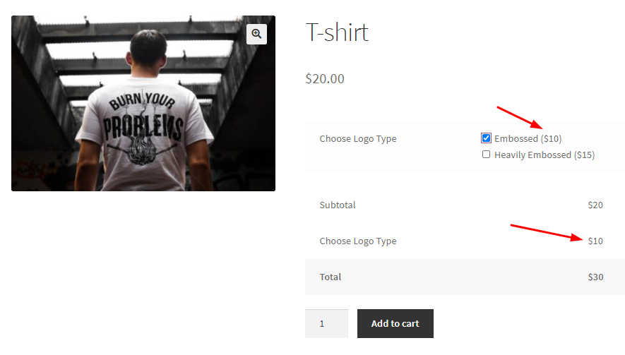
- Flat Fee: This will be the same as the one mentioned previously. For example, if you have set the flat fee for different multicheck options for ‘Embossed’ as $10 and ‘Heavily Embossed’ as $15 in the ‘Price’ field respectively, then depending on the option selected the customer will be charged the flat fee. See below to understand more:
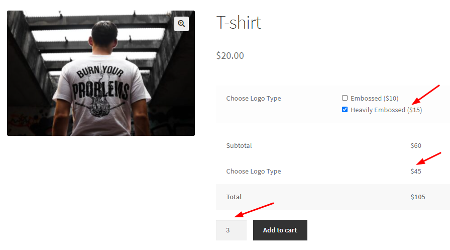
- Quantity based: When this condition is selected, your customer will be charged a price for the input field based on the quantity selected by them. For example, if the quantity selected by the customer is 3, while the input field is selected as ‘Heavily Embossed’ which is charged at $15, then the total price will be $105, along with adding the Base Price too. Have a look here:
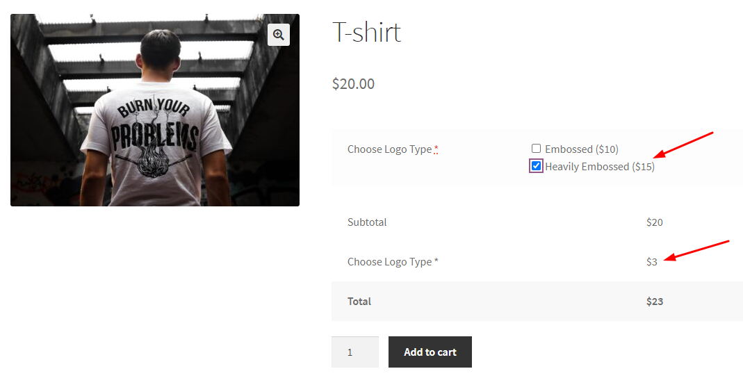
- Percentage of Base fee: This condition lets you choose a relative percentage of the price that’s been set by you in the “Regular Price” or “Sale Price” field of the product. The total amount will be calculated upon the percentage that’s been set by you after choosing this condition. For example, if you have set your percentage as 15% for a T-shirt, then the cost of the input field will be calculated based on this percentage with the base price (i.e $20). So, 15% of $20 will be $3 and that would be the charge for the input field as shown below:
- Percentage of base fee multiplied by quantity: This condition allows you to charge the total amount based on the number of quantities brought by the customer multiplied by the percentage you have set on the base price. For example, you have set 10% under this condition and the quantities of items brought by the customer are 2, then they will be charged as:
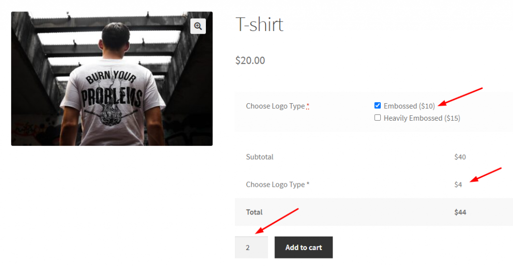
B. For Text, Textarea, Search, and Color Input Field Type
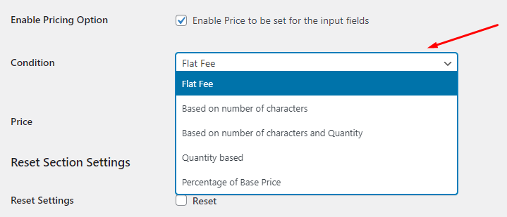
You can choose from the following conditions:
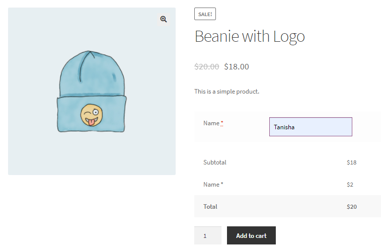
- Flat Fee: If you choose this option then the price set for ‘Flat fee’ will be added to the item irrespective of the quantity. For example, let’s say that the price of a ‘Beanie with Logo’ in your store is $18 and you have set the condition ‘Flat fee’ which charges $2 additionally. Then, on the Checkout Page, the price that will be charged to the customer for a beanie would be $20.
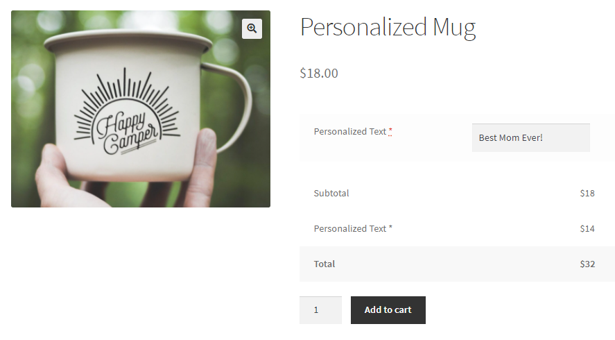
- Based on number of characters: With this option, you will be able to charge the additional price based on the number of characters entered in the Input field. For example, if you have set this condition and the price as $1 for the item ‘Personalized Mug’ then the customer will be charged $1 per character they enter in the Input field. If the customer has entered ‘Best Mom Ever!’ then that text will have 14 characters. So they will be charged as shown below:
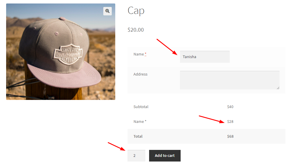
- Based on number of characters and Quantity: This option will allow you to charge an additional price based on the number of characters entered by a customer in the Input field as well as the quantity of the items added in their cart. For example, for an item called ‘Cap’ (charged at $20 for a piece), if a customer chooses 2 (quantities) of it, and under the input field they have added the name ‘Tanisha’ which is made up of 7 characters, then the price for your input field would come up to $28. That’s because the price for each character is $4. Here’s a look at it:
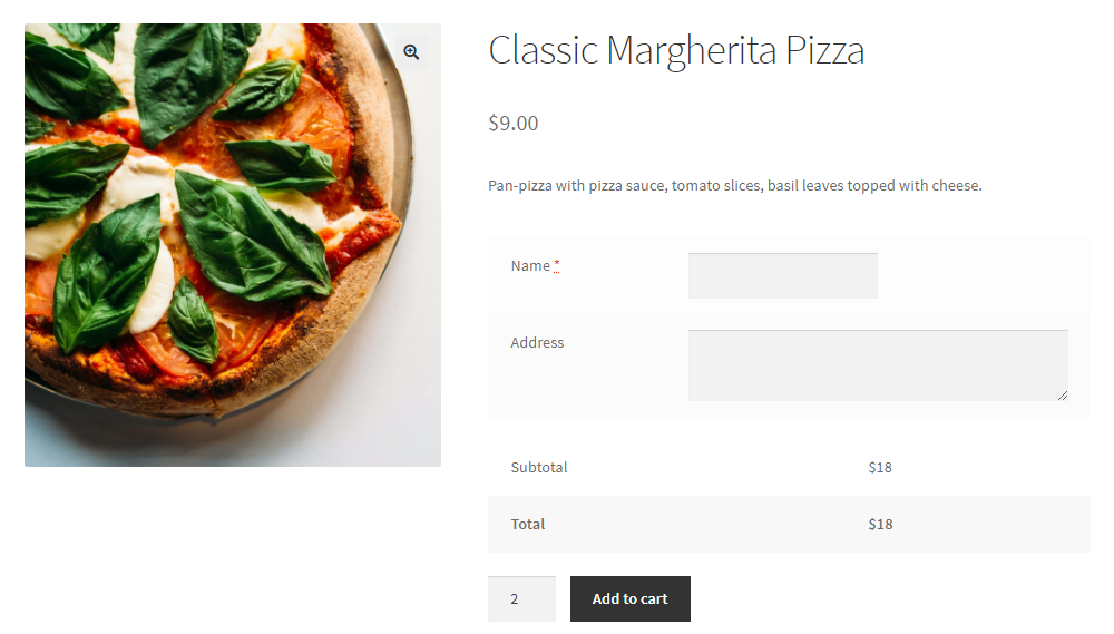
- Quantity based: With this condition, you will be able to charge the price on the basis of quantity of an item. For example, let’s say that you sell a ‘Classic Margherita Pizza’ for $9. And you have also set the ‘Quantity based’ condition. If the customer chooses 2 pizzas, then they will be charged $18 for it.
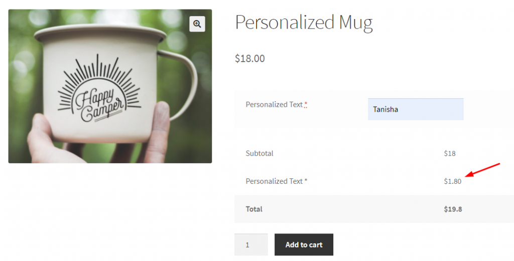
- Percentage of Base Price: This condition will decide the total amount based on the percentage of the base price. For example, if your item’s base price is $18 and you’ve set the percentage as 10%, then the price for the input field will be charged as 10% of 18 which will be $1.80. The total price would then be $19.8. See the example below:
C. For Number, and Range Input Field Type
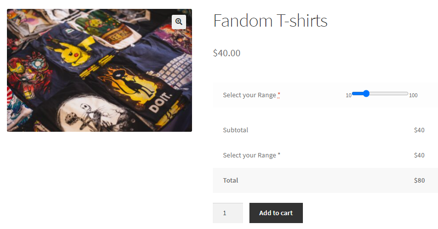
- Flat Fee: This will be the same as the one mentioned previously. For example, if the customer has selected the range as 30, while your Flat fee price is set to $40 then this is how it will appear on the frontend:
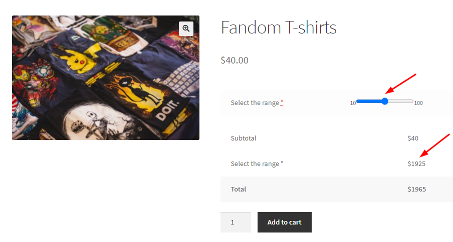
- Based on Number selected: Let’s say that a customer chooses a certain number in the range from 10-100 of your ‘Fandom T-shirts’. This customer will be charged additionally on the basis of this number selected, when you choose this condition in your settings. For example, you have set this condition and the price that you will charge based on it is $35. So when your customer chooses 55 T-shirts, they will be charged $1925 additionally. Here’s a look at it:
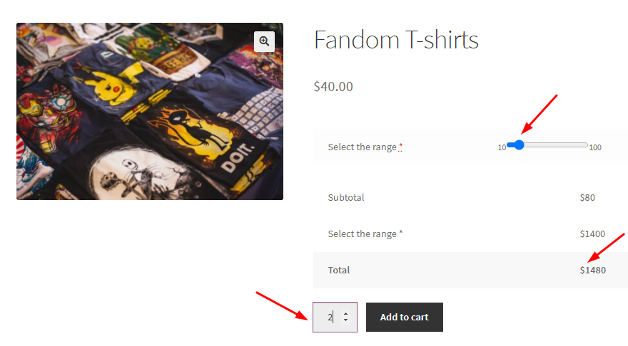
- Based on Number and Quantity: If this condition is selected, you will be able to charge your customer on the basis of the number of items as well as the quantity of the items selected. For example, your customer requires 2 (quantity) sets of 20 (number) fandom T-shirts from your store. And for this condition, you have set the price as $35. So including the base price and these additional charges of $35, your customer will be charged a total of $1480 as shown below:
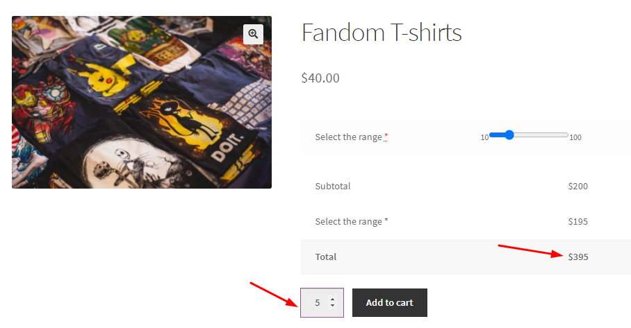
- Based on Quantity: When you have selected this condition, your customers will be charged the price on the basis of the quantity of an item. For example, if you have set the price as $39, and the customer chooses 5 quantities of your item, then their total price would be $395 as shown below:
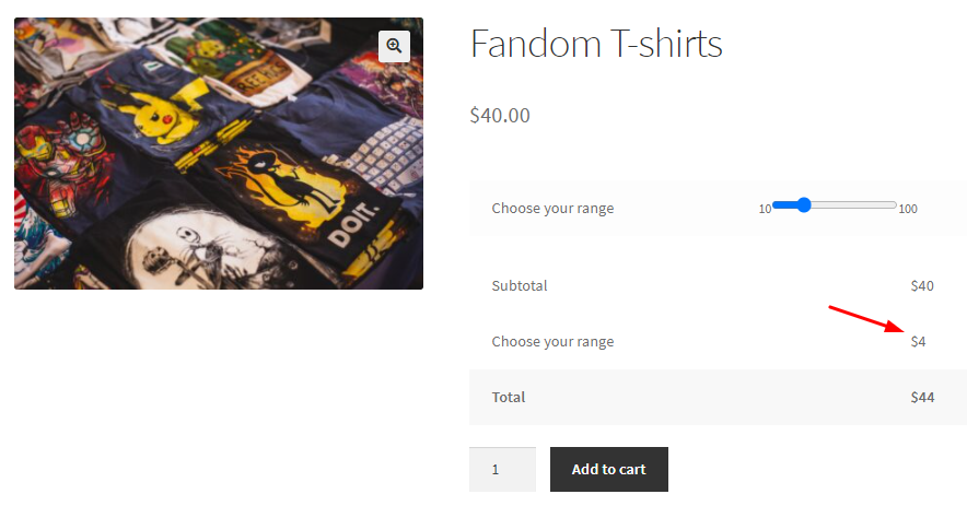
- Percentage of Base Price: With this condition, the percentage that is set by you will be calculated upon the base fee. For example, if you have the percentage as 10% and your base price is $40, then the amount for the input field will be calculated as 10% of $40 which will be $4 as shown below:
When the Input field is selected as File, Datepicker, Weekpicker, Timepicker, Password, Country, Email, Phone, URL it will not have any condition dropdown options.
3. Price or Percentage
The Price or Percentage option will be given to you according to the Condition you select.

If you see the ‘Price’ option then you can set the price of the product based on the condition that you have selected for it.
If you see the ‘Percentage’ option, you can set the percentage for conditions such as ‘Percentage of Base Price’ and ‘Percentage of base fee multiplied by quantity’.
For instance, let us take the example of a Checkbox Type Input Field. For one checkbox, we added the condition ‘Percentage of base price’ while for the other we have added the condition ‘Flat Fee’.
Just beside it, you will see the Price or Percentage fields. We have entered our values as shown here:
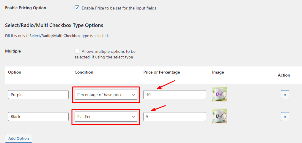
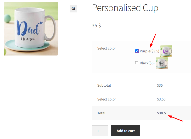
This would mean that if the customer chooses to go with the Purple cup, they will be charged 10% of the base price, which is $3.5 as shown below:
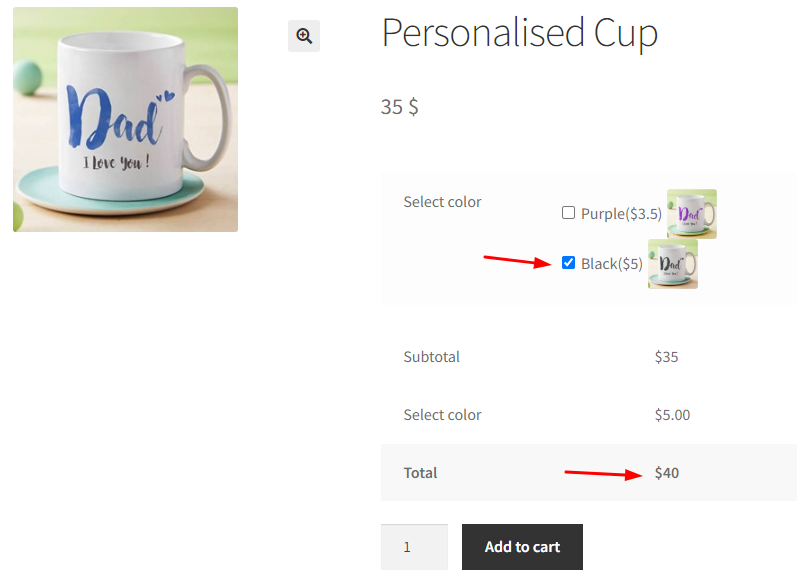
If the customer chooses to go with the Black Cup then they will be charged a flat fee of $5 as shown below:
6. Reset Section Settings
This setting allows you to reset the Product Input Field #1 settings to its default values. To do so, tick the Reset checkbox of Reset Settings.
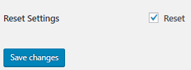
This will disable the Enable/Disable option, Type will be selected as Text, Title will be set as Input Field and values will be set in Datepicker, Timepicker as mentioned above. Main impact of reset settings will be made on the front end as Product Input Field #1 will be disabled. This means the product input field selected will not appear on the front end and hence the customer will not be able to add related details for it.
