NOTE
This product is no longer available on WooCommerce.com. This document has been left available for existing users, but will no longer be updated.
Bonum is a modern yet timeless WooCommerce theme built entirely around the Gutenberg Full Site Editing features. The theme allows you to create a minimalistic online shop and present all your products elegantly.
Installation
↑ Back to topTheme can be installed two way – through the WordPress admin dashboard or by manually uploading files through FTP. Installing theme through the WordPress admin dashboard
- Log into the WordPress admin panel.
- Go to Appearance -> Themes.
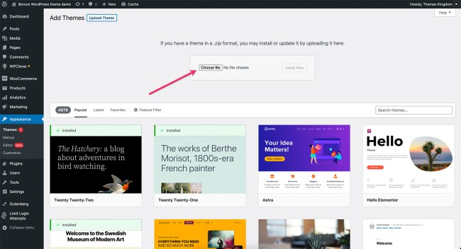
- Click on the Add New button, at the top of the screen.
- In the Add Themes screen, click on Upload Theme.
- Click on Choose theme, and then browse for theme file on your computer.
- Click on Install Now to start the installation.
- After the installation is done, click on Activate theme.
Installing the theme by manually uploading files
- Download the latest theme veresion from WooCommerce.com.
- Extract the zip folder on your computer.
- Connect to your server using FTP client.
- Upload extracted theme folder into ..wp-content/themes/ directory.
- Log into the WordPress admin panel.
- Go to Appearance -> Themes.
- Click on Activate theme.
More information on Adding New Themes.
Theme setup and configuration
↑ Back to topBefore proceeding with demo import, make sure that WooCommerce plugin is installed and active. If WooCommerce plugin is missing or is not active, demo import will not be completed.
WooCommerce plugin can be installed through the WordPress admin dashboard or by manually uploading files through FTP.
Installing WooCommerce through the WordPress admin dashboard
- Log into the WordPress admin panel.
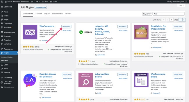
- Go to Plugins -> Add New.
- Search for “WooCommerce”.
- In the search results, click on Install Now.
- When the installation is done, click on Activate button.
Importing demo content
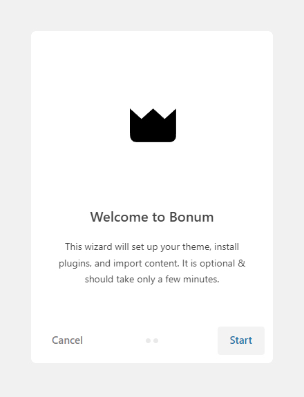
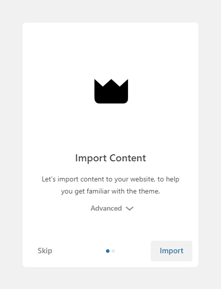
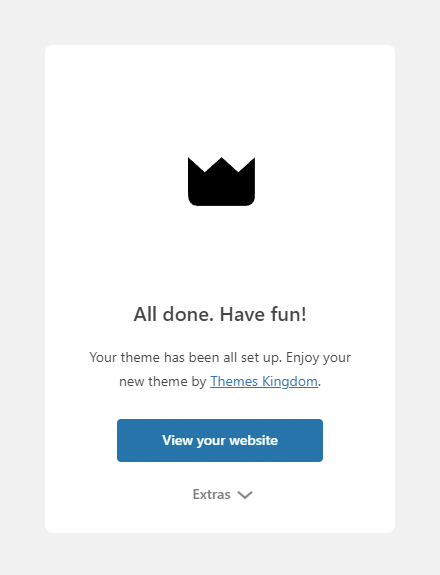
↑ Back to topAfter activating the theme, demo importer will start. Automatic importer will import all posts, pages, products, and set the site to look like demo. Demo import will take a few minutes. Follow the steps from the importer.
Theme Customization
↑ Back to topUsing theme editor
Theme can be customized using Editor feature. Editor allows you to control layout and elements of the page templates. Go to Appearance -> Editor. More details how to work with the editor are available on this link.
Setting up menus
Theme menus can be created under Appearance -> Menus. Created menus can be used when working with templates using Editor.
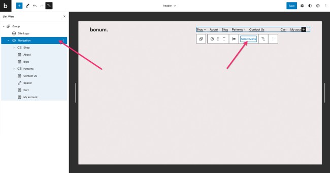
Selecting navigation menu
Navigation menu can be changed in the Editor – you can easily replace the default menu with your own.
- In Site Editor, click on the down arrow, near the template name, on the top of the screen. Click on Browse all templates button.
- In templates screen, click on Template parts on the left hand side. Click on header.
- Menu placeholder is set. Click on it, and from the floating menu click on Select Menu.
- Save changes.
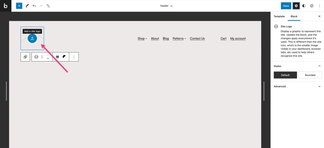
Setting up site logo
- In Site Editor, click on the down arrow, near the template name, on the top of the screen. Click on Browse all templates button.
- In templates screen, click on Template parts on the left hand side. Click on header.
- Logo placeholder is already there. Click on the blue upload icon.
- Upload or browse for the desired logo. Logo should be png or jpeg file.
- Save changes when you are done.
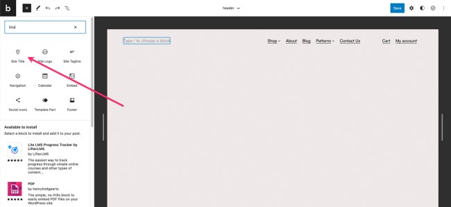
Setting up site title
Site title can be set in the Appearance -> Customize, and under Site Identity panel you can set site title and favicon.
- In Site Editor, click on the down arrow, near the template name, on the top of the screen. Click on Browse all templates button.
- In templates screen, click on Template parts on the left hand side. Click on header.
- Logo placeholder is already there. Click on it, and from the floating menu select Remove site logo.
- Click on the header container, and then on the plus icon to add the new element. Search for “Site title” element.
- Site element will be placed on the far right of the header. Move it to the desired position.
Changing colors and fonts
Text and Colors setting are global setting, and are applied to the whole site and all elements.
- In Site Editor, click on Colors option in the right hand side panel.
- Set the desired colors for background, text and links. Color set will be applied to the whole site, and all pages.
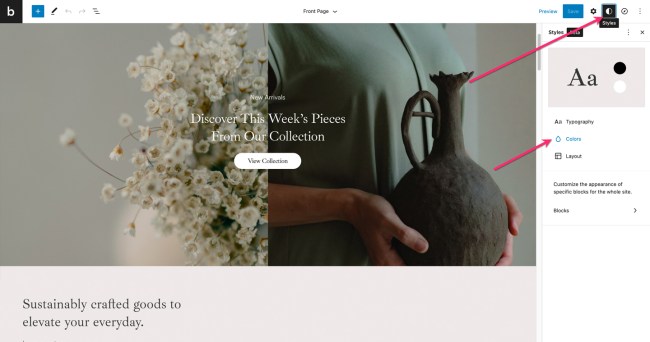
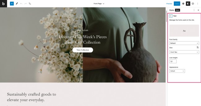
- In Site Editor, click on Typography option in the right hand side panel.
- Here you can set the desired font families, size, line height and weight for text and links.
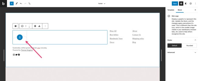
Setting footer logo
Footer is fully customizable – you can set desired number of columns, various elements(e.g menus, text, logo)… Please note that before setting up menus in the footer, you will need to create those menus in Appearance -> Menus.
- In Site Editor, click on the down arrow, near the template name, on the top of the screen. Click on Browse all templates button.
- In templates screen, click on Template parts on the left hand side. Click on footer.
- Logo placeholder is already there. Click on the blue upload icon.
- Upload or browse for the desired logo. Logo should be png or jpeg file.
- Save changes when you are done.
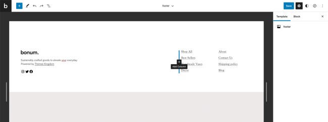
Adding column to the footer
By default, footer uses three columns. You can add more columns if needed.
- In Site Editor, click on the down arrow, near the template name, on the top of the screen. Click on Browse all templates button.
- In templates screen, click on Template parts on the left hand side. Click on footer.
- Place mouse cursor between two columns until Add column icons shows up. Click on the button.
- Now, when the new column is created, you can insert the desired blocks in it.
Theme defined patterns
↑ Back to topPatterns are predefined blocks, that can be added in the content. Paterns are group of several blocks, so their content – text and images can be edited. Besides of standard patterns, Bonum theme is coming with theme-specific patterns.
To add pattern, click on the block Add button, and then click on Browse All button in the floating block picker. In the left hand side panel, click on Patterns tab, and then from the dropdown pick desired pattern group.
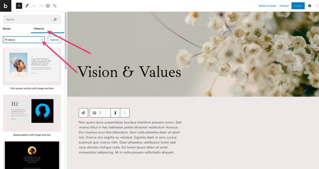
Predefined patterns are grouped by their purpose:
- Text patterns
- About patterns
- Contact patterns
- Testimonials patters
- Gallery patterns
- Header patterns
- Call to action patterns
Theme built-in CSS classes
↑ Back to topBonum theme is coming with several built-in CSS classes. CSS classes can be used to create spacings, hide/show elements etc. CSS classes are used on the desired elements.
- Go to Pages -> All Pages and find the desird page.
- On the page, click on the desired element.
- Expand Advanced panel on the right hand side.
- Paste the name of the class there. You can add multiple classes, separated by space.
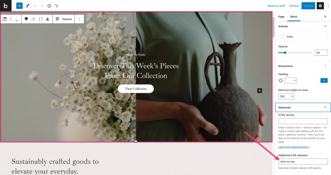
Theme classes that can be used:
- stick-to-top element will stick to the top of the screen, regardless of the page scroll.
- l-desktop-only element will appear only on computers.
- l-touch-only element will appear only on devices with the tocuh screen.
- l-above-mobile-only element will be shown only on devices with larger screen resolution.
- l-mobile-only element will appear only on the mobile devices.
- l-center-margin-auto element will get automatic left and right margin, and will be centered on the screen.
- l-no-margin-top removes the top margin from the element.
- l-no-margin-bottom removes the bottom margin from the element.
- background-color–transparent element will get transparent background.
- padding–horizontal-default adds default padding for the element. This class will prevent element from sticking to the left and right side of the screen. Padding values are 50px for computers, and 30px for mobile devices.
- no-padding–top removes the top padding from the element.
- no-padding–bottom removes the bottom padding from the element.
- no-padding–horizontal-on-touch removes left and right padding for all devices with touch screen.
- no-padding–horizontal-on-mobile removes left and right padding for all mobile devices.
- h-animate–from-top element with this class will float in from the top, when it comes into the viewport.
- h-animate–from-left element with this class will float in from the left, when it comes into the viewport.
- h-animate–from-right element with this class will float in from the right, when it comes into the viewport.
- h-animate–from-bottom element with this class will float in from the bottom, when it comes into the viewport.