This guide covers general guidelines, and best practices to follow in order to ensure your product experience aligns with WooCommerce for ease of use, seamless integration, and strong UX adoption.
We strongly recommend you review the current WooCommerce setup experience to get familiar with the user experience, and taxonomy.
We also recommend you review the WordPress core guidelines to ensure your product isn’t breaking any rules (excluding rules 1, 3, 12, and 18), and review this helpful resource on content style.
Onboarding
↑ Torna in cimaThe first experience your users have with your extension is crucial. A user activating your extension for the first time provides an opportunity to onboard new, and reorient returning users the right way. Design a post activation notification that’s informative, and useful.
Note: This is not a time to promote your brand, or product, it’s a time to inform the user on what to do next.
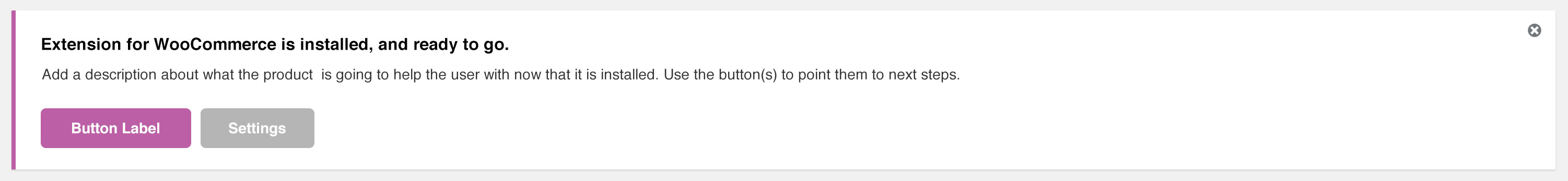
Provide a notification. Once a user activates your extension they are taken back to the installed plugins screen. Add a notification to help the user orient themselves on next steps. There are a two types of notification styles, text, and link text only, or text with buttons. Use whichever helps with pointing your customer to the right next steps.
Get to the point, and keep it instructional. This is not a time to promote your brand, or pitch the product. The user has bought your product, and is ready to use it. Keep the information instructional and precise. Help users with context on next steps. Try to keep the copy between 125 to 200 characters.
Avoid heavy branding, and self promotion. Keep the notification free of promotional images, links to your website, and anything obtrusive. At this point, the goal is to let your products experience do the work.
Keep notice in plugin area. Keep the post activation notice with the WordPress plugin area—do not display it on the dashboard, or any other parts of the platform.
Provide option to dismiss notice. Users should have a clear way to close the notice.
Notice Examples
↑ Torna in cimaText only

Text with buttons
Logo, text, and buttons
Navigation
↑ Torna in cimaMenu Structure. Try to place your product navigation elements within the existing WooCommerce taxonomy. If your extension is extending a component within WooCommerce, it should live within either the components navigation draw, or directly within the components section.
Examples:
- If your plugin integrates with a third party service (e.g., to receive tax rates or connect to a Help Desk), it should live under WooCommerce>Settings>Integration.
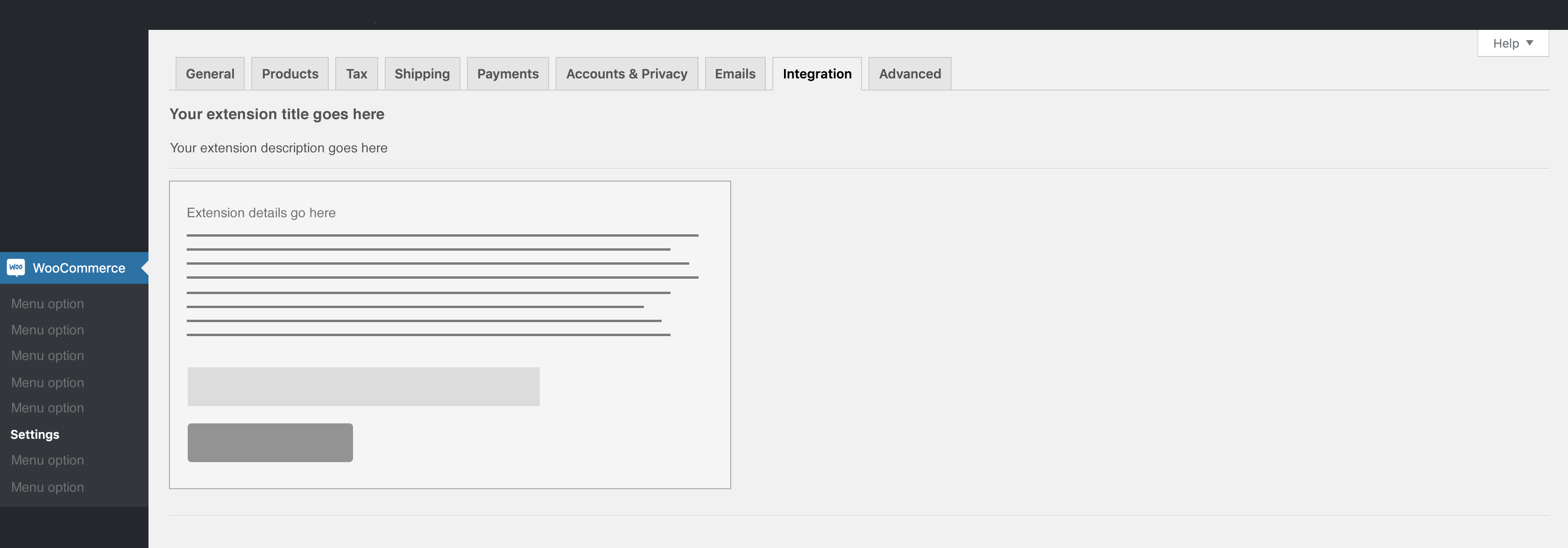
- If your plugin adds a settings screen to set up the plugin, settings should be under an appropriate tab on the WooCommerce > Settings screen.

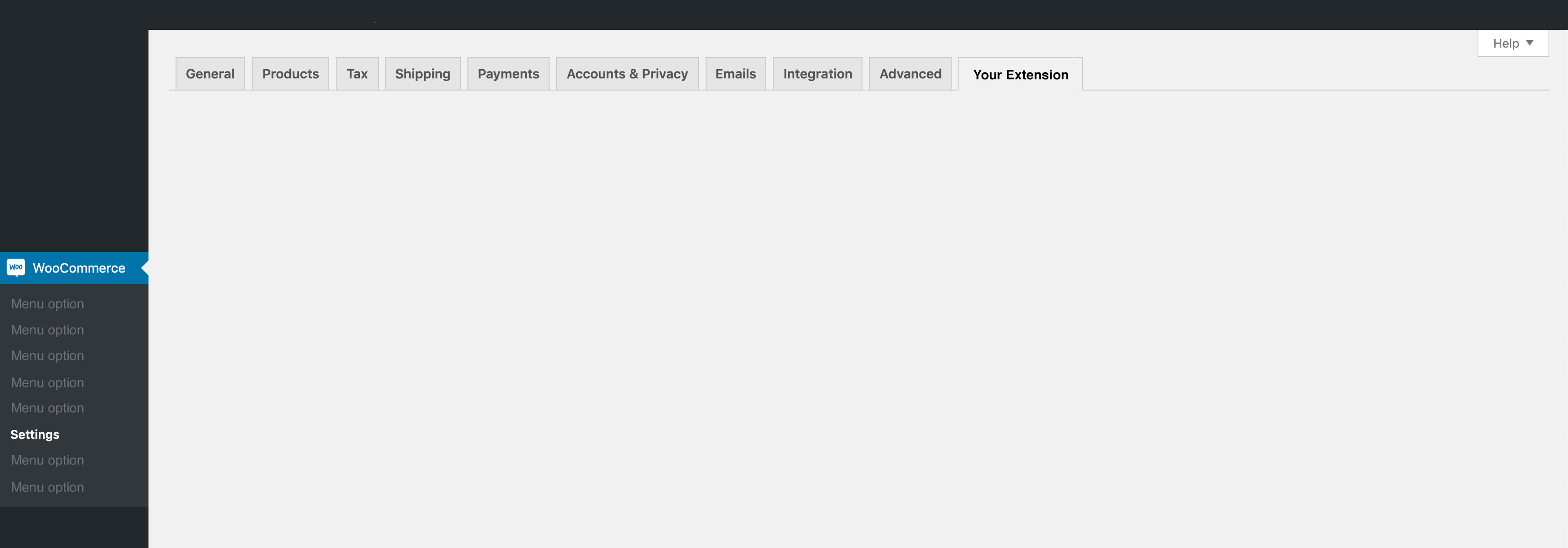
- If your plugin has settings that don’t fit under existing tabs, and creating a sub-tab isn’t appropriate, create a top-level settings tab.
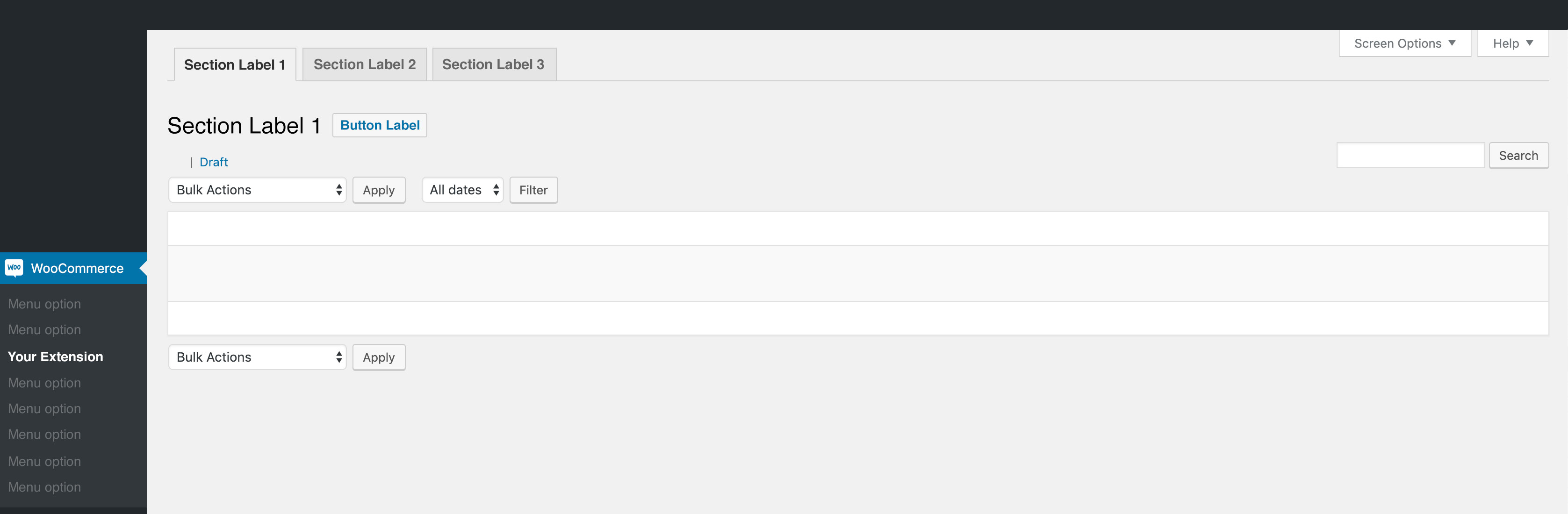
- If your plugin adds administration screens that don’t involve settings (e.g., Checkout Add-Ons has a screen for managing checkout add-on fields), use a sub-menu under the WooCommerce admin menu item.
No iframes, only APIs. To create a cohesive experience, application data should be loaded via API instead of an iFrame.
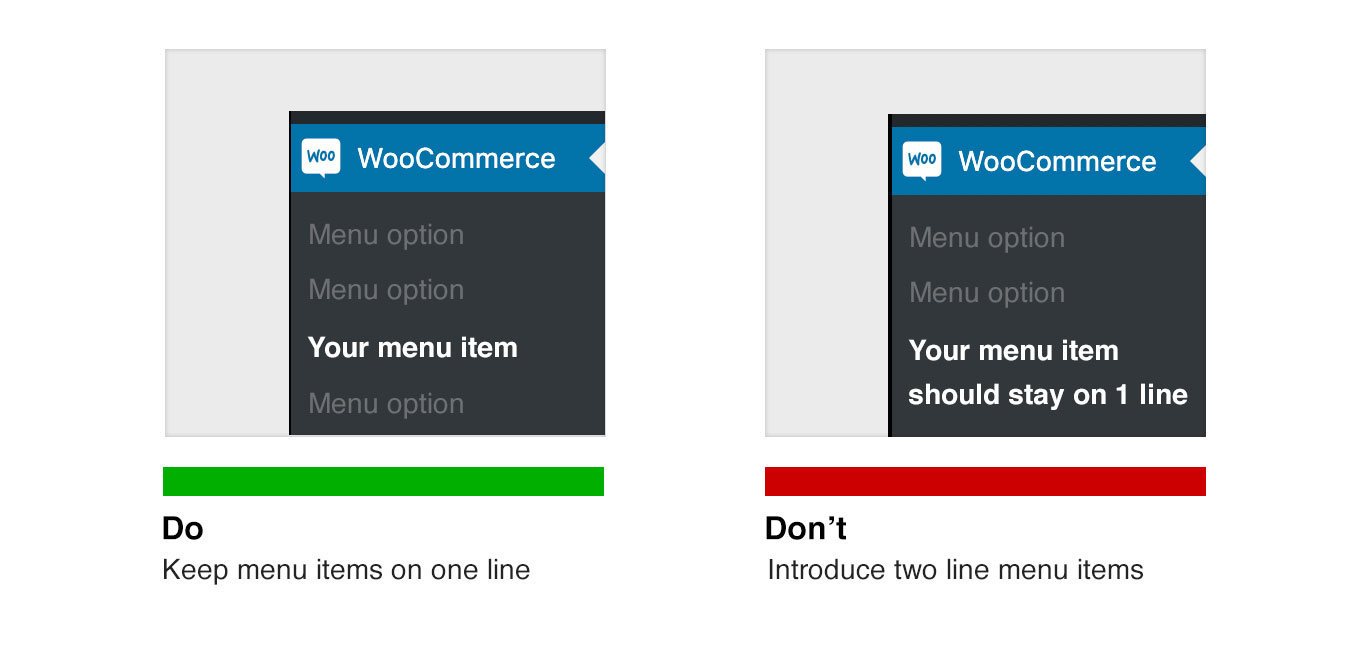
One line navigation label. Keep all navigation labels on one line. Do not introduce a second line in any of the preexisting menu items.
Keep menu structure simple. Use existing WooCommerce menu structures as much as possible to reduce redundancies. Only create new menu options if there are no alternatives. When creating new menu options, try to keep it to a minimum. Consolidate were ever possible to reduce creating new learning curves for the user.
Avoid dead ends. Don’t bury pages. There should always to a way to get back if needed.
No top level navigation. If your product is extending WooCommerce, then there’s a 99.9% chance your product navigation, and settings should live within the WooCommerce nav structure—see above menu structure examples.
Branding
↑ Torna in cimaNo logos, or images in interface. The interface should solely focus on the experience. Do not add logos—this excludes the post activation notice above—or large visual banners to any page.
Focus on the experience. After the customer installs your product, the experience should be the primary focus. Keep things simple. Do not convoluted the experience, or distract the user with branding.
No self promotion. Do not advertise your website, brand, or products within the interface.
Keep copy short and simple. Limit instructions within the interface to 120-140 characters. Anything longer should be placed in the product documentation on woocommerce.com
User Interface
↑ Torna in cimaAvoid creating new UI. Try not to introduce a completely new user interface into the WordPress/WooCommerce ecosystem. Before considering a new UI, review the WordPress interface to see if a component can be repurposed.
Be considerate of mobile. Stores operate 24/7. Merchants shouldn’t be limited to checking their store on a desktop. Make sure your product experience is accessible through mobile, and tablets.
It’s all about the merchant. Don’t distract with none related content. Keep the product experience front and center to help the user achieve the tasks they purchased your product for.
Extensions should not hijack the admin dashboard.
Feedback
↑ Torna in cimaProviding timely feedback like success and error messages is essential for ensuring that the user understands whether changes have been made.
Language
↑ Torna in cimaUse short but meaningful messages that communicate what is happening. Ensure that the message provides instructions on what the user needs to do to continue. Proper punctuation should be used if the message contains multiple sentences. Avoid abbreviations.
Design
↑ Torna in cimaThe placement of feedback is vital so the user notices it. For example, when validation messages are needed to prompt the user to enter data, get the user’s attention by displaying a message at the top of screen and close to the inputs where data needs to be revised.
You can use iconography and color to create highlight and give a particular tone to feedback. Keep in mind that the color and iconography can be perceived differently by people from different cultures, so it’s key that the copy on feedback is sufficient to understand what is being communicated.
Types of feedback
↑ Torna in cimaSuccess message: When the user performs an action that is executed successfully.
Error Message: When the user performs an action that could not be completed. (This can include validation messages.) When requiring the user to input data, make sure you verify whether each field meets the requirements, such as format, ranges, and if the field is required. Provide validation messages that are adjacent to each field so that the user can act on each in context. Avoid technical jargon.
Warning Message: When the user performs an action that may have completed successfully, but the user should review it and proceed with caution.
Informational Message: When it’s necessary to provide information before the user executes any action on the screen. Examples can be limitations within a time period or when a global setting limits actions on the current screen.
Accessibility
↑ Torna in cimaYour extensions must meet the Web Content Accessibility Guidelines (WCAG). Meeting 100% conformance with WCAG 2.0 is hard work; meet the AA level of conformance at a minimum.
For more information on accessibility, check out the WordPress accessibility quick start guide.
Tone
↑ Torna in cimaMaintain a consistent tone when communicating with a user. Maintain the same communication style and terminology across an extension, and avoid abbreviations and acronyms.
In extensions:
- Use sentences for descriptions, feedback, and headlines. Avoid all-caps text.
- Use standard punctuation and avoid excessive exclamation marks.
- Use American English.
For more, read our Grammar, Punctuation, and Capitalization guide.
Colors
↑ Torna in cimaWhen creating extensions for the WordPress wp-admin, use the core colors and ensure your designs pass AA level guidelines.
- Accessibility handbook on uses of color and contrast
- Color contrast ratio checker
- More resources regarding accessibility and color testing
For WooCommerce-specific color use, review our Style Guide.
Testing
↑ Torna in cimaUsers must be able to perform all actions of the functionality provided. This can be achieved by running user tests.
To run an effective user test, list as many scenarios your extension supports. An example of a scenario: “I am a store owner who wants to create a customizable product that includes letting customers add custom text and select from 5 different color options for the custom text.” Give this scenario to testers, and watch them attempt/perform the task with your extension.
Different ways to do quick user testing:
- Ask friends and family to participate in test sessions.
- Use online services that allow you to expose your extension to new users. We recommend UserTesting.com.
- Ask enthusiasts in the WooCommerce Community Slack for feedback.