Documentation of Configurable Products Builder for WooCommerce.
Installation
↑ Back to top- Download the .zip file from your WooCommerce account.
- Go to: WordPress Admin > Plugins > Add New and Upload Plugin the file you have downloaded.
- Install Now and Activate.
More information at Install and Activate Plugins/Extensions.
Initial Setup & Configurations:
↑ Back to top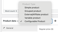
After activating the Configurable Products Builder extension, you can see a new product type under WooCommerce > Products > Product Edit Sheet > Product Data and select Configurable Product.
Creating New Configurable Product:
↑ Back to topYou can add new or edit any existing product to convert it into configurable product. Once you select product type – “Configurable Product”, you will following new tabs in product data section,
- Configurable Products
- Conditional Logic
- Components
Configurable Product Settings
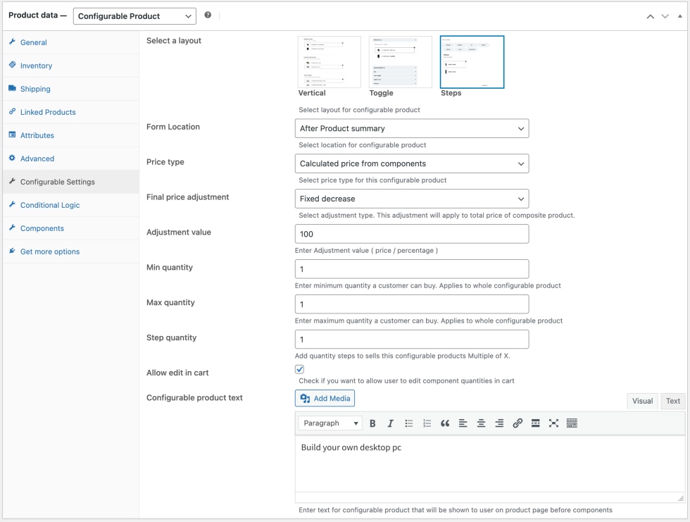
↑ Back to topIn Configurable Product tab you can access the basic/general settings for the configurable product. Here you can customize following option,
- Configuration Layout – select one of three layouts for your configurable product these layouts are: vertical, Steps and Toggle. Each layout offers 2 different locations and will adjust design accordingly.
- Configuration Form Location – Choose the location where your components will show up. You can show components after description or after summary.
- Price Type – Choose a price type for your configurable product, you can either choose to charge for the whole product or price calculated from each component added. Your standard product price will be considered as fixed price of the composite product.
- Price Adjustment Modes – You adjust the final price of the product to offer any discount or increase the price.
- Ignore adjustments (No adjustment will apply on final product price)
- Fixed Increase
- Fixed Decrease
- Percentage Increase
- Percentage Decrease
- Minimum Quantity – Set minimum quantity that can be added to cart for your configurable product. This applies to entire composite product not components.
- Maximum Quantity – Set maximum quantity that can be added to cart for your configurable product. This applies to entire composite product not components.
- Step Quantity – Add quantity steps to sell this configurable product in Multiple of X.
- Allow Edit in Cart – Allow customers to edit configurable products from the cart
Configurable product text(Description) – Add a short description that will be displayed above the configurable product. This will appear at the top of configurable product block.
Adding Components to Configurable Products:
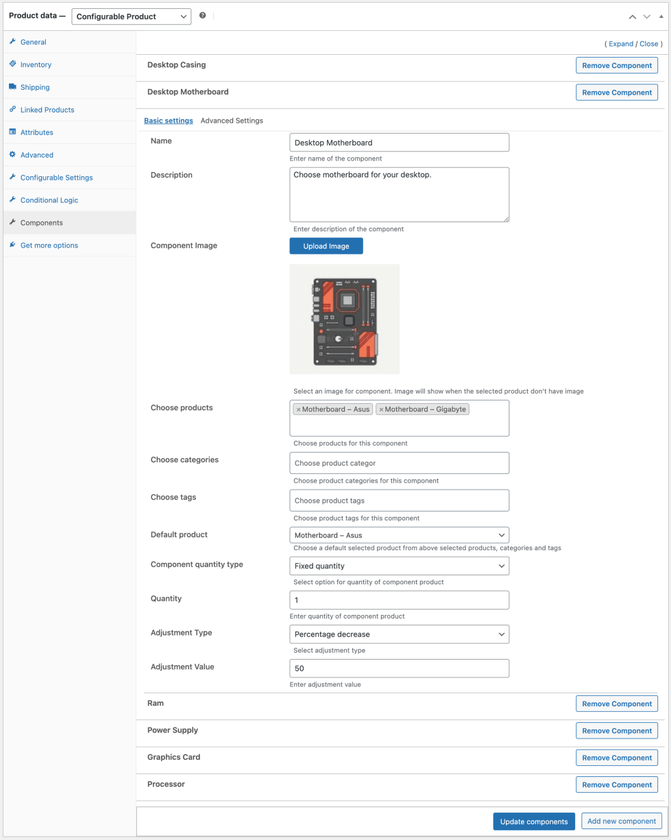
↑ Back to topYou can add unlimited new components to your configurable products, new components can be added after the initial release of the product. When adding a new component you have to configure the following settings:
- Basic Settings
- Advanced Settings
Basic Settings
↑ Back to topIn basic settings you can customize the following:
- Component’s name – Choose a name for this component that will appear on frontend.
- Component’s Description – Write a short description about this component. It will guide customer to make accurate selection
- Component’s Image – Choose a product image for this component. This will be a placeholder image if the select product does not have any image.
- Choose products – Choose the products that will be shown in this component, you can choose from existing products in your store
- Choose Categories – Choose a category and your customer will be able to select any product from that category in this component.
- Product Tags – In addition to adding products by categories, you can also allow customers to add products form a certain tag.
- Default Product – Choose a product from selected products that will be selected by default if the customer doesn’t select any other component variation.
- Component Quantity Type – Choose a quantity type by which customers will be able to add components to cart these types are:
- Fixed quantity – Fix a quantity and user will not be able to buy more or less than that.
- Quantity range – Set a range of minimum and maximum quantity and customers will not be able to buy outside the predetermined range.
- Adjustment Type – Choose from price adjustment modes and an adjustment value in the adjustment field to increase/decrease prices of products selected in this component. You can adjust price by,
- Same Price (Keeps the product current price)
- Fixed Increase
- Fixed Decrease
- Percentage Increase
- Percentage Decrease
Advanced Settings
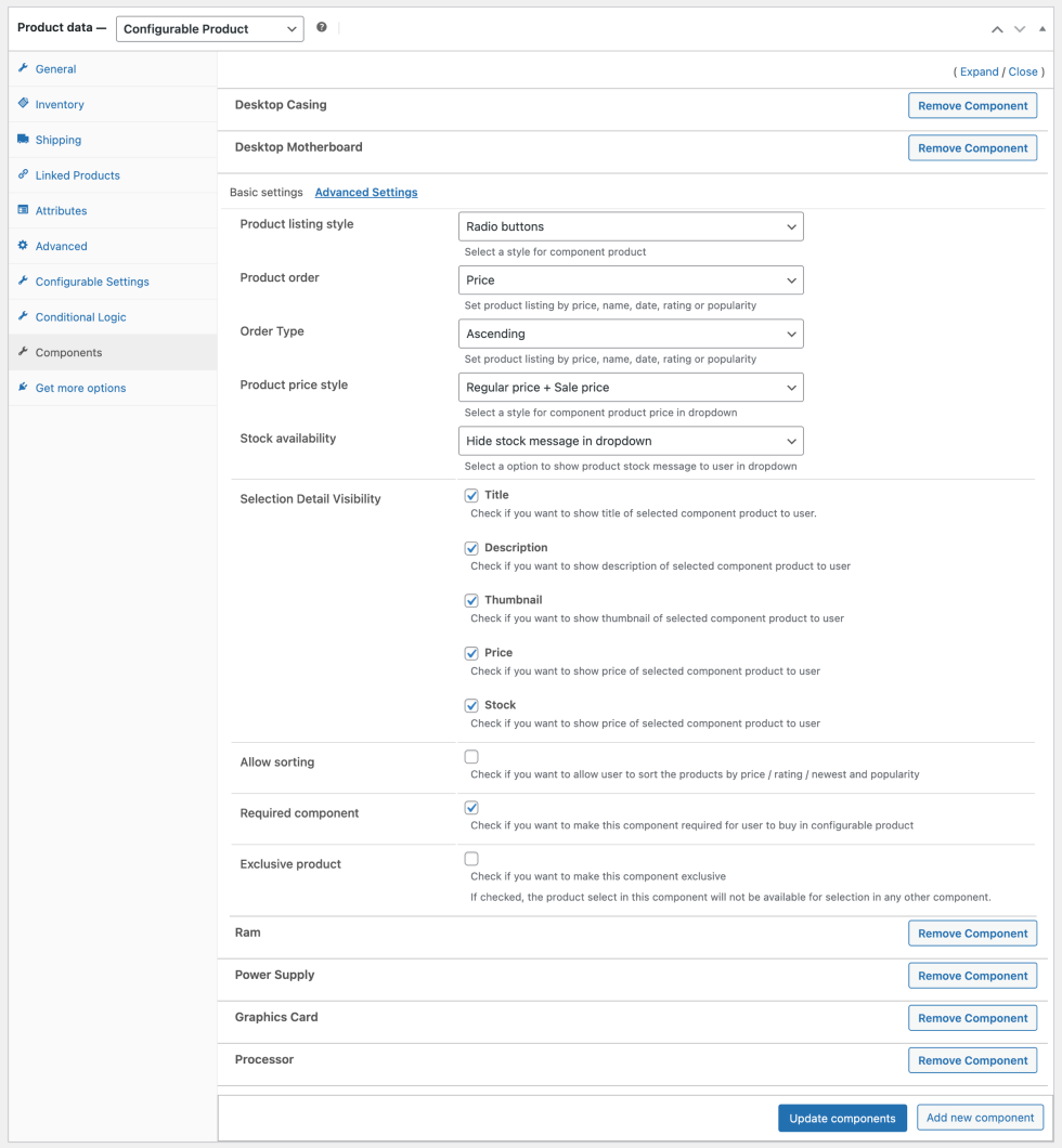
↑ Back to topIn advanced settings you can basically customize the appearance of products in a component. Advanced settings consist of the following customization options:
- Product Listing Style – This is the layout in which products will be displayed under a component; there are five listing styles to choose from:
- Dropdown with product image
- Simple Dropdown
- Radio Buttons
- Thumbnail
- Product Order – Sort the order of products by:
- Popularity
- Price
- Name
- Date
- Rating
- Order Type – Select whether you want to sort products in ascending or descending order.
- Product Price Style – Select price visibility options such as:
- Hide price
- Show active price
- Show active price + Regular price
- Stock Availability – Show or hide stock status for a product in a component
- Selection Detail Visibility – Hide or show the following parts of a component:
- Title
- Description
- Thumbnail
- Price
- Stock
- Enable / Disable Sorting – This will show default sorting filters to let customers quickly find the relevant product if huge list of products is attached to component.
- Required Component – Make component selection mandatory for all customers.
- Exclusive Product – Make the product exclusive, and it will not be eligible for selection in any other component.
Conditional Logic
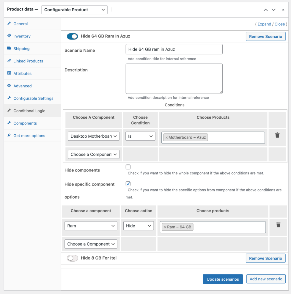
↑ Back to topConditional logic can be applied to make components dependable. You can create multiple conditional logics to hide or show components or its specific products based on the selection made in other component. Click on the “Add New Scenario” button to create a new conditional logic. While creating a conditional logic you can customize following options.
- Add scenario name and description for admin reference
- Choose the component based on which the next component or option visibility will be defined. Once the component is selected you can select the matching condition.
IS – Select this if you can to match a single or multiple products that needs to be selected in order to make the first condition true.
Not – Select Not, if you want first conditions to not have specific product. Forexample, if we have X, Y, Z products attached to component, selecting X here would mean that the condition will be true if a customer would select Y or Z.
Any – If Any of the 3 X, Y or Z is selected in the component then the condition will be true. - You can select multiple components specify the conditions. Once these conditions are met, the extension will move to second condition where you can choose to Hide an entire component or its specific products
- Hide Components – This is simple, as soon as the above condition is met, the extension will hide the selected component entirely.
- Hide Component Option – Using this checkbox, you can select components and its specific products that you want to hide. You can either Hide or Show Product. Forexample, if have A.B,C products in a component and you select Hide and then select “A”. The extension will hide product “A” from component once first condition is met. If you select Show instead of hide then extension will by default keep “A” product hidden and only show when first condition is met. In the following screenshot you can see we have select to hide “64GB” ram option when a customer selects Azuz motherboard since it does not support that size of ram.
