Theme installation
↑ Back to topRequired Plugins
↑ Back to top- WooCommerce: (required) WooCommerce is the world’s most popular open-source eCommerce solution. You must have this plugin installed. Check how to setup it here.
- MaxSlider: MaxSlider is probably the easiest way to add a custom responsive slider to any page of your website.
- GutenBee: A free set of awesome Gutenberg blocks and advanced capabilities.
- One Click Demo Import: (recommended) Help you import dummy content and replicate the live demo. The plugin can be deactivated and deleted after the demo content is imported.
- Jetpack: (recommended) Security, performance, and site management: the best way to WordPress is with Jetpack. You will use this plugin to add Contact Form, Widget visibility and several other enchantments that might appear in the theme demo
How to import the sample content
↑ Back to topHere’s how to do it:
↑ Back to top- In your WordPress dashboard visit Plugins > Add New.
- Search for One Click Demo Import and Install the plugin.
- Activate it.
 Please note: Due to the nature of the import mechanism some links may link back to our demo website. If you are not sure how to update / change these links simply get in touch and we’ll help you out.
First you will need to download the Sample Content archive file for Miniature by clicking here. Extract the file like described here for MacOS and here of Windows PC. We are going to import these files using the One Click Import free plugin.
Please note: Due to the nature of the import mechanism some links may link back to our demo website. If you are not sure how to update / change these links simply get in touch and we’ll help you out.
First you will need to download the Sample Content archive file for Miniature by clicking here. Extract the file like described here for MacOS and here of Windows PC. We are going to import these files using the One Click Import free plugin.
Don’t forget to activate all required plugins first. This will ensure the sample content can be properly installed.
After activating the plugin navigate to Appearance > Import Demo Data. In this section add:

- Add your content.xml from your sample content archive.
- Add your widgets.wie from your sample content archive.
- Add the customizer.dat from your sample content archive.
- Import the content
Image sizes
↑ Back to topSetting up your website
↑ Back to topHeader Section
↑ Back to top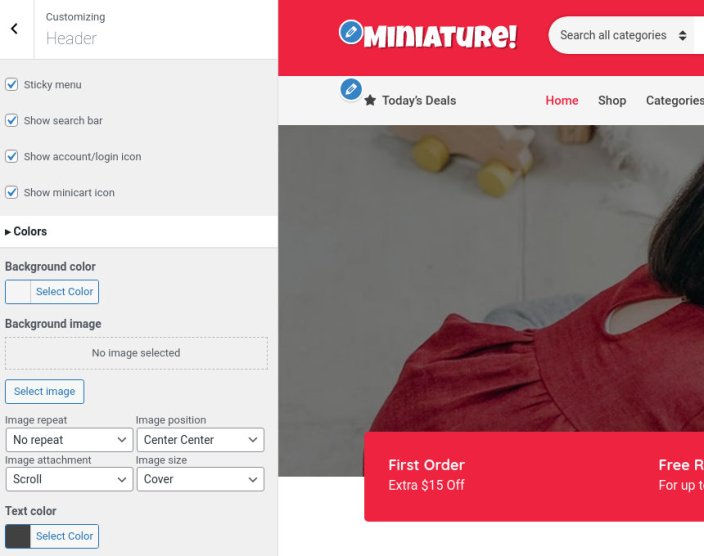 Under Customize > Header you will find customization options for the theme’s header section. Here you can toggle the sticky menu, the search bar and the account & minicart icons. You can also customize the header’s background color, image and text color.
Logo
The section of the header which contains the logo can be configured under Customize > Site Identity.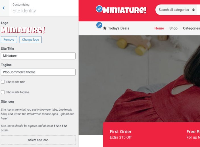 Here you can set your site’s logo, title and tagline. The site title and tagline can be hidden globally by unticking the corresponding boxes. Finally a site icon can be set here.
Top bar
The top bar works complementary to the header and allows you to add some general info which will be useful to your customers. There are three content areas which can host plain text, HTML, or shortcodes. On the theme’s demo the left content area informs customers about a free shipping offer and the right one provides them with a telephone number in case they need to contact the store. The top bar can be disabled altogether if not needed.Fonts and Colors
↑ Back to topMain Menu
↑ Back to topCreate a menu button
You can create a special button-like menu item by setting a certain class for to it. The class name is nav-button and you can set it under Appearance > Menus for the item you want. First enable this section from Screen Options.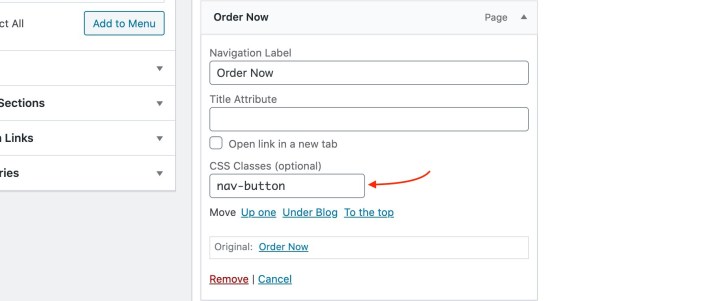
Footer
↑ Back to topFront page
↑ Back to top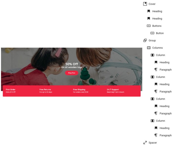 The page starts with a Cover block which has its alignment set to full. Inside it we find two Heading blocks and a Button block, all three have their alignment set to center.
Next up we have a Group block with the Pull up style applied to it and a background color set. Inside we have a Columns block with 4 equal columns. Each column contains a Heading and a Paragraph. Right after the group block we have a 50px tall spacer.
The page starts with a Cover block which has its alignment set to full. Inside it we find two Heading blocks and a Button block, all three have their alignment set to center.
Next up we have a Group block with the Pull up style applied to it and a background color set. Inside we have a Columns block with 4 equal columns. Each column contains a Heading and a Paragraph. Right after the group block we have a 50px tall spacer.
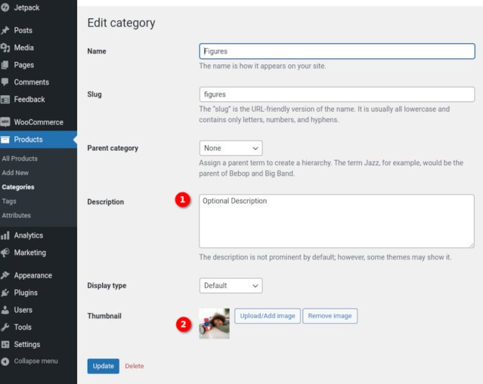
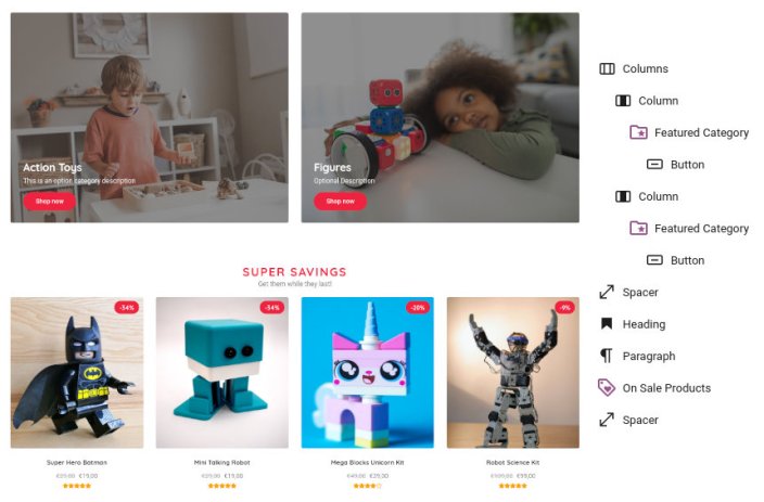 Next up we have a Columns block with two equal columns. Each one contains a Featured Category block. For the block to work properly you will need to set up the Product Category’s thumbnail and description under Products > Categories.
 Following the columns block we have another 50px Spacer. Next is a Heading, a Paragraph and an On Sale Products block which displays 8 products in a 4 column layout. Closing out the section is another 50px Spacer.
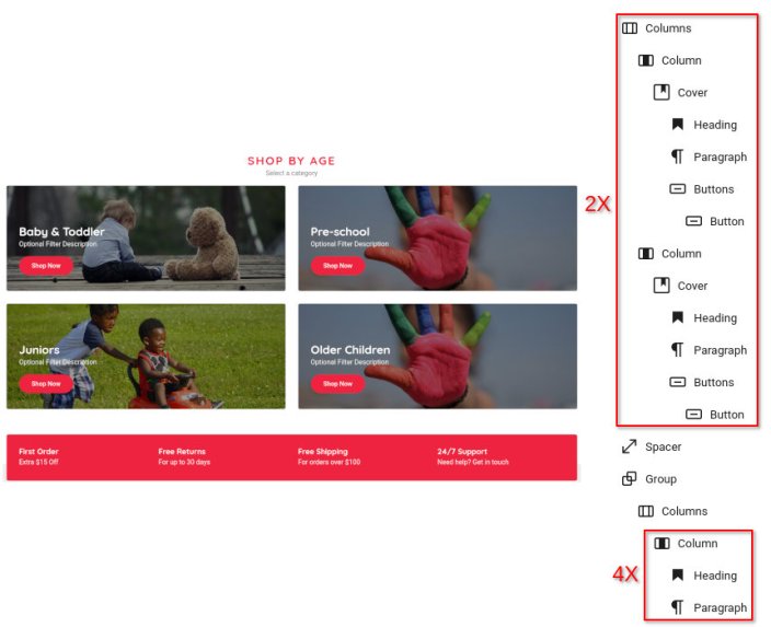 Next up we have two Columns blocks with two equal columns each. Each column contains a Cover block with the content alignment set to bottom left, a background image set, a minimum height of 250px and the opacity set to 40%. Inside each cover block we have a Heading, a Paragraph and a Button. After the second Columns block instance we have a 50px tall Spacer.
Closing up the homepage we have a group block, just like the one at the top of the page, the difference between them is that this one has the Push Down style applied. The layout of its content is the same as before.
Next up we have two Columns blocks with two equal columns each. Each column contains a Cover block with the content alignment set to bottom left, a background image set, a minimum height of 250px and the opacity set to 40%. Inside each cover block we have a Heading, a Paragraph and a Button. After the second Columns block instance we have a 50px tall Spacer.
Closing up the homepage we have a group block, just like the one at the top of the page, the difference between them is that this one has the Push Down style applied. The layout of its content is the same as before.
Shop page
↑ Back to topShop page customization
↑ Back to top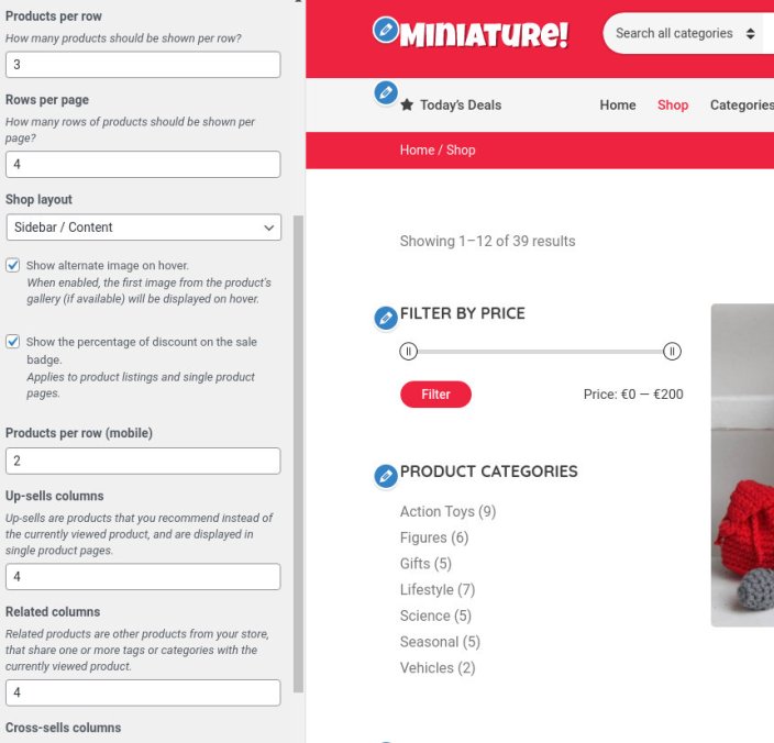 You can modify the layout of the shop page by picking your preference among the four available ones: Content/Sidebar, Sidebar/Content, Full width boxed, Full width narrow. An alternative image can be displayed when a product is hovered and the sale badge can display the percentage of discount instead of just the “Sale” text. You can choose to display one or two columns for the mobile product listing and finally you can customize the number of up-sells, related and cross-sells displayed.
About
↑ Back to top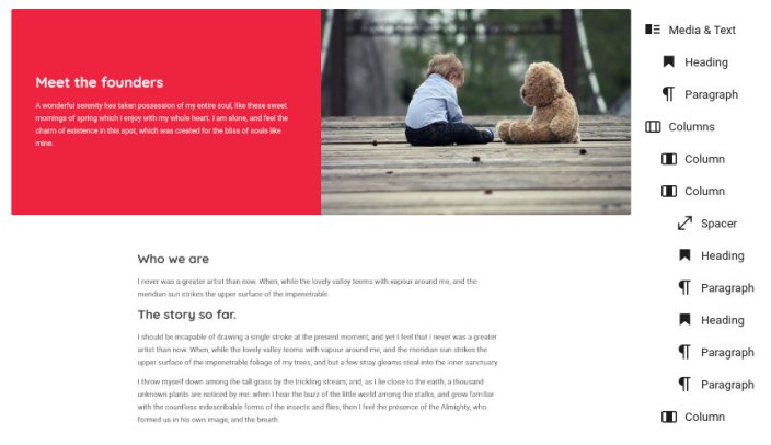 The page’s content consists of a Media & Text block which shows the media on the right, it has a text and background color set. In the text area we have a Heading and a Paragraph block.
Next we have a Columns block with three columns, the first and third are empty and have their width set to 20%. The middle one contains a 50px Spacer and a few Headings and Paragraphs which make up the content.
The page’s content consists of a Media & Text block which shows the media on the right, it has a text and background color set. In the text area we have a Heading and a Paragraph block.
Next we have a Columns block with three columns, the first and third are empty and have their width set to 20%. The middle one contains a 50px Spacer and a few Headings and Paragraphs which make up the content.
News
↑ Back to topSupport
↑ Back to top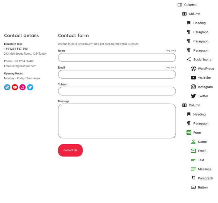 The content starts out with a Columns block with the width of the left column set to 30%. In the left column we have a Heading, a couple of Paragraphs and a Social Icons block. In the right column we have a Heading, a Paragraph and a Form block (provided by Jetpack) which serves as the site’s contact form.
Single product
↑ Back to topWidget areas
↑ Back to topChild Theme
↑ Back to topUpdating Miniature
↑ Back to top In the next screen click on the Upload Theme (1) button and select your new theme archive (zip) file (2). Next click on the Install Now (3) button.
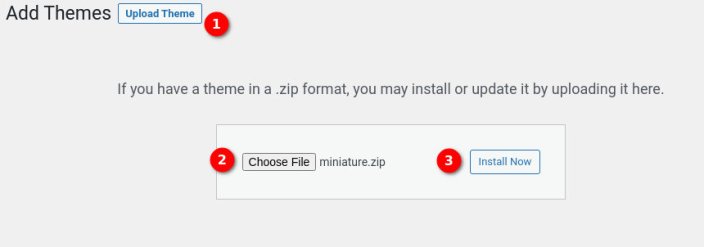 Wait until the theme is uploaded and when prompted select to replace the current version of the theme with the uploaded one.
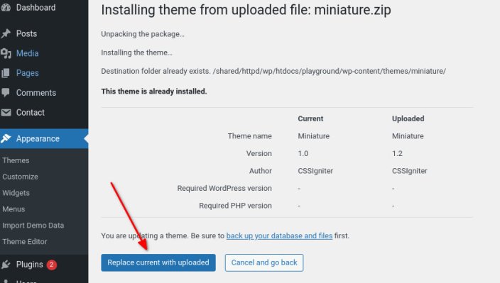
That’s it! This will update Miniature to the latest version.