Product Table Builder for WooCommerce can create, customize, and manage product tables effortlessly with an intuitive drag-and-drop interface. Enjoy features like advanced query builder, table sorting, pagination, customizable table elements, and seamless “Add to Cart” functionality.
Setup and Installation
↑ Back to top- Download the .zip file from your WooCommerce account.
- Go to: WordPress Admin > Plugins > Add New and Upload Plugin with the file you downloaded with Choose File.
- Install Now and Activate the plugin.
More information at: Install and Activate Plugins/Extensions.
Getting Started
↑ Back to topCreate a New Product Table
↑ Back to top- After installation, you will see the “Product Tables” menu on the left sidebar of your WordPress dashboard.
- Navigate to the “Product Tables” page.
- Click the “Add New” button to create a new product table.
- You will be taken to the product table editor interface.
Understanding the Interface
↑ Back to top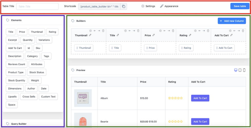
The product table editor interface consists of three main sections:
- Top Bar:
- Table Title: Enter a name for your table.
- Shortcode: Displays the shortcode for your table.
- Settings: Access table settings.
- Appearance: Customize the appearance of your table.
- Save Table Button: Save your table.
- Left Sidebar:
- Elements: Contains various elements you can add to your table.
- Query Builder: Use to filter the data displayed in your table.
- Main Screen:
- Builders: The area where you build and customize your table.
- Preview: A real-time preview of your table.
Building Your Table
↑ Back to top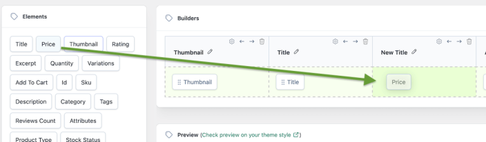
Adding Columns
- In the Builders section, click “Add New Column” to create a new column.
- Drag and drop elements from the Elements panel to the Builder column.
- You can add multiple elements to the same column.
Customizing Columns
- Delete Column: Click the bin icon in the top right corner of each column to delete it.
- Move Column: Use the left or right arrow icons beside the bin icon to move the column left or right.
- Customize Column: Click the gear icon beside the left arrow icon to customize the column. For more details, refer to the Column Settings section.
Customizing Each Element
- Click on each element within your builder to customize it.
- For more details, refer to the Element Settings section.
Using the Query Builder
- Set up the query builder to filter the data displayed in your table.
- For more details, refer to the Query Builder Settings section.
Customizing Settings & Appearance
- Access the Settings and Appearance sections from the top bar to customize your table’s settings and appearance.
- For more details, refer to the Individual Table Settings and Appearance Settings sections.
Previewing Your Table
↑ Back to top- The Preview section shows the table data instantly.
- Note that the preview may not match your theme’s table style 100% due to different CSS.
- Use the “Check Preview on Your Theme Style” option to see how the table will appear on your site.
Adding the Shortcode
↑ Back to top- Copy the generated shortcode from the top bar.
- Paste the shortcode into any page, post, or widget area that supports shortcodes.
Example:
[product_table_builder id="82" title="On sale table"]
Individual Table Settings
↑ Back to top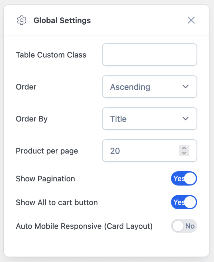
Table Custom Class
↑ Back to topInput Field: Use this field to add a custom CSS class to your table. This allows you to apply specific styles to your table by targeting the custom class in your stylesheet.
Example: my-custom-table
Order
↑ Back to topOptions: Set the default order for the table data. You can choose between ascending (ASC) and descending (DESC) order.
Values:
ASC– Ascending orderDESC– Descending order
Order By
↑ Back to topOptions: Specify the column by which the table data should be ordered. This should match the column name or identifier used in your table data.
Example: Popularity, Price, Rating, Reviews Count, Title, Slug (URL), Date, Date Modified, Rand, ID, Author, Type, Parent, Relevance, None
Default: ID
Product per page
↑ Back to topCheckbox: Define the number of products to display per page. This setting works in conjunction with the pagination feature to control how many rows of data appear on each page.
Default: 10
Show Pagination
↑ Back to topCheckbox: Enable or disable pagination for your table. When enabled, the table will display a set number of rows per page and provide navigation to move between pages.
Default: Checked (enabled)
Show All to Cart Button
↑ Back to topCheckbox: Enable or disable the “All to Cart” button. When enabled, this button allows users to add all items in the table to their cart with a single click.
Default: Checked (enabled)
Auto Mobile Responsive
↑ Back to topCheckbox: Enable or disable automatic mobile responsiveness for your table. When enabled, the table will adjust its layout to be user-friendly on mobile devices.
Default: Unchecked (disable)
Appearance Settings
↑ Back to topCommon Style
↑ Back to topInner Cell Padding
Options: Select the unit for padding values (px, %, em) and set the padding for each side of the cell (top, right, bottom, left).
Example:
- Unit:
px - Top:
10, Right:10, Bottom:10, Left:10
Border Type
Options: Select the type of border for the table.
Values: None, Solid, Dashed, Dotted, Double
Upon Selection:
- Border Width: Set the width of the border in the selected unit.Example:
2px - Border Color: Choose a color for the border.Example:
#000000
Header Style
↑ Back to topBackground Color
Options: Set the background color for the table header.
Example: #f8f8f8
Text Color
Options: Set the text color for the table header.
Example: #333333
Text Align
Options: Set the alignment of text within the header cells.
Values: Left, Center, Right, Justify
Custom Typography
- Select Font: Choose a font for the header text. Example:
Arial, sans-serif - Font Size: Set the font size for the header text. Example:
16px - Font Weight: Set the weight of the font. Values: Normal, Bold, Thin, Extra Light, Light, Medium, Semi Bold, Extra Bold, Black
- Text Transform: Set the text transformation. Values:
Normal,Uppercase,Lowercase,Capitalize - Font Style: Set the font style. Values:
Normal,Italic,Oblique - Decoration: Set the text decoration. Values:
None,Underline,Overline,Line-through - Line Height: Set the line height for the header text. Example:
1.5 - Letter Spacing: Set the letter spacing for the header text. Example:
0.05em
Body Style
↑ Back to topText Align
Options: Set the alignment of text within the body cells.
Values: Left, Center, Right, Justify
Vertical Align
Options: Set the vertical alignment of text within the body cells.
Values: Top, Middle, Bottom
Text Color
Options: Set the text color for the body cells.
Example: #555555
Background Color
Options: Set the background color for the body cells.
Example: #ffffff
Stripped Background
Enable or disable striped backgrounds for rows and set the colors.
- Stripped Background Color: Set the background color for striped rows. Example:
#f9f9f9 - Stripped Text Color: Set the text color for striped rows. Example:
#666666
Custom Typography
- Select Font: Choose a font for the body text. Example:
Arial, sans-serif - Font Size: Set the font size for the body text. Example:
14px - Font Weight: Set the weight of the font. Values:
Normal,Bold,Bolder,Lighter, Specific numeric values (e.g.,400,700) - Text Transform: Set the text transformation. Values:
None,Uppercase,Lowercase,Capitalize - Font Style: Set the font style. Values:
Normal,Italic,Oblique - Decoration: Set the text decoration. Values:
None,Underline,Overline,Line-through - Line Height: Set the line height for the body text. Example:
1.5 - Letter Spacing: Set the letter spacing for the body text. Example:
0.05em
Body Link Style
↑ Back to topLink Color
Options: Set the color for links in the body cells.
Example: #007bff
Link Hover Color
Options: Set the color for links when hovered over.
Example: #0056b3
Stripped Link Color
Options: Set the color for links in stripped rows.
Example: #0062cc
Stripped Link Hover Color
Options: Set the color for links in stripped rows when hovered over.
Example: #004085
Rating Style
↑ Back to topActive Star Color
Options: Set the color for active (filled) stars in the rating system.
Example: #ffcc00
Background Star Color
Options: Set the color for inactive (empty) stars in the rating system.
Example: #e0e0e0
Add to Cart Button Style
↑ Back to topText Color
Options: Set the text color for the “Add to Cart” button.
Example: #ffffff
Background Color
Options: Set the background color for the “Add to Cart” button.
Example: #28a745
Active Text Color
Options: Set the text color for the “Add to Cart” button when active.
Example: #ffffff
Active Background Color
Options: Set the background color for the “Add to Cart” button when active.
Example: #218838
Font Size
Options: Set the font size for the “Add to Cart” button text.
Example: 16px
Padding
Options: Set the padding for the “Add to Cart” button.
Example: 10px 20px 10px 20px
Border Size
Options: Set the border size (px) for the “Add to Cart” button.
Example: 2
Border Color
Options: Set the border color for the “Add to Cart” button.
Example: #28a745
Active Border Color
Options: Set the border color for the “Add to Cart” button when active.
Example: #218838
Border Radius
Options: Set the border radius(px) for the “Add to Cart” button.
Example: 4
Pagination Style
↑ Back to topPagination Text Color
Options: Set the text color for pagination links.
Example: #000000
Pagination Background Color
Options: Set the background color for pagination links.
Example: #f1f1f1
Pagination Active Text Color
Options: Set the text color for the active pagination link.
Example: #ffffff
Pagination Active Background Color
Options: Set the background color for the active pagination link.
Example: #007bff
All to Cart Button Style
↑ Back to topButton Text Color
Options: Set the text color for the “All to Cart” button.
Example: #ffffff
Button Background Color
Options: Set the background color for the “All to Cart” button.
Example: #28a745
*** All Other settings for All to Cart will inherit from Add to cart button
Column Settings
↑ Back to top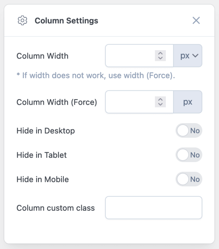
Column Width
↑ Back to topOptions: Set the width of the column using the selected unit (px or %). If the specified width does not work, you can use the force width option.
- Unit: Select between pixels (px) or percentage (%).
- Width Number: Specify the numeric value for the width.
Example:
- Unit:
px - Width Number:
150
Note: If the specified width does not apply correctly, use the “Column Width (Force)” option.
Column Width (Force)
↑ Back to topOptions: Force the width of the column by specifying a numeric value. This setting ensures that the column width is applied regardless of other constraints.
- Force Width Number: Specify the numeric value to force the column width.
Example: 200
Hide in Desktop
↑ Back to topOptions: Choose whether to hide this column when the table is viewed on desktop devices.
- Values:
YesorNo - Default:
No
Example: Yes
Hide in Tablet
↑ Back to topOptions: Choose whether to hide this column when the table is viewed on tablet devices.
- Values:
YesorNo - Default:
No
Example: Yes
Hide in Mobile
↑ Back to topOptions: Choose whether to hide this column when the table is viewed on mobile devices.
- Values:
YesorNo - Default:
No
Example: Yes
Column Custom Class
↑ Back to topInput Field: Use this field to add a custom CSS class to the column. This allows you to apply specific styles to the column by targeting the custom class in your stylesheet.
Example: my-custom-column
Query Settings
↑ Back to top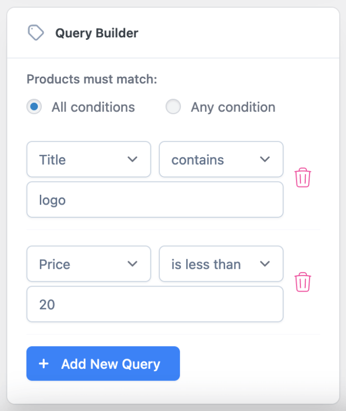
Products Must Match
↑ Back to topAll Conditions / Any Condition
Options: Choose whether products must match all conditions or any condition specified in the query.
- All Conditions: All of the query conditions need to match for a product to be displayed in the results.
- Any Condition: If any condition matches from the query, the product will be displayed in the results.
Example:
- Select:
All ConditionsorAny Condition
Title Query
↑ Back to topSelect: Choose whether the product title should contain or not contain specific text.
- Contains: Display products whose title contains the specified text.
- Does Not Contain: Display products whose title does not contain the specified text.
Example: Select: Contains
Title Text
Input Field: Enter the text to be included in or excluded from the product title.
Example: T-Shirt
Price Query
Select: Choose the condition to apply to the product price.
- Is Equal To: Display products with a price equal to the specified value.
- Is Not Equal To: Display products with a price not equal to the specified value.
- Is Greater Than: Display products with a price greater than the specified value.
- Is Less Than: Display products with a price less than the specified value.
Example: Select: Is Greater Than
Price Value
Input Field: Enter the numeric value for the price condition.
Example: 100
Category Query
↑ Back to topSelect: Choose whether the product category should be equal to or not equal to a specific category.
- Is Equal To: Display products that belong to the selected category.
- Is Not Equal To: Display products that do not belong to the selected category.
Example: Select: Is Equal To
Category List
Select: Choose the category from the list of available categories.
Example: Hoodies
Example Configuration
↑ Back to topHere is an example configuration using the query builder settings:
- Products Must Match: All Conditions
- Title Query:
- Contains:
T-Shirt
- Contains:
- Price Query:
- Is Greater Than:
100
- Is Greater Than:
- Category Query:
- Is Equal To:
Clothings
- Is Equal To:
Element Settings
↑ Back to topTitle Settings
↑ Back to top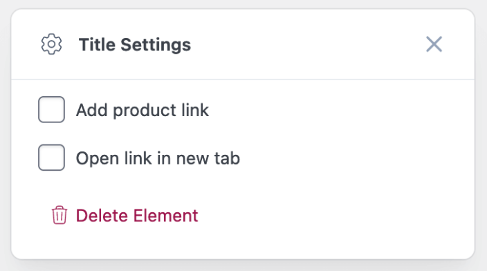
Add Product Link
Checkbox: Enable or disable linking the title to the product page.
Default: Unchecked
Open Link in New Tab
Checkbox: Enable or disable opening the product link in a new tab.
Default: Unchecked
Thumbnail Settings
↑ Back to top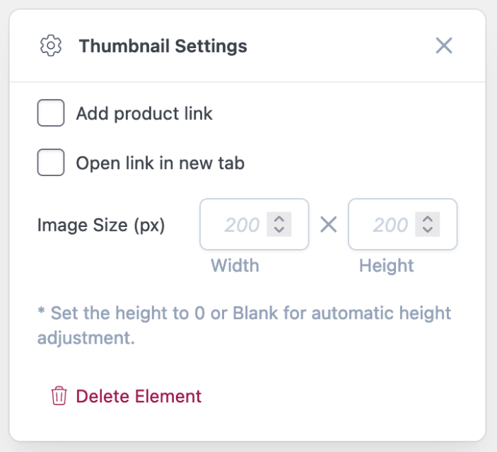
Add Product Link
Checkbox: Enable or disable linking the thumbnail to the product page.
Default: Unchecked
Open Link in New Tab
Checkbox: Enable or disable opening the product link in a new tab.
Default: Unchecked
Image Size
Input Fields: Set the width and height of the thumbnail image in pixels. Set the height to 0 or leave it blank for automatic height adjustment.
Example:
- Width:
100 - Height:
100
Price Settings
↑ Back to top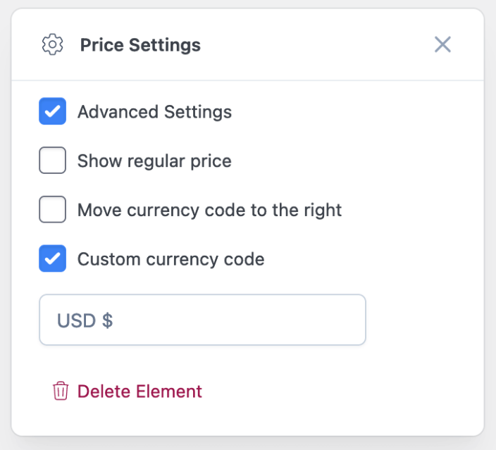
Advanced Settings
Checkbox: Enable or disable advanced price settings.
Default: Unchecked
If Advanced Settings is On:
- Show Regular Price: Show the regular price alongside the sale price.Default: Unchecked
- Move Currency Code to the Right: Move the currency code to the right side of the price.Default: Unchecked
- Custom Currency Code: Enable or disable a custom currency code.Default: Unchecked
- If Custom Currency Code is On:
- Custom Currency Code: Enter the custom currency code.Example:
USD
- Custom Currency Code: Enter the custom currency code.Example:
Add to Cart Settings
↑ Back to topAdd to Cart Label
Input Field: Set the label for the “Add to Cart” button.
Example: Add to Cart
Excerpt Settings
↑ Back to topWord Limit
Input Field: Set the word limit for the excerpt. Note that this will remove HTML markup.
Example: 20
Quantity Settings
↑ Back to topShow Quantity as Dropdown
Checkbox: Enable or disable showing the quantity selector as a dropdown.
Default: Unchecked
Variations Settings
↑ Back to topMove Variations Label in Select
Checkbox: Enable or disable moving the variations label inside the select dropdown.
Default: Unchecked
Attributes Settings
↑ Back to topHide Attributes Title
Checkbox: Enable or disable hiding the title of attributes.
Default: Unchecked
Stock Status Settings
↑ Back to topCustom “In Stock” Status
Input Field: Set a custom status text for “In Stock”.
Example: Available
Custom “Out of Stock” Status
Input Field: Set a custom status text for “Out of Stock”.
Example: Sold Out
Custom “On Backorder” Status
Input Field: Set a custom status text for “On Backorder”.
Example: Pre-Order
Stock Quantity Settings
↑ Back to topCustom Static Stock Quantity
Input Field: Set a static quantity value to be displayed for stock.
Example: 100
Weight Settings
↑ Back to topRemove Weight Unit
Checkbox: Enable or disable removing the unit from the weight display.
Default: Unchecked
Dimensions Settings
↑ Back to topRemove Dimensions Unit
Checkbox: Enable or disable removing the unit from the dimensions display.
Default: Unchecked
Author Settings
↑ Back to topShow Username Instead of Display Name
Checkbox: Enable or disable showing the username instead of the display name.
Default: Unchecked
Date Settings
↑ Back to topShow Modified Date
Checkbox: Enable or disable showing the modified date instead of the published date.
Default: Unchecked
Custom Text Settings
↑ Back to topCustom Text
Text Field: Enter custom text to be displayed.
Example: Limited Time Offer
Add Link to Custom Text
Checkbox: Enable or disable adding a link to the custom text.
Default: Unchecked
If On:
- Link URL: Enter the URL for the custom text link.
Example:http://example.com - Open Link in New Tab: Enable or disable opening the custom text link in a new tab.
Default: Unchecked
Space Settings
↑ Back to topSpace Type
Dropdown: Select the type of space to add. This option allows you to define whether the space should be horizontal or vertical.
Values:
Horizontal: Adds horizontal space between elements, effectively increasing the left and right margins or padding.Vertical: Adds vertical space between elements, effectively increasing the top and bottom margins or padding.
Example: Horizontal
Space Size
Slider/Numeric Input: Set the size of the space in pixels. You can either use a slider or directly input a numeric value.
Example: 20px
Delete Element
↑ Back to topNote: Deleting an element in each element settings will remove that element from the table.
Global Settings
↑ Back to topFloating Cart Settings
↑ Back to top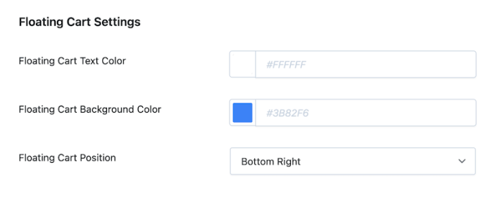
Floating Cart Text Color
Input Field: Set the text color for the floating cart. Use color picker to choose the right color value (hex).
Example: #FFFFFF
Floating Cart Background Color
Input Field: Set the background color for the floating cart. Use color picker to choose the right color value (hex).
Example: #000000
Floating Cart Position
Dropdown: Select the position for the floating cart. Choose between bottom right or bottom left.
- Bottom Right: The floating cart will appear at the bottom right of the screen.
- Bottom Left: The floating cart will appear at the bottom left of the screen.
Example: Bottom Right
Label Settings
↑ Back to top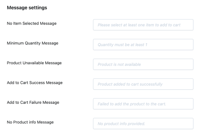
All Add To Cart Label
Input Field: Set the label for the “Add to Cart” button.
Example: Add to Cart
Floating View Cart Label
Input Field: Set the label for the floating “View Cart” button.
Example: View Cart
Item Label
Input Field: Set the label for a single item.
Example: Item
Item Label (Plural)
Input Field: Set the label for multiple items.
Example: Items
Message Settings
↑ Back to topNo Item Selected Message
Input Field: Set the message to be displayed when no items are selected.
Example: Please select at least one item to add to cart.
Minimum Quantity Message
Input Field: Set the message to be displayed when the minimum quantity requirement is not met.
Example: Please select at least one item.
Product Unavailable Message
Input Field: Set the message to be displayed when a product is unavailable.
Example: This product is currently unavailable.
Add to Cart Success Message
Input Field: Set the message to be displayed when an item is successfully added to the cart.
Example: Item added to cart successfully!
Add to Cart Failure Message
Input Field: Set the message to be displayed when an item fails to be added to the cart.
Example: Failed to add item to cart. Please try again.
No Product Info Message
Input Field: Set the message to be displayed when there is no product information available.
Example: No product information available.
Table Export/Import
↑ Back to topExport Settings
↑ Back to top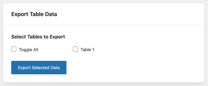
Select Tables to Export
Options: You can select which tables you want to export. You have the option to export all tables or only specific ones.
- Toggle All:
- Check this option to select all tables for export.
- Uncheck to deselect all tables.
Individual Table Selection:
- You can manually check or uncheck individual tables to include or exclude them from the export.
Export Format
The export will be in JSON format. You can use this to import tables to other website.
Import Settings
↑ Back to top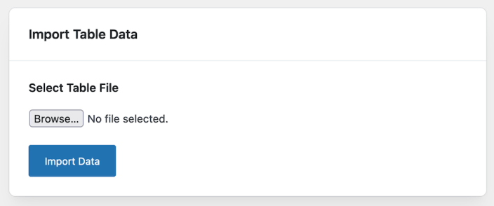
Import JSON File
To import settings, you need to upload a JSON export file. Follow these steps:
- Choose File:
- Click on the “Choose File” button to select the JSON file from your computer.
- Import Data:
- After selecting the file, click on the “Import Data” button to start the import process.
Note: Ensure the JSON file is correctly formatted and exported from a compatible version of the Table Plugin to avoid any import errors.