Welcome to the comprehensive documentation for the Vault WooCommerce Theme. This guide will walk you through the installation process and help you customize your store with ease. Whether you are building a product showcase or a full-featured online shop, Vault provides the tools you need to get started quickly and confidently.
Setup and Installation
↑ Back to topTheme Installation
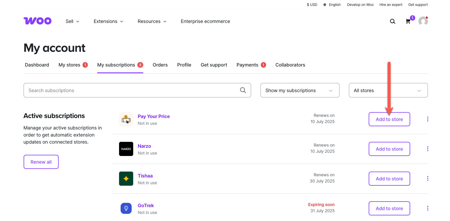
↑ Back to topTo start using a product from WooCommerce.com, you can use the “Add to store” functionality on the order confirmation page or the My subscriptions section in your account.
- Navigate to My subscriptions.
- Find the Add to store button next to the product you’re planning to install.
- Follow the instructions on the screen, and the product will be automatically added to your store.
Alternative options and more information at:
Managing WooCommerce.com subscriptions.
Demo Content Import
↑ Back to top- In your WordPress dashboard, navigate to Appearance > Theme Demos.
- Select the Vault demo and click ‘Import‘.
- Choose which demo content you would like to import.
- Wait for the import process to complete. This may take a few minutes.
- Once completed, your website will display the imported demo content.
Theme Customization
↑ Back to topSetting Up Your Logo
↑ Back to top- Go to Appearance > Editor.
- In the Site Editor, navigate to Patterns > Header, click ‘Header’ pattern.
- Locate the Site Title block in the header layout.
- Replace it with an Image block.
- Upload your logo or select it from the Media Library.
- Set the logo image link to your homepage.
- Click ‘Save’ to apply the changes.
You can repeat the same steps to update the logo in the simplified Checkout Header and Footer patterns, if needed.
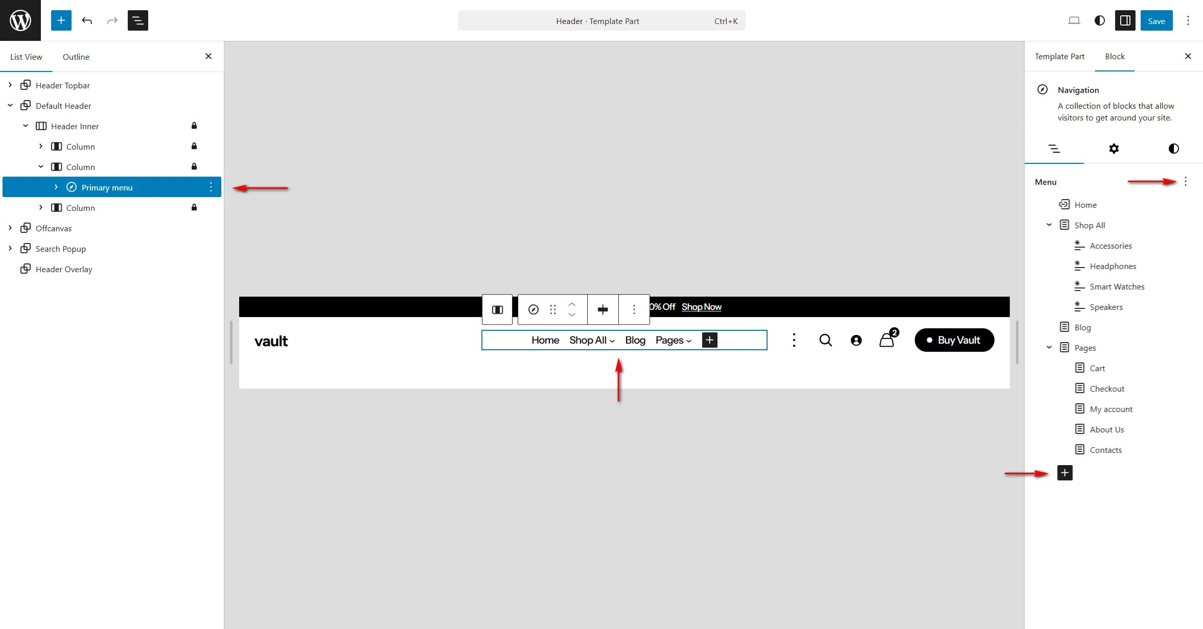
Setting Up Navigation Menus
↑ Back to top- Go to Appearance > Editor.
- In the Site Editor, navigate to Patterns > Header, click ‘Header’ pattern.
- Locate the Header Primary Menu block.
- Click the Plus (+) icon to add links to pages, products, posts or custom URLs.
- To switch to a different menu, use the More Settings option inside the Navigation block.
- Click ‘Save’ to apply the changes.
You can repeat the same steps to add or edit navigation menus in the Footer pattern.
For additional guidance, see the official WordPress Navigation Block tutorial.
Mega Menu
↑ Back to top- Go to Appearance > Editor.
- In the Site Editor, navigate to Patterns > Header, click ‘Header’ pattern.
- Locate the Header Primary Menu block. Click the Plus (+) icon then select Add Block > Mega Menu
- Click on the newly added Mega Menu item. Update the menu label to match your needs (e.g., Shop, Collections, Categories).
Inside the container, you can add any blocks you need, such as: Images product grids, categories, text or banners. Customize the layout to fit your design.
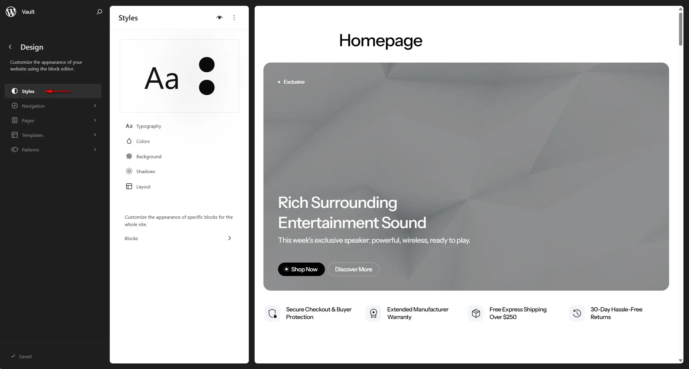
Global Styles
↑ Back to top- Go to Appearance > Editor.
- In the Site Editor, click ‘Styles‘ to browse through
- You can modify the preset typography and color palette or add custom fonts and colors.
- In the ‘Layout’ section you can set the width of your web-site.
- Click ‘Save‘ to apply the changes.
Sections
↑ Back to topBanners
↑ Back to topThe Vault theme includes multiple responsive banner sections designed to look great on all devices. Each banner section features built-in aspect-ratio controls, allowing you to define different aspect ratios for desktops, laptops, tablets, and mobile devices individually.
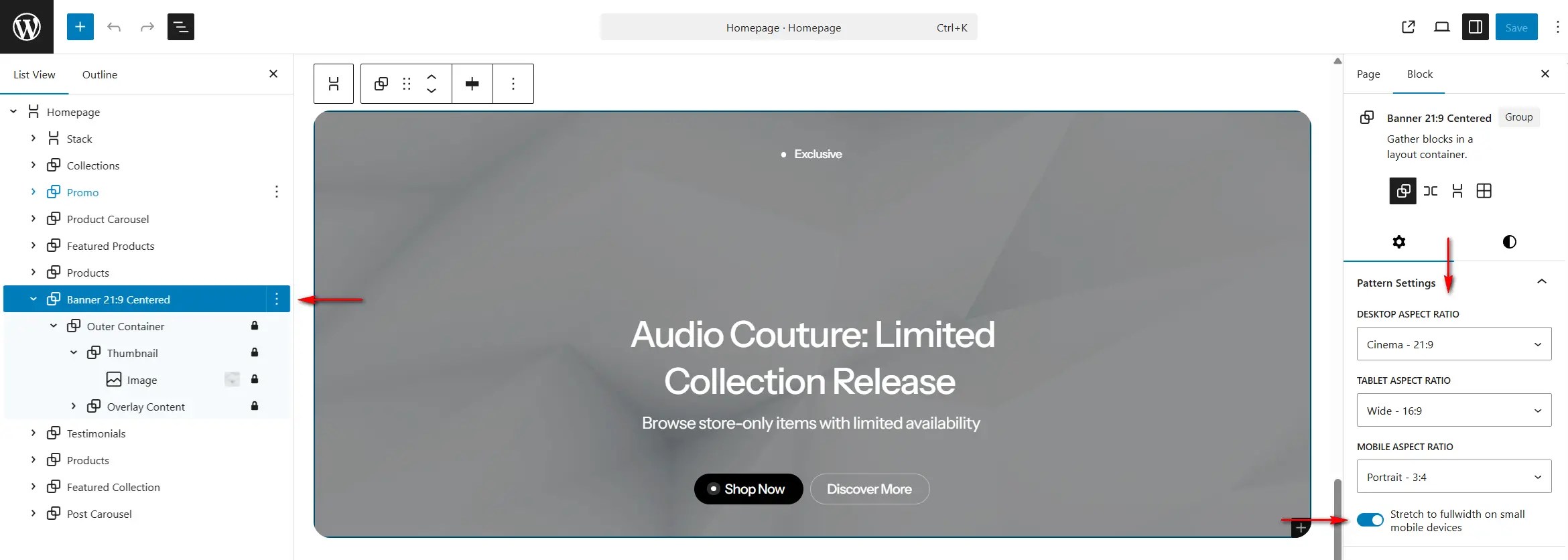
Although the standard WordPress Image block aspect-ratio setting can still be used inside Banner and similar sections, we recommend using the theme’s native aspect-ratio controls located in the core Section block. These provide more consistent results and a better visual experience across all screen sizes.
Banner sections can also be set to stretch to full width on mobile devices (screens smaller than 576px), while remaining normally aligned or wide aligned on larger displays.
Carousels
↑ Back to topThe Product Carousel and Post Carousel sections allow you to display a different number of items depending on the screen size, ensuring a smooth and well-optimized user experience across all devices.
Through the core Section block settings, you can control:
- Autoplay behavior,
- Number of visible items for desktops, laptops, tablets, and mobile devices
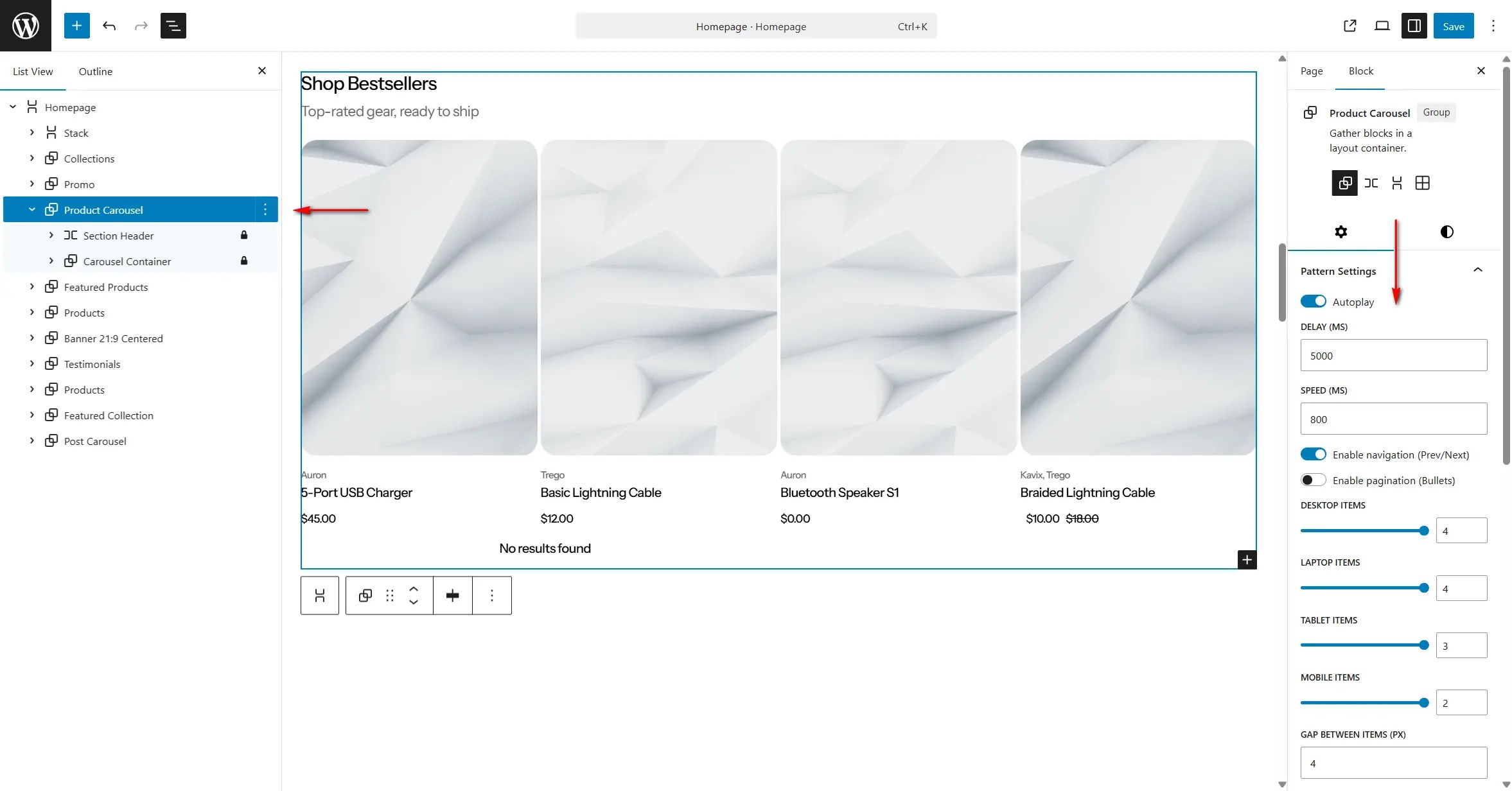
While the native Product Collection block includes a basic carousel option, we recommend using the Vault theme carousel instead. It offers:
- Individual controls for all device types
- Full touch and swipe support for mobile users
- Greater flexibility for layout and animation settings
Hero Slider
↑ Back to topThe Hero Slider section is designed to showcase a sequence of banners in a dynamic, engaging layout. Similar to the Carousel sections, it includes autoplay controls for adjusting slide speed and delay. Like the Banner sections, it also features aspect-ratio controls, allowing you to define different aspect ratios for desktops, laptops, tablets, and mobile devices individually.
There are two quick ways to add new banners to the Hero Slider:
Method 1: Duplicate an Existing Slider Item
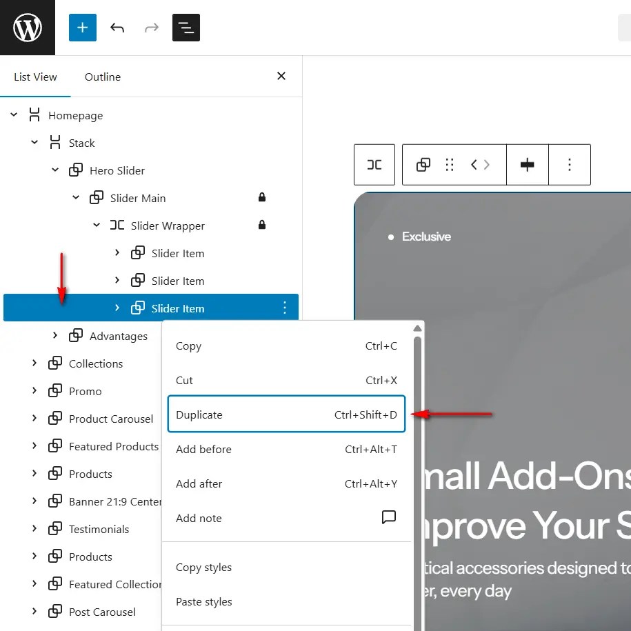
- Select a Slider Item block.
- Right-click and choose Duplicate, or use the keyboard shortcut Ctrl + Shift + D.
- The duplicated Slider Item will appear immediately after the original and is ready for customization.
Method 2: Add a Slider Item Patter
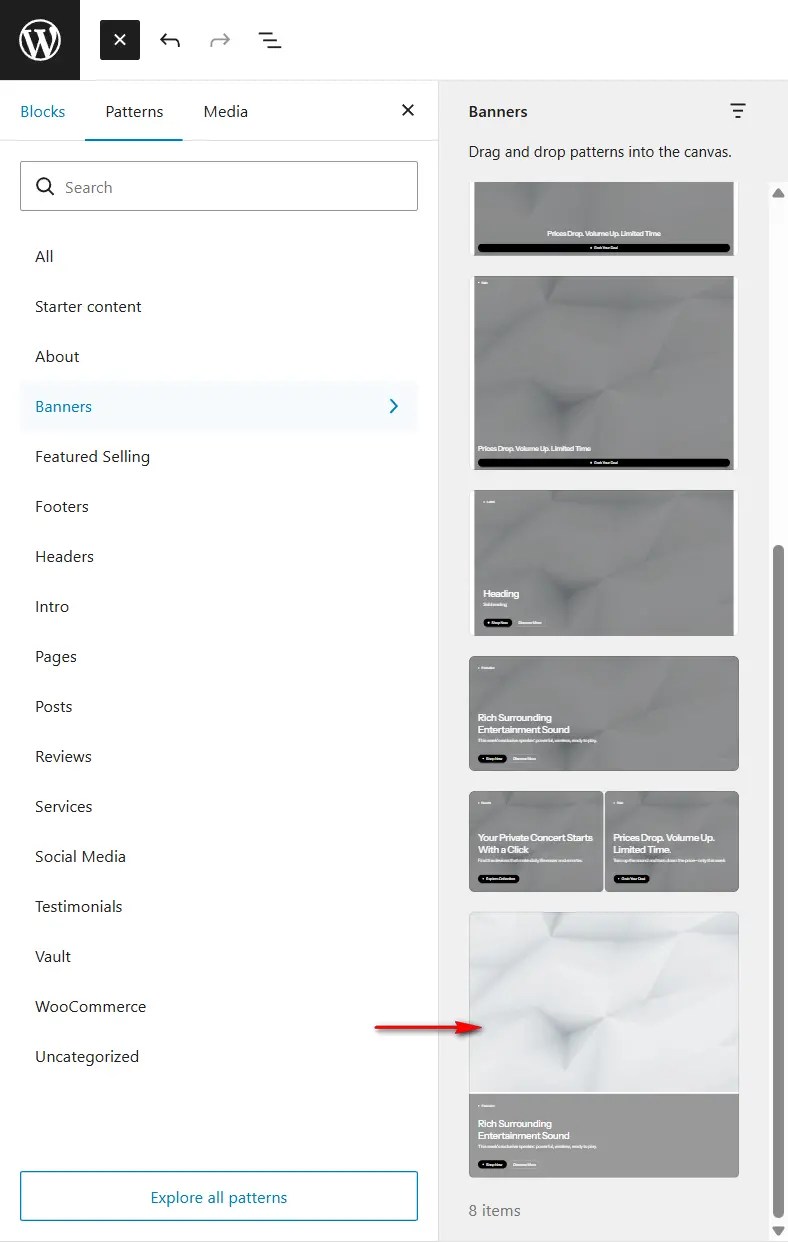
- Select the parent Slider Wrapper block.
- Click the Plus (+) icon to open the block and pattern selector.
- Go to Patterns > Banners and choose the Slider Item pattern.
- A new banner will be inserted into the slider and will be ready for configuration.
Featured Post
↑ Back to topThe Featured Post section is designed to highlight the first post in your post archives and latest posts pages by displaying it in a larger, more prominent layout.
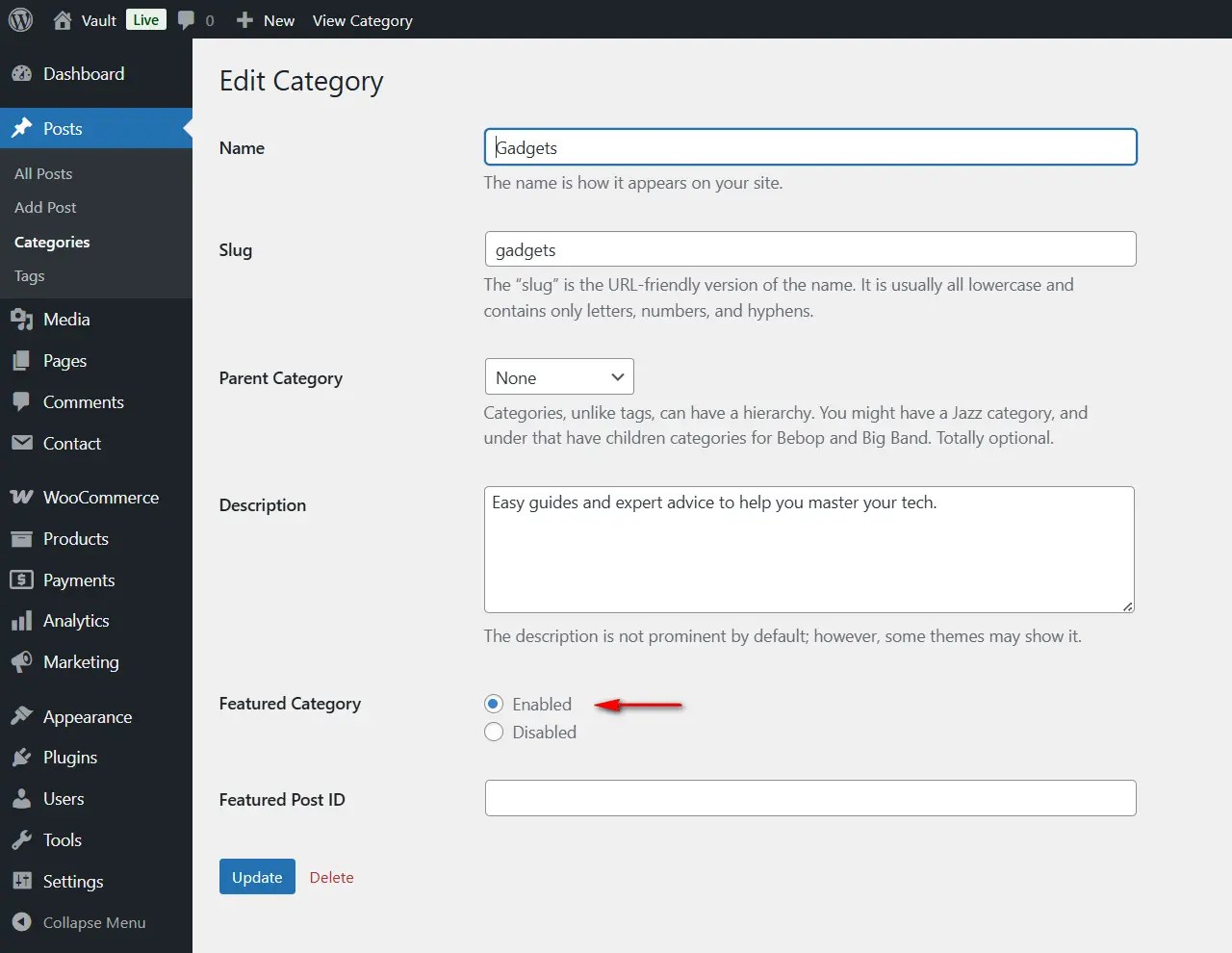
To enable the Featured Post in post archives, the ‘Featured Category‘ option must be enabled in the Categories settings.
You can manually add the Featured Post section to the Latest Posts page:
- Go to Appearance > Editor.
- In the Site Editor, open Templates and select the ‘Blog Home’ template.
- Insert the Featured Post pattern before the Posts block.
- Click ‘Save‘ to apply the changes.
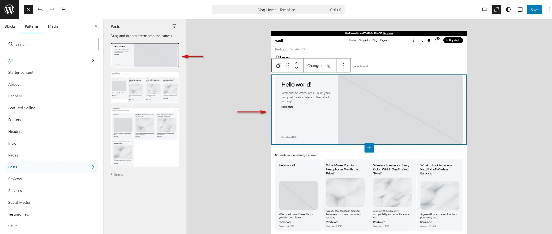
The Featured Post section can also be added to any other page. Outside of blog archive contexts, it will function as a standard post display section.
Responsive Content
↑ Back to topVault allows you to display different content (for example, responsive advertisements or images) based on the user’s viewport size.
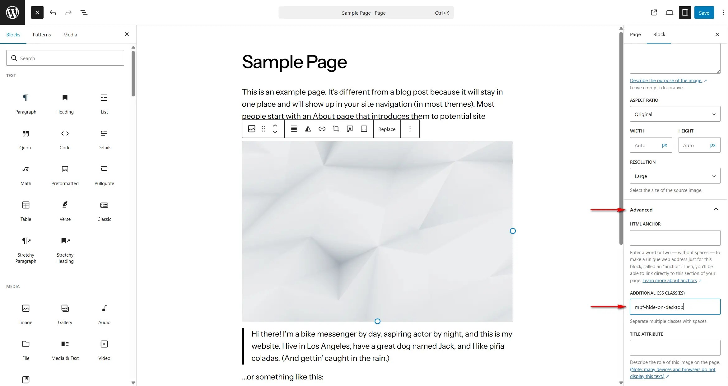
For example:
<img src="test.com/image.jpg" class="mbf-hide-on-desktop">
<img src="test.com/image.jpg" class="mbf-hide-on-mobile mbf-hide-on-tablet mbf-hide-on-laptop">
In this example:
- The first image will be visible on mobile, tablet, and laptop devices, but hidden on desktop screens.
- The second image will be visible only on desktop screens and hidden on all smaller devices.
This approach allows you to tailor content specifically for different screen sizes and improve both layout and performance across devices.