NOTE
This product is no longer available on WooCommerce.com. This document has been left available for existing users, but will no longer be updated.
Lenis is an ultramodern theme that helps focus site visitors’ attention on what matters to you the most: your fashionable products. With its user-friendly interface, users will enjoy spending time on your website and shopping for their next outfits of the day.
Theme installation
↑ Back to topTheme can be installed two ways – through the WordPress admin dashboard or by uploading files through FTP manually.
Installing the theme through the WordPress admin dashboard
- Log into the WordPress admin panel.
- Go to Appearance -> Themes.
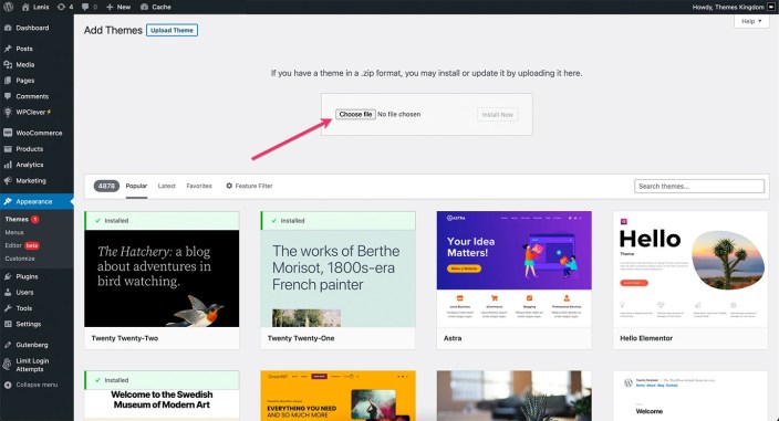
- Click on the Add New button, at the top of the screen.
- In the Add Themes screen, click on Upload Theme.
- Click on Choose theme, and then browse for the theme file on your computer.
- Click on Install Now to start the installation.
- After the installation is done, click on Activate theme.
Installing the theme by manually uploading files
- Download the latest theme version from WooCommerce.com.
- Extract the zip folder on your computer.
- Connect to your server using FTP client.
- Upload extracted theme folder into ..wp-content/themes/ directory.
- Log into the WordPress admin panel.
- Go to Appearance -> Themes.
- Click on Activate theme.
More information on Adding New Themes.
Required plugins
↑ Back to topBefore proceeding, make sure that the WooCommerce plugin is installed and active. If the WooCommerce plugin is missing or is not active, theme features and demo import will not be complete.
The WooCommerce plugin can be installed through the WordPress admin dashboard or by uploading files through FTP manually.
Installing WooCommerce through the WordPress admin dashboard
- Log into the WordPress admin panel.
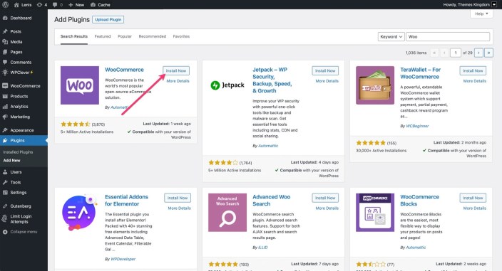
- Go to Plugins -> Add New.
- Search for “WooCommerce”.
- In the search results, click on Install Now.
- When the installation is done, click on Activate button.
Importing demo content
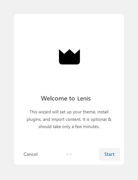
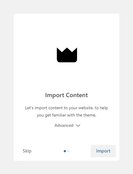
↑ Back to topAfter activating the theme, demo importer will start. Automatic importer will import all posts, pages, products, and set the site to look like demo. Demo import will take a few minutes. Follow the steps from the importer.
Theme customization
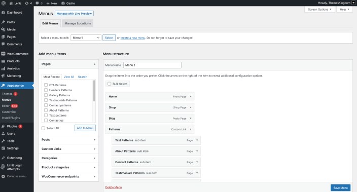
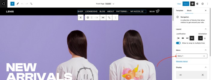
↑ Back to topSetting up menus
↑ Back to topTheme menus can be created under Appearance -> Menus. Created menus can be used when working with templates using Editor.
The navigation menu can be changed in the Editor – you can easily replace the default menu with your own.
- Go to Appearance -> Editor.
- In Site Editor, click on the down arrow, near the template name, on the top of the screen. Click on the Browse all templates button.
- In the templates screen, click on Template parts on the left-hand side. Click on the header.
- The Menu placeholder is set. Click on it, navigate to block settings on the right-hand side and from the menu drop-down select previously created menu.
- Save changes.
Using the theme editor
↑ Back to topThe theme can be customized using Editor feature. Editor allows you to control layout and elements of the page templates. Go to Appearance -> Editor. More details how to work with the editor are available on this link.
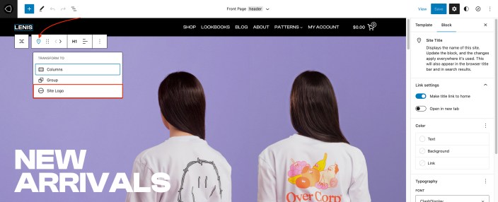
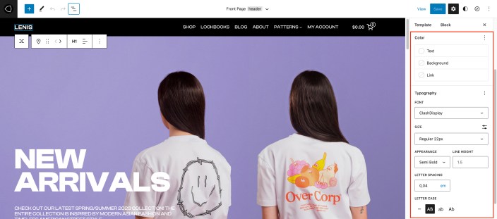
Setting up site logo
↑ Back to top- In Site Editor, click on the down arrow, near the template name, on the top of the screen. Click on the Browse all templates button.
- In the templates screen, click on the Template parts on the left-hand side. Click on the header.
- The title placeholder is already there. Click on the title icon. From the Transform to dropdown click on Site Logo.
- When the Site Logo element appears, click on it, and then upload or browse for the desired logo file.
- Save changes when you are done.
Setting up the site title
↑ Back to topSite title can be set in the Appearance -> Customize, and under the Site Identity panel, you can set site title and favicon.
- In Site Editor, click on the down arrow, near the template name, on the top of the screen. Click on Browse all templates button.
- In the templates screen, click on the Template parts on the left-hand side. Click on the header.
- The title placeholder is already there. Click on it, and enter the desired text for your site title.
- Save changes when you are done.
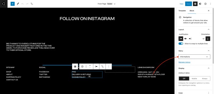
Replacing footer menus
↑ Back to top- In Site Editor, click on the down arrow, near the template name, on the top of the screen. Click on Browse all templates button.
- In the templates screen, click on the Template parts on the left-hand side. Click on the footer.
- Click on the menu that you wish to replace.
- Navigate to block settings on the right-hand side and from the menu drop-down select previously created menu.
- Save changes when you are done.
Changing colors and fonts
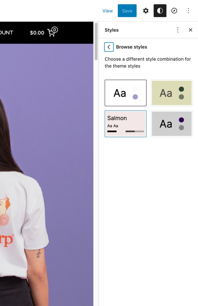
↑ Back to topChanging your website’s colors and fonts can also be done in just a few clicks within the Editor.
Note: To help you choose the right colors and typography for your website, we gave your four style options – different style combinations. You can access them once in the Editor – just click the Styles icon at the top right corner of the screen and select Browse styles.

Font options
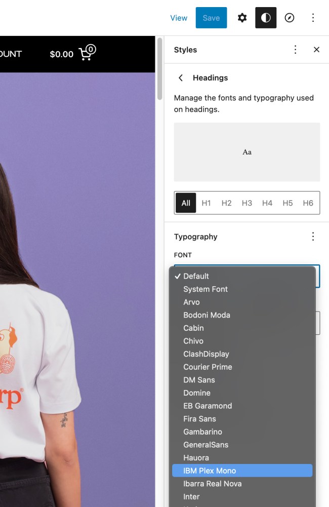
1. In the Editor, click the Styles icon at the top right corner of the screen.
2. Click on Typography to open the typography settings for different website elements.
Once you click on Typography, you will see four separate sections – Texts, Links, Headings, and Buttons. You can set typography settings for each of these elements. So, for example, once you click on Texts, you will be given options to choose a font, text size, appearance, and line height. There are numerous options for fonts you can choose from.

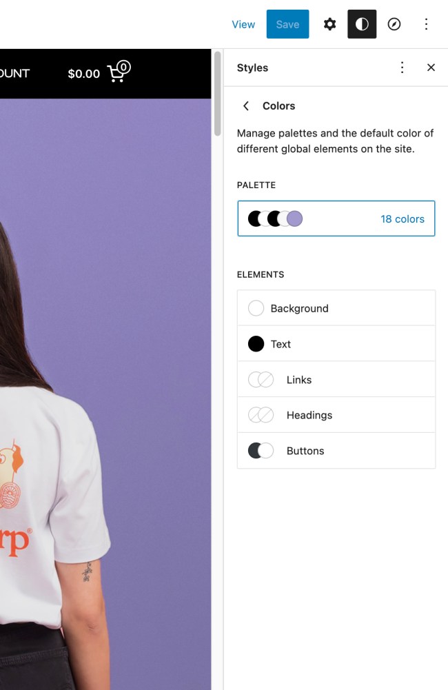
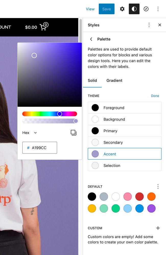
Color options
1. In the Editor, click the Styles icon at the top right corner of the screen.
2. Click on Colors to manage the color palette for different website elements.
Once you click on Colors, you will see three separate sections – Background, Text (Links and Headings), and Buttons. You can set colors for each of these elements. For example, once you click on Background, you will be given options to set a background color or choose a gradient. There are numerous options for colors for you to play with.
Hiding sidebar filters behind the button
↑ Back to topBy default, the product catalog page(shop page) is displayed with the sidebar filters. On mobile devices, the sidebar filter will be displayed before the products. But, the sidebar filter is hidden behind the button, so the visitors will focus on products, and expand the filter area only if they need to filter products by attribute, price, and such. If you imported the demo content, then there is no need to add theme-specific classes for WooCommerce sidebar. However, if you skipped demo import, then please the following steps how to set it up:
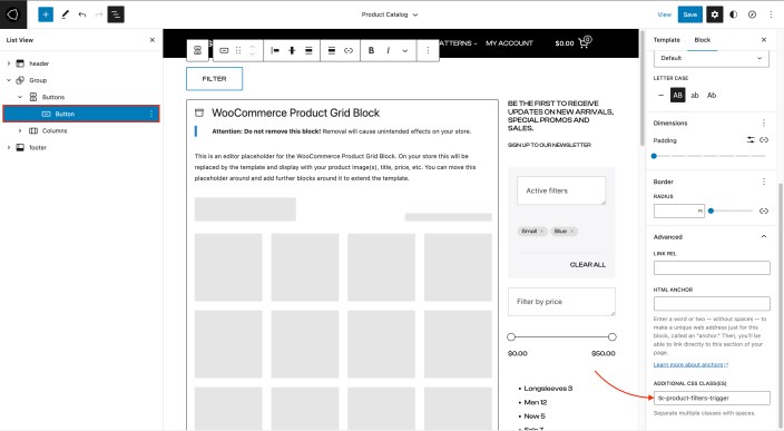
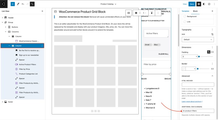
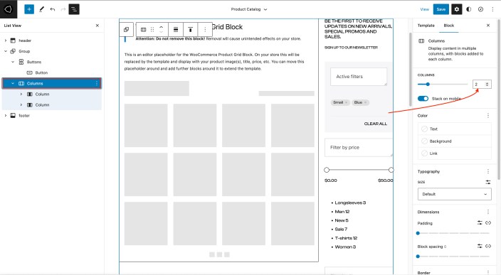
- In Site Editor, click on the down arrow, near the template name, on the top of the screen. Click on Browse all templates button.
- In the templates screen, click on the Templates on the left-hand side. Click on the Product Catalog.
- Shop is displayed in full width. Click on the Columns element.
- Change number of columns from 1 to 2 usiing slider in the right-side panel. New column on the right side will appear.
- Adjust column width by selecting the desired column, and setting their width value in Column settings panel in the right side panel. For the best effect, set left column width to 85%, and right column width to 15%.
- Click on the right column, where filters will be displayed. Add desired filters to this column.
- Expand Advanced panel on the right.
- Add classtk-product-filtersclass to Additional CSS Class(es) field. This class will automatically hide the filter sidebar on mobile devices.
- Now, add a button element above product and filter columns.
- Add classtk-product-filters-triggerclass to Additional CSS Class(es) field. This class will allow selected button to become filter sidebar trigger.
- Save changes when you are done.
NOTE: This can be implemented for Products by Category, Products by Tag and Product Search Results templates as well.
Removing sidebar with filters from the shop
↑ Back to top- In Site Editor, click on the down arrow, near the template name, on the top of the screen. Click on Browse all templates button.
- In the templates screen, click on the Templates on the left-hand side. Click on the Product Catalog.
- Click on Columns element.
- Change number of columns from 2 to 1 usiing slider in the right-side panel. Right-side column will disappear, and left-side column will take full width.
- Delete the trigger button as well.
- Save changes when you are done.
NOTE: This can be implemented for Products by Category, Products by Tag and Product Search Results templates as well.
Theme defined patterns
↑ Back to topPatterns are predefined blocks that can be added to the content. Patterns are groups of several blocks, so their content – text and images – can be edited.
Besides standard patterns, Lenis theme comes with theme-specific patterns. To add a pattern, click on the block Add button, and then click on the Browse All button, in the floating block picker. In the left-hand side panel, click on the Patterns tab, and then from the dropdown pick the desired pattern group.
- TK Text
- TK Contact
- TK About
- TK Testimonials
- TK Gallery
- TK Headers
- TK Call to Action
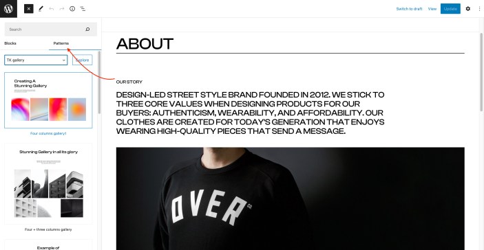
To learn more about built-in patterns, and how to work with them, please read our official guide WordPress Block Patterns.
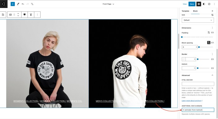
Theme built-in CSS classes
↑ Back to topLenis theme comes with several built-in CSS classes. CSS classes can be used to create spacings, hide/show elements, etc. CSS classes are used on the desired elements.
- Go to Pages -> All Pages and find the desired page.
- On the page, click on the desired element.
- Expand Advanced panel ,on the right-hand side.
- Paste the name of the class there. You can add multiple classes, separated by space.
Theme classes that can be used:
- stick-to-top element will stick to the top of the screen, regardless of the page scroll.
- l-desktop-only element will appear only on computers.
- l-touch-only element will appear only on devices with the tocuh screen.
- l-above-mobile-only element will be shown only on devices with larger screen resolution.
- l-mobile-only element will appear only on the mobile devices.
- l-center-margin-auto element will get automatic left and right margin, and will be centered on the screen.
- l-no-margin-top removes the top margin from the element.
- l-no-margin-bottom removes the bottom margin from the element.
- background-color–transparent element will get transparent background.
- padding–horizontal-default adds default padding for the element. This class will prevent element from sticking to the left and right side of the screen. Padding values are 50px for computers, and 30px for mobile devices.
- no-padding–top removes the top padding from the element.
- no-padding–bottom removes the bottom padding from the element.
- no-padding–horizontal-on-touch removes left and right padding for all devices with touch screen.
- no-padding–horizontal-on-mobile removes left and right padding for all mobile devices.
- h-animate–from-top element with this class will float in from the top, when it comes into the viewport.
- h-animate–from-left element with this class will float in from the left, when it comes into the viewport.
- h-animate–from-right element with this class will float in from the right, when it comes into the viewport.
- h-animate–from-bottom element with this class will float in from the bottom, when it comes into the viewport.
- stack-on-tablet–portrait elements inside the block with this class will be stacked on tablet devices, when the device is in the portrait orientation.
- animate-separator this class will add a eparator with animation effect from the left to the right.
- button-align-on-mobile–left class is used to align button to the left on mobile devices.
- button-align-on-mobile–center class is used to center align button on mobile devices.
- button-align-on-mobile–right class is used to align button to the right on mobile devices.