This widget show all/select cart notices on the nominated page/product.
Content Tab
↑ Back to top- Display specific notices – This switcher allows you to choose whether to display specific notices or not. The default value is “Yes”.
- Notice Type – This control allows you to select the type of notice to display. The options include ‘All notices’, ‘Specific notice’, ‘All minimum amount notices’, ‘All deadline notices’, ‘All referer notices’, ‘All product notices’, and ‘All category notices’.*
- Notice Name – This control allows you to select a specific notice to display by its name.*
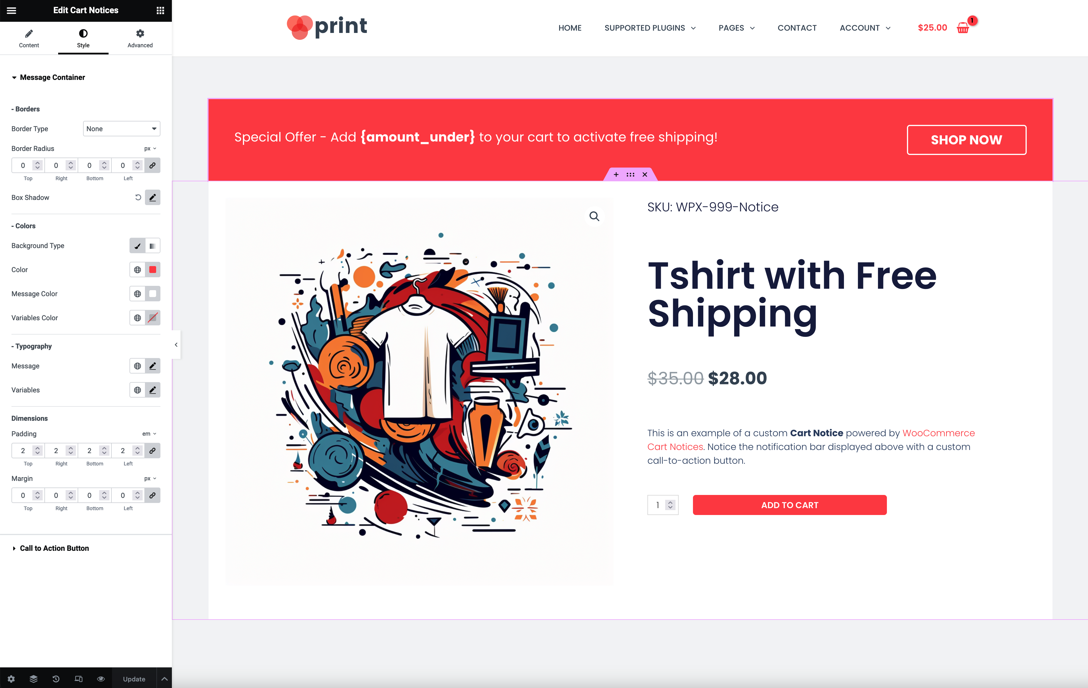
Style Tab
↑ Back to top- Border – This control allows you to define the border style, width, and color of the message container.
- Border Radius – This control allows you to set the border radius of the message container.
- Box Shadow – This popover toggle allows you to define the box shadow of the message container.
- Background – This control allows you to set the background color or gradient of the message container.
- Message Color – This control allows you to set the color of the message text. The default color is ‘#ffffff.
- Variables Color – This control allows you to set the color of the variables in the message. The default color is ’#ffffff’.
- Message Typography – This control allows you to set the typography of the message text.
- Variables Typography – This control allows you to set the typography of the variables in the message.
- Padding – This control allows you to set the padding of the message container.
- Margin – This control allows you to set the margin of the message container.
- Border (Call to Action Button) – This control allows you to define the border style, width, and color of the call to action button.
- Border Radius (Call to Action Button) – This control allows you to set the border radius of the call to action button.
- Colors (Call to Action Button) – This popover toggle allows you to define the normal, hover, and focus colors of the call to action button.
- Padding (Call to Action Button) – This control allows you to set the padding of the call to action button.
- Margin (Call to Action Button) – This control allows you to set the margin of the call to action button.
* To see ‘Notice Type’ and ‘Notice Name’, you must set ‘Display specific notices’ to ‘No’. Also, ‘Notice Name’ will only show if ‘Notice Type’ is set to ‘Specific notice’.