Overview
↑ Back to topThe WooCommerce Gift Cards plugin is a powerful tool that allows WooCommerce store owners to create and sell digital gift cards on their website. Customers can purchase these gift cards for themselves or as a gift for others. The plugin provides a variety of features including the ability to set custom amounts for gift cards, schedule delivery, and personalize with custom messages. It also offers a balance section for customers to check their gift card balance, an add card section to redeem gift cards, an active card section to view currently active gift cards, and an activity section to track gift card usage. Overall, it’s a great way to increase sales, attract new customers, and enhance the shopping experience of a WooCommerce store.
Elementor Connector for WooCommerce connects WooCommerce Gift Cards with Elementor and can significantly enhance the usability and design flexibility of your WooCommerce store. Here’s how:
- Design Flexibility: Elementor’s drag-and-drop interface allows you to easily customize the layout and design of your WooCommerce Gift Cards without any coding knowledge. You can adjust the look and feel of the gift card sections to match your brand aesthetics.
- Easy Management: The plugin’s controls can help you manage the visibility of various sections like the balance, add card, active card, and activity sections. You can easily decide which sections to display based on your business needs.
- Improved User Experience: By integrating these two powerful tools, you can provide a seamless user experience. Customers can easily purchase, redeem, and track their gift cards all within a well-designed and user-friendly interface.
- Increased Sales: A well-designed gift card interface can boost customer engagement and potentially lead to increased sales. Customers are more likely to purchase gift cards if the process is straightforward and visually appealing.
Requirements
↑ Back to topIn order to use these widgets, you’ll need the following:
Gift Cards Widget – Elementor
↑ Back to topContent Tab
↑ Back to top- Show Balance Section – This switcher control allows you to decide whether to display the balance section of the WooCommerce Gift Cards on the page. The default setting is ‘Yes’.
- Show Add Card Section – This switcher control lets you choose if you want to display the ‘Add Card’ section of the WooCommerce Gift Cards on the page. The default setting is ‘Yes’.
- Show Active Card Section – This switcher control enables you to determine whether to display the ‘Active Card’ section of the WooCommerce Gift Cards on the page. The default setting is ‘Yes’.
- Show Activity Section – This switcher control allows you to decide if you want to display the ‘Activity’ section of the WooCommerce Gift Cards on the page. The default setting is ‘Yes’.
Style Tab
↑ Back to topBalance Section
This section allows you to style the balance display of the gift cards on your WooCommerce page. This section is only visible when the Show Balance Section from the content tab described above, is set to ‘yes’. Please note that this control may be affected by your theme and plugins.
Balance Heading
- Heading – This control is a heading for the balance section of the gift cards.
- Margin – This control allows you to set the margin around the balance heading. You can specify the margin in px, %, or em.
- Padding – This control allows you to set the padding around the balance heading. You can specify the padding in px, %, or em.
- Fonts – This control allows you to set the typography of the balance heading.
- Color – This control allows you to set the color of the balance heading.
Balance Value / Add Card
- Heading – This control is a heading for the balance value section of the gift cards.
- Border – This control allows you to set the border of the balance value.
- Margin – This control allows you to set the margin around the balance value. You can specify the margin in px, %, or em.
- Padding – This control allows you to set the padding around the balance value. You can specify the padding in px, %, or em.
- Fonts – This control allows you to set the typography of the balance value.
- Color – This control allows you to set the color of the balance value.
Active Cards Section
This section contains controls to modify the appearance of the Active Gift Cards area. It will only be visible if the ‘Show Active Gift Cards’ option is enabled in the settings.
Active Cards
- Margin – Adjusts the margin around the Active Gift Cards heading. Available units are pixels (px), percentage (%), or em.
- Padding – Adjusts the padding around the Active Gift Cards heading. Available units are pixels (px), percentage (%), or em.
- Fonts – Modifies the typography of the Active Gift Cards heading.
- Color – Changes the color of the Active Gift Cards heading.
- Table Background – Allows you to set the background color or gradient for the Heading, Odd, and Even rows of the Active Gift Cards table.
Active Cards Table
- Padding – Adjusts the padding for the table and cells in the Active Gift Cards area. Available units are pixels (px), percentage (%), or em.
- Heading Fonts – Modifies the typography of the headings in the Active Gift Cards table.
- Cell Fonts – Modifies the typography of the cells in the Active Gift Cards table.
- Color – Allows you to set the color for the headings and cells in the Active Gift Cards table.
Activity Section
This section contains controls to modify the appearance of the Activity area. It will only be visible if the ‘Show Activity’ option is enabled in the settings.
- Margin – Adjusts the margin around the Activity heading. Available units are pixels (px), percentage (%), or em.
- Padding – Adjusts the padding around the Activity heading. Available units are pixels (px), percentage (%), or em.
- Fonts – Modifies the typography of the Activity heading.
- Color – Changes the color of the Activity heading.
- Table Background – Allows you to set the background color or gradient for the Heading, Odd, and Even rows of the Activity table.
- Padding – Adjusts the padding for the table and cells in the Activity area.Available units are pixels (px), percentage (%), or em.
- Heading Fonts – Modifies the typography of the headings in the Activity table.
- Cell Fonts – Modifies the typography of the cells in the Activity table.
- Color – Allows you to set the color for the headings and cells in the Activity table.
Add-To-Cart Additional Controls
↑ Back to top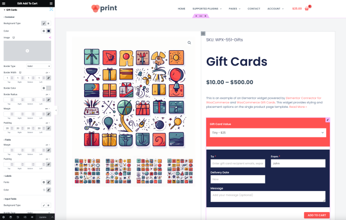
Elementor Connector for WooCommerce also adds additional controls to the Add to Cart widgets of Elementor Pro. These controls focus on the Gift Cards section that’s added to the add-to-cart buttons on the single product page.
Style Tab
↑ Back to topContainer
- Background – This control allows you to set the background for the gift card container. You can choose between a classic solid color or a gradient.*
- Border – This control lets you set the border style, width, and color for the gift card container.*
- Border Radius – This control allows you to adjust the border radius of the gift card container.^
- Margin – This control lets you set the margin around the gift card container.^
- Padding – This control allows you to set the padding inside the gift card container.^
Fields
- Margin – This control lets you set the margin around the fields within the gift card form.^
- Padding – This control allows you to set the padding inside the fields within the gift card form.^
- Typography – This control lets you set the font properties for the labels in the gift card form.
- Color – This control allows you to set the color for the labels and the required markers in the gift card form.
Input Fields
- Background – This control lets you set the background for the input fields in the gift card form. You can choose between a classic solid color or a gradient.*
- Border – This control allows you to set the border style, width, and color for the input fields in the gift card form.*
- Border Radius – This control lets you adjust the border radius of the input fields in the gift card form.^
- Padding – This control allows you to set the padding inside the input fields in the gift card form.^
- Margin – This control lets you set the margin around the input fields in the gift card form.^
- Typography – This control allows you to set the font properties for the text within the input fields in the gift card form.
- Color – This control lets you set the color for the text and the placeholders within the input fields in the gift card form.
* You can choose between a classic solid color or a gradient for any background control. You can also set the border style, width, and color for any border control.
^ You can set the values in pixels (px), percentage (%), or em for any control that adjusts size or space.