Overview
↑ Back to topWooCommerce Brands is a plugin for WooCommerce that allows shop owners to assign products to one (or more) brands. For more information on how the WooCommerce Brands plugin works, please consult its documentation here.
Elementor Connector for WooCommerce adds dedicated widgets for the styling and placement of WooCommerce Brands on the single product page and regular pages (depending on widget context).
Requirements
↑ Back to topIn order to use these widgets, you’ll need the following:
- WooCommerce
- WooCommerce Brands
- Elementor
- Elementor Pro (For adding Brand elements to custom single product templates)
- Elementor Connector
Brand Index Widget – Elementor
↑ Back to topThe Brand Index widget shows an A-Z index of all brands with links to their archive pages.
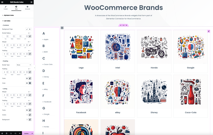
Content Tab
- Show Scroll to Top: This control enables or disables the ‘Scroll to Top’ button. This button allows users to quickly navigate to the top of the page.
- Show Empty Brands: This control allows users to decide whether or not to display brands that currently have no associated products.
Style Tab
- Hide Index: This control allows users to hide or show an alphabetical A-Z index for the brands.
- Alignment: This control allows users to align the A-Z index to either the left or the right side of the page.
- Background: This control allows users to customize the background of A-Z brand indexes that both show as available / unavailable (due to products being assigned to them or not).
- Opacity: This control allows users to adjust the opacity of unavailable indexes.
- Border, Border Radius, Margin, Padding: These controls allow users to customize the appearance and spacing around the A-Z index and the list of brands.
- Fonts: This control allows users to customize the typography of the index, list of brands, and ‘Scroll to Top’ button.
- Color: This control allows users to customize the color of the index, list of brands, and ‘Scroll to Top’ button.
Brands List Widget – Elementor
↑ Back to topThe Brand Index widget shows all products in a certain brand.
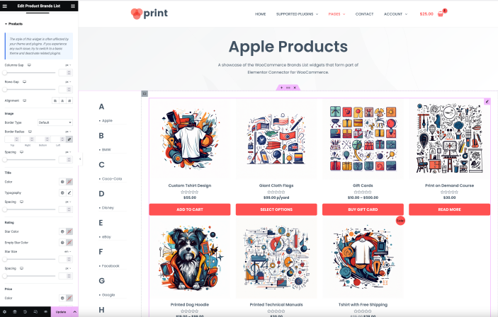
Content Tab
- Products Per Page – This control allows you to set the number of products that will be displayed on each page. You can choose any number between 1 and 100. By default, 12 products will be displayed per page.
- Columns – This control allows you to set the number of columns in which the products will be displayed. You can choose any number between 1 and 6. By default, the products will be displayed in 4 columns.
- Order By – This control allows you to set the attribute by which the products will be ordered. The options are ‘Title’, ‘Slug’, ‘Author’, ‘Date’, ‘ID’, and ‘Random’. By default, products will be ordered by ‘Title’.
- Order – This control allows you to set the order direction for the products. The options are ‘Ascending’ and ‘Descending’. By default, the order direction is set to ‘Ascending’.
- Brand – This control allows you to select one or more brands to display their linked products. You can select multiple brands at once. The available brands are dynamically filled based on the brands you have in your WooCommerce store under Products > Brands.
Style Tab
Products Section
- Columns Gap – A slider control that adjusts the gap between the product columns. Default value for mobile is 20px.
- Rows Gap – A slider control that adjusts the gap between the product rows.
- Alignment – A choice control that allows users to align the products to the left, center, or right.
- Image Border – A control that allows users to set the border properties for the product images. Default value is ‘none’. *
- Image Border Radius – A control that allows users to set the border radius for the product images. Default value is ‘0’. *
- Title Color – A color control that allows users to set the color for the product title. *
- Title Typography – A typography control that allows users to set the typography for the product title. *
- Title Spacing – A control that allows users to set the spacing around the product title. Default value is ‘0’. *
- Star Color – A color control that allows users to set the color for the product star rating. *
- Empty Star Color – A color control that allows users to set the color for the empty stars in the product rating. *
- Star Size – A control that allows users to set the size for the stars in the product rating. Default value is ‘0’. *
- Rating Spacing – A control that allows users to set the spacing around the product rating. Default value is ‘0’. *
- Price Color – A color control that allows users to set the color for the product price. *
- Price Typography – A typography control that allows users to set the typography for the product price. *
- Regular Price Color – A color control that allows users to set the color for the regular product price. This control is only visible if the product has a regular price.*
- Regular Price Typography – A typography control that allows users to set the typography for the regular product price. This control is only visible if the product has a regular price. *
- Button Text Color – A color control that allows users to set the color for the product button text. *
- Button Background Color – A color control that allows users to set the background color for the product button. *
- Button Border Color – A color control that allows users to set the border color for the product button. *
- Button Typography – A typography control that allows users to set the typography for the product button text. *
- Button Border Radius – A control that allows users to set the border radius for the product button. Default value is ‘0’. *
- Button Text Padding – A control that allows users to set the padding around the product button text. Default value is ‘0’. *
- Button Spacing – A control that allows users to set the spacing around the product button. Default value is ‘0’. *
- View Cart Text Color – A color control that allows users to set the color for the ‘View Cart’ text. *
- View Cart Typography – A typography control that allows users to set the typography for the ‘View Cart’ text. *
- View Cart Spacing – A control that allows users to set the spacing around the ‘View Cart’ text. Default value is ‘0’. *
* This control is only visible if the ‘Show Image’, ‘Show Rating’, ‘Show Rating’ or ‘Show View Cart’ control is set to ‘Yes’.
Box Section
- Border Width – A dimensions control that sets the width of the border around the box. The units can be ‘px’, ‘%’, ’em’, ‘rem’, ‘vw’, ‘custom’.
- Border Radius – A slider control that sets the border radius of the box. The units can be ‘px’, ‘%’, ’em’, ‘rem’, ‘custom’. The range is from 0 to 200px.
- Padding – A responsive dimensions control that sets the padding around the box. The units can be ‘px’, ‘%’, ’em’, ‘rem’, ‘vw’, ‘custom’. The range is from 0 to 50px.
- Shadow – A group control that sets the box shadow in the normal state.
- Background Color – A color control that sets the background color of the box in the normal state.
- Border Color – A color control that sets the border color of the box in the normal state.
- Shadow Hover – A group control that sets the box shadow in the hover state.
- Background Color Hover – A color control that sets the background color of the box in the hover state.
- Border Color Hover – A color control that sets the border color of the box in the hover state.
Visibility
There are no specific conditions defined in the code for these controls to be visible or hidden. They should be visible at all times when editing this widget in Elementor.
Pagination Section
- Pagination Spacing: This control adjusts the spacing for the pagination. It uses a slider control type, and you can specify the size in px, em, rem, or custom units.
- Show Pagination Border: This switcher control allows you to toggle the border of the pagination on or off. By default, the border is shown (‘yes’).
- Pagination Border Color: This color control changes the color of the pagination border. It only appears if the ‘Show Pagination Border’ control is set to ‘yes’*.
- Pagination Padding: This slider control adjusts the padding for the pagination. The size can be specified in px, %, em, rem, vw or custom units. For em, the minimum value is 0, maximum is 2, and it increases in steps of 0.1.
- Pagination Typography: This group control adjusts the typography of the pagination.
- Pagination Style Tabs: These tabs allow you to adjust the Link Color and Background styles of the pagination in three different states: Normal, Hover, and Active.
* The ‘Pagination Border Color’ control only appears if the ‘Show Pagination Border’ control is set to ‘yes’.
Sale Flash Section
- Sale Flash: This switcher control allows you to show or hide the sale flash. The default state is ‘yes’ (shown).
- Text Color: Changes the color of the text within the sale flash.*
- Background Color: Changes the background color of the sale flash.*
- Typography: Adjusts the typography of the text within the sale flash.
- Border Radius: Adjusts the border radius of the sale flash. You can specify the size in px, %, em, rem, or custom units.*
- Width: Adjusts the width of the sale flash. The size can be specified in px, %, em, rem, vw or custom.*
- Height: Adjusts the height of the sale flash. The size can be specified in px, em, rem, vw or custom.*
- Position: Sets the horizontal position of the sale flash, either to the left or the right.*
- Distance: Adjusts the distance of the sale flash from the edge of the product. The size can be specified in px, em, rem, or custom units. For pixels, the range is -20 to 20; for em, the range is -2 to 2.*
* These controls are only available if the ‘Sale Flash’ control is set to ‘yes’.
Product Brand – Elementor
↑ Back to topThis widget shows a single brand’s image with a link to its archive page. This only works on single product pages. Note that showing brands on the single page with this widget will only show one brand and not all (assuming the product is linked to multiple brands).
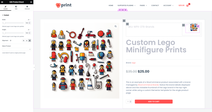
Content Tab
- Width – This control adjusts the width of the product brand image. It has a slider type control that allows you to choose the width in either px, %, or em. The minimum value is 0. The maximum value for pixels can be customized up to 1000, and for percentage, it’s 100. The default value is 64px. Please refresh the page to see image size updates.*
- Height – Similar to the Width control, this adjusts the height of the product brand image. The minimum value is 0. The maximum value for pixels can be customized up to 1000, and for percentage, it’s 100. The default value is 64px. Please refresh the page to see image size updates.*
- Alignment – This control allows you to align the product brand. The options available are left, center, and right. The default alignment is to the left.
- Select Product – This control allows you to select a specific product. If left blank, it will be used on the single product page.
Style Tab
- Border – This control allows you to adjust the border of the product brand image. You can customize the border type, width, and color.
- Border Radius – This control allows you to adjust the border radius of the product brand image. You can set the top, right, bottom, and left radius in either px, %, or em.
- Margin – This control allows you to adjust the margin of the product brand image. You can set the top, right, bottom, and left margin in either px, %, or em.
- Padding – This control allows you to adjust the padding of the product brand image. You can set the top, right, bottom, and left padding in either px, %, or em.
* For Width and Height controls, the maximum pixel value can be customized using ‘ecw_brands_width_custom_max_px’ and ‘ecw_style_section_custom_max_px’ filters respectively. Similarly, the step value for pixel range is 1.
Product Brand Meta – Elementor
↑ Back to topThis widget adds all brand names to the single product page as meta information.
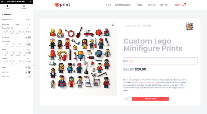
Style Tab
- Background – Set the background of the brand meta using classic or gradient options.
- Border – Modify the border of the brand meta by adjusting its type, width, and color.
- Border Radius – Control the border radius of the brand meta.*
- Margin – Adjust the margin around the brand meta.*
- Padding – Set the padding inside the brand meta.*
- Fonts – Customize the typography of the brand meta including font family, size, weight, transform, style, decoration, line-height, and letter spacing.
- Color Text – Determine the text color for the brand meta.
- Color Links – Configure the color of links within the brand meta for both default and hover states –
- Default – Set the regular color for links.
- Hover – Define the hover color for links.
* For Border Radius, Margin, and Padding controls, you can adjust the top, right, bottom, and left values individually in pixels (px), percentage (%), or em.
Brands Thumbnails Description – Elementor
↑ Back to topThis widget shows a list of all product brand thumbnails with brand descriptions and links to their archives.
Content Tab
- Columns – Determines the number of columns to display. You can choose a number between 1 and 6. Default is 4.
- Show Empty – This switcher control allows you to decide whether to display brands that don’t have any products. Default is set to ‘Yes’.
- Order By – This control allows you to sort the displayed brands based on ‘Title’, ‘Slug’, ‘Author’, ‘Date’, ‘ID’, ‘Random’, or ‘Name’. Default is ‘Title’.
- Exclude – Allows you to exclude certain brands from being displayed. You can select multiple brands from the dropdown list.
- Number – Controls the number of brands to display. You can choose a number between 1 and 100. Default is 12.
Style Tab
Thumbnails Section
- Border – Adjust the border of the brand thumbnails.
- Border Radius – Modify the border radius of the brand thumbnails. This control will only appear if the border is not set to ‘none’ or empty.*
- Padding – Set the padding inside the brand thumbnails.
- Minimum Height – Define the minimum height of the brand thumbnails. You can choose a value between 1px and 1000px.
Description Section
- Alignment – Set the alignment of the brand description text. You can choose ‘Left’, ‘Center’, or ‘Right’.
- Margin – Adjust the margin around the brand description text.*
- Padding – Set the padding inside the brand description text.*
- Fonts – Customize the typography of the brand description text.
- Color – Set the color of the brand description text.
* For Border Radius, Margin, and Padding controls, you can adjust the top, right, bottom, and left values individually in pixels (px), percentage (%), or em.
Brands Thumbnails – Elementor
↑ Back to topThis widget shows a list of all product brand thumbnails with links to their archives.
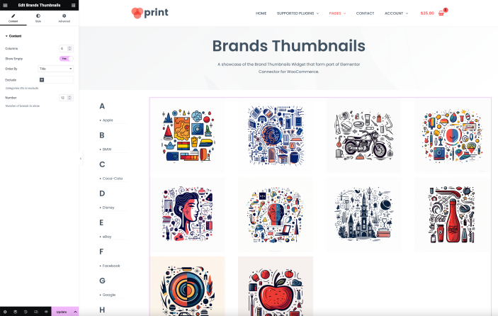
Content Tab
- Columns – Determines the number of columns to display. You can choose a number between 1 and 6. Default is 4.
- Show Empty – This switcher control allows you to decide whether to display brands that don’t have any products. Default is set to ‘Yes’.
- Order By – This control allows you to sort the displayed brands based on ‘Title’, ‘Slug’, ‘Author’, ‘Date’, ‘ID’, ‘Random’, or ‘Name’. Default is ‘Title’.
- Exclude – Allows you to exclude certain brands from being displayed. You can select multiple brands from the dropdown list.
- Number – Controls the number of brands to display. You can choose a number between 1 and 100. Default is 12.
Style Tab
- Border – Adjust the border of the brand thumbnails.
- Border Radius – Modify the border radius of the brand thumbnails. This control will only appear if the border is not set to ‘none’ or ’empty’.*
- Padding – Set the padding inside the brand thumbnails.*
- Minimum Height – Define the minimum height of the brand thumbnails. You can choose a value between 1px and 1000px.
* For Border Radius and Padding controls, you can adjust the top, right, bottom, and left values individually in pixels (px), percentage (%), or em.