A complete WooCommerce theme, ideal for stores selling groceries and food items such as Fruits, Vegetables, Dairy products, Bakery Items, Meat and Fish, Beverages and so on.
Installation
To create a site with Kirana, you need to install the Kirana theme and WooCommerce plugin.
Kirana Download and Installation
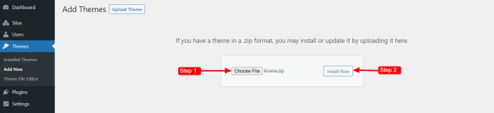
- Log in to your WooCommerce.com account and navigate to the Downloads page. Click the Download Icon to get a compressed kirana.zip theme file on your computer.
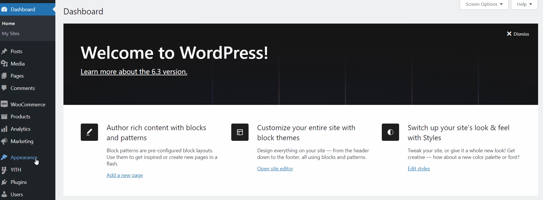
- From your WordPress dashboard, navigate to Appearance > Themes and click on the Add New button.
- Click the Upload Theme button to upload the kirana.zip file you downloaded.
- Click the Install Now button.
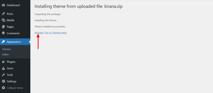
- You’ll be redirected to the activation page. Click the Activate button.
Install WooCommerce
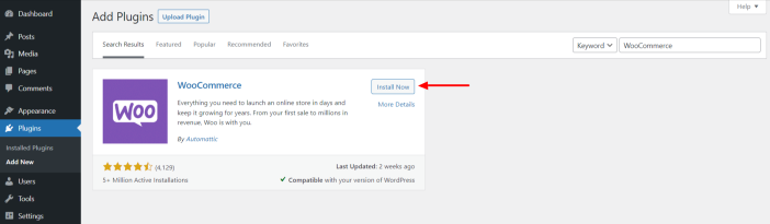
If you haven’t installed WooCommerce already, follow the steps below:
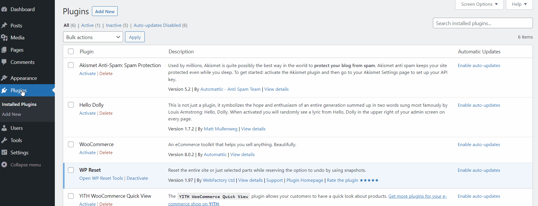
- Go to Plugins > Add New
- Search for “WooCommerce”
- Hit the Install Now button on the box containing the WooCommerce title
- Finally, press the Activate Now button
Import Demo Site
Kirana has a pre-built demo site that you can import into your site and edit content. You can import the demo to your site by two methods.
1. Get Started Notice(One Click Demo)
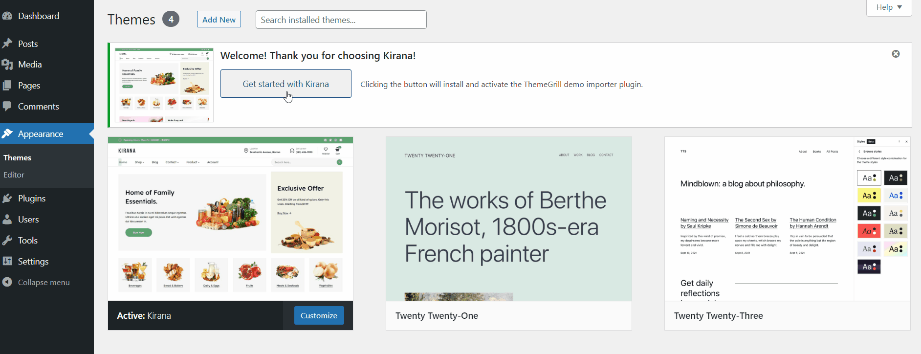
As soon as you install and activate the theme, you will see the notification to get started with the theme.
Click on Get started with Kirana, which will automatically set up the ThemeGrill Demo Importer plugin and redirect you to the demos page. Here, you can check out the available demos and import the one you like. Just hover the mouse cursor over the demo and click on Import.
Note: In case you miss this notification, you won’t have to worry as you can import the demo manually as well.
2. Import Demo Manually
To import the demo manually, you need to install the ThemeGrill Demo Importer plugin and follow these few steps:
- Go to Plugins > Add New
- Search for the “ThemeGrill Demo Importer” plugin
- Once the plugin appears on the search result, click on the Install Now button
- Click on the Activate Now button
- Go to Appearance > Demo Importer
- Hover over the Kirana box and click the Import button
- On the confirmation box, read the heads-up message carefully and click the Confirm button if all points look good to you
- Wait till the Importing… text on the button changes to Live Preview
- Click the Live Preview button
- Your site should now look like the demo site
Note: After importing the demo, go the Appearance>Editor>Templates and clear the customizations in Cart and Checkout templates in order to replicate the Cart and Checkout pages provided in the demo.
Now, it’s time to edit your site’s content, like posts, pages, products, images, etc. Go through the documentation below for detailed information.
Editing Kirana Demo Content
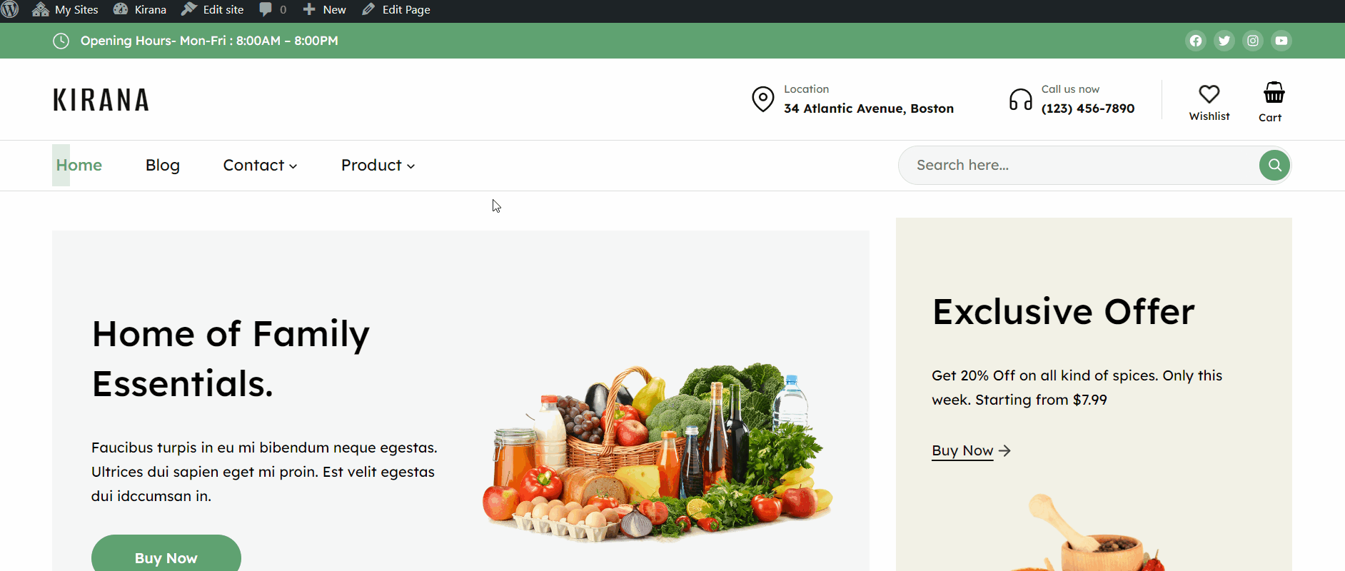
Well, coming up here, you might have successfully imported the Kirana demo to your WordPress website. You might be wondering how to edit or replace the demo content, images, header, footer, templates, and more with your own.
Being a Full-Site Editing theme, all the customization options can be achieved from the front end.
Navigate to WordPress Dashboard > Appearance > Editor and choose the elements you want to customize or edit. It lets you choose the specific elements of the template parts like color, typography, content, etc.
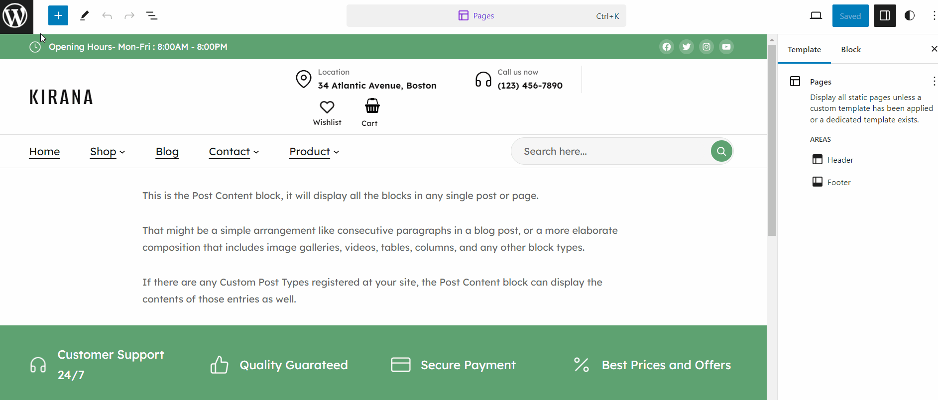
Let us provide an example by showing how you can edit the header area of the Kirana theme after the demo is imported.
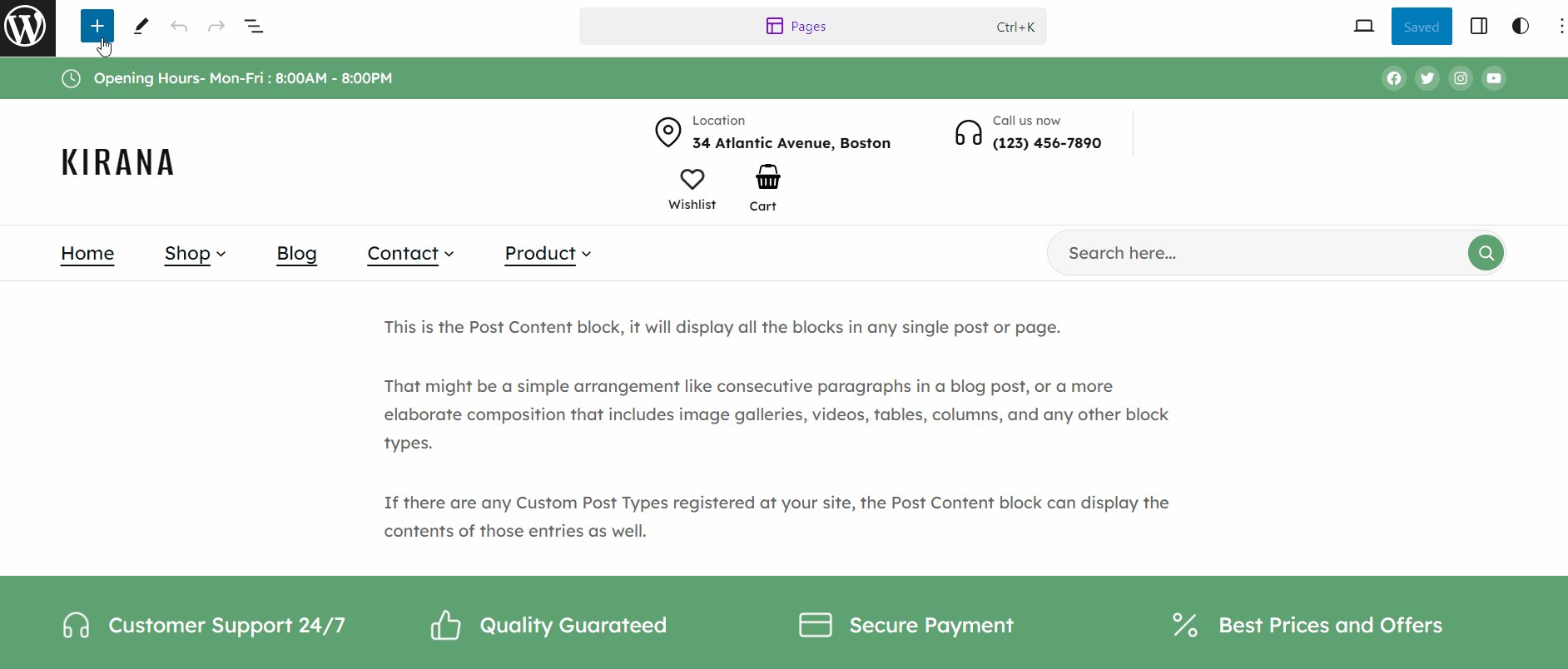
The header area of the Kirana theme consists of Site Title, Menus, and Add to Cart icon.
These elements are added via the available blocks. For example: The Site Title is added via the Site Title Block, the Add to Cart is added via the Mini Cart Block, and so on.
Edit Site Title
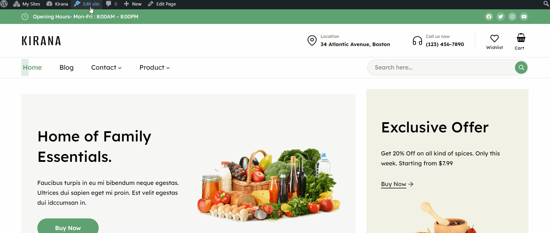
↑ Back to topTo edit the Site Title, follow the steps below:
- Click on the WordPress Icon from the top left corner of the site editor.
- Choose the Templates Parts > Header.
- Click on the Site Title that displays a toolbar with various settings options.
- Choose the settings options you want to change, such as Drag, Align, Heading Tags, etc.
- Moreover, for other settings and customization, navigate to the right sidebar, where you will find different settings like Link Settings, Color, Typography etc.
Following the steps above, you can customize all other elements available within the Kirana demo and add your own.
Major Kirana Highlights
↑ Back to topMega-Menu
↑ Back to topMega Menu is a type of navigation menu where the menu and sub-menu items are displayed in an organized way unlike the old traditional dropdown menu. It displays the menu in multiple columns and rows creating a grid-like layout.
Follow the steps below to add a mega menu on your site with Kirana theme
- Navigate to Template Parts > Header.
- Create a normal menu by inserting the navigation block and adding the menu items and sub items.
- Click on the menu items having the submenu and then Settings from the top right area. Choose the Styles option and then click on Mega Menu. This will allow displaying the chosen sub-menu items to be displayed as Mega Menu (menu having row and column)
- To add images, click the dropdown in the menu item.
Wishlist
↑ Back to top- Kirana is fully compatible with YITH WooCommerce Wishlist plugin.
- YITH WooCommerce Wishlist is a plugin for the WooCommerce platform that allows customers to create a wishlist of products that they are interested in purchasing at a later time. This plugin is developed by YITH, a well-known WordPress plugin developer.
- The plugin allows customers to create and manage multiple wishlists, add and remove items from their wishlists, and share their wishlists with friends and family. It also allows store owners to customize the appearance of the wishlist and set up email notifications for when items are added or removed from a wishlist.
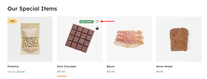
Quickview
↑ Back to top- Kirana is fully compatible with YITH WooCommerce Quick View plugin.
- YITH WooCommerce Quick View is a plugin for the WooCommerce platform that allows customers to have a quick look about products. This plugin is developed by YITH, a well-known WordPress plugin developer.
- The plugin allows customers to preview the product details without leaving the current page. Customers can quickly view product details, including images, descriptions, prices, and availability, through a pop-up modal window. Moreover, customer can add products to their cart directly from the quick view window, reducing the number of steps required to make a purchase.
Mobile and Desktop Headers
↑ Back to topKirana theme allows you adding different header for desktop and mobile devices. In-order to do so, please follow the steps below:
- Add both the header patterns i.e Default and Mobile Header on your site. The Default header is for the desktop and Mobile header is for the mobile device.
- Currently both header gets displays on mobile and desktop. The Default header should be displayed for desktop and Mobile header should be displayed for mobile device only.
- Click on the Default header block which will display the setting on the right side area. Choose the Hide on Mobile option to hide the header on mobile device.
- Follow the similar method for disabling the mobile header on desktop. Choose the Hide on Desktop option to hide the mobile header on desktop.
Upon saving the changes, you’ll find different headers on mobile and desktop devices.
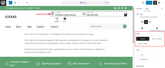
Additional Styles
↑ Back to topKirana theme comes up with additional styles for Group, Column and Navigation Block. The additional styles includes hiding those elements based on various devices like mobile, tablets, desktop and so on.
The options available is included below:
- Hide on mobile: Hide on screen less than 768px.
- Hide on tablet: Hide on screen less than 1024px.
- Hide on desktop: Hide on screen greater than 768px.
- Show on tablet: Show on screen less than 1024px.
For example – If you import the demo, you’ll find a section with Location and Call Now on the right header area. Now if you don’t want to display the information on the mobile device, click on the section. It will display a setting on the right sidebar where you can click on the option Hide on Mobile to hide the information on Mobile device. Upon saving the changes, you’ll no longer see the Location and Call Now section on mobile devices.
Blocks and Patterns
Blocks
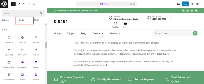
↑ Back to topBlocks are the components used in the theme for adding content to the posts/pages. The Kirana themes come with several blocks that you can use to add text, media assets, and layout components, allowing you more freedom to create content. To get access to the Block, you can follow the step below:
- Go to Pages and choose your desired page.
- Click the plus (+) icon at the top left of the toolbar to insert blocks.
It will display a list of blocks available. You can use the appropriate block that suits your site requirements. For example: You can use the Site Title block to add the site title on the header area.
Patterns
↑ Back to topIn WordPress, Patterns refer to the combination of Blocks. Meanwhile, the Blocks are components used for creating and editing elements in a WordPress post or page. The combination of various blocks makes the patterns which, after inserting them on your site, allows you fully customize it with your content to make it unique.
Kirana themes come with 12 pre-built patterns by default. You can choose the one that fits your site and customize it accordingly. Once you have installed and activated the theme, you will see a set-up pattern on your front end. You can either edit or remove it by replacing the other available patterns.
Before listing the available patterns in the Kirana theme, let’s point out several reasons for using the patterns in the theme:
- It saves time as you don’t need to create the same layout. You can reuse the same patterns on multiple areas of your site.
- It helps you add professional designs to your site without needing degree designers.
Kirana Header:
- The pattern is created for the header area of the theme. For now, the header pattern has two styles, i.e., Default and Mobile Header. The Default is added at the time of importing the demo.
- Mobile Header is especially designed for displaying the header on mobile device where the design is completely different from default header.
Kirana Footer:
- The pattern is created for the footer area of the theme. It comes with two designs, i.e., Default and Style 1. By default, Default pattern is used in the demo.
Default patterns contain blocks inside it, where the service provided by the site is displayed. With Style 1 no such block is available.
Kirana Banner
- As the name suggests, this pattern consists of various banners that helps you for branding or any other purposes. There are five designs of the banner that you can choose from.
Kirana Testimonial:
- There are four beautiful patterns available for the Testimonial.
Kirana Contact:
- The Contact pattern is generally used to display your contact information. There are four designs that you can choose from.
Kirana Offers:
- Use the available offer pattern for showing various offers on your ecommerce shop.
Kirana CTA:
- Call to action sections help you perform a certain action quickly by just clicking a button. There are four pattern that you can choose from.
Kirana Blog:
- The Blog pattern is used for displaying the posts on your site and comes with three different patterns to choose from.
Kirana Shop:
- The Shop pattern is used to display your site’s products. There are two pattern designs available in this category.
Kirana Mini Cart:
- The Mini Cart pattern defines the layout of the Minicart appearing on the Kirana theme.
Kirana Single Post:
- The Single Post pattern defines the layout of how your post gets displayed while allowing it to open on a single page.
Kirana 404:
- The 404 pattern is useful for displaying when no content is found on the requested page.
Adding Patterns in the Kirana theme You can follow the steps below to add the new pattern to your Kirana FSE Theme.
- Click on the plus (+) sign from the top left of your page editor.
- Select the Pattern option from the tab.
- Scroll down the available patterns and click on the one that fits on the site.
- Upon clicking, it will automatically add the selected patterns on the page.
- Once done, the patterns become individual blocks that you can move, change and customize according to your site requirement.
Templates and Template Parts
↑ Back to topTemplates
↑ Back to topThe Kirana FSE theme offers 13 Templates for your use. You can customize these templates if you feel like changing anything on a specific template and wish to see those changes across your site.
A template defines the structure of the site’s content area, such as a 404 page, search result, single post, etc.
Below is the list of available templates within the Kirana theme:
- Single
The template is used for displaying any single post or attachment.
- 404
The template is displayed when no content is found on the requested page.
- Product Catalog
It displays the products added on your site.
- All Archives
The template displays posts by a single author, category, tag, taxonomy, custom post type, and date.
- Index
The index template is the fallback template for all pages when no template is defined. It is also the default template for displaying blog posts.
- Mini-cart
The template displays the Mini-Cart drawer.
- Page No Margin Top
The default page template uses the block space of 30px. Using the templates the 30px space appearing beside the header is removed.
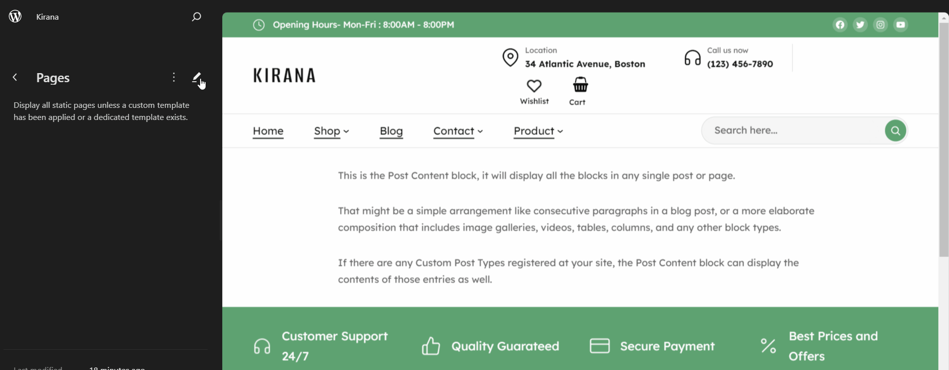
- Pages
It displays all static pages unless a custom template has been applied or a dedicated template exists.
- Search Results
Displays search results for your store when a visitor performs a search on your website.
- Single Product
It displays the single product of your site.
- Products by Attribute
It displays the products which are filtered by attribute.
- Products by Category
It displays the products which are filtered by category.
- Products by Tag
It displays the products which are filtered by tag.
Theme Built-in CSS Classes
The Kirana theme comes with several built-in CSS classes. CSS classes can be used to create spacings, hide/show elements, etc. CSS classes are used on the desired elements.
In order to add the CSS classes within the Kirana theme, you can follow the steps below:
- Go to WordPress Dashboard > Pages and choose the desired page.
- Select the specific elements you want to add to the CSS.
- Click on the settings from the top-right section of the page editor.
- Under Advanced, add the CSS code inside the Additional CSS box. (Multiple classes can be added by separating them with spaces).
Available CSS Classes
- kirana-shopping-icon
- It replaces the Cart Icon with the Shopping Bag Icon.
- kirana-margin-block-start-zero
- Removes the top margin from the first block after header.
- kirana-avatar
- The class is used for adding the Avatar for my account, replacing the text. It should be added inside the navigation page classes.
- kirana-wishlist-icon
- It is used to add the Wishlist Icon for the Wishlist page.
- kirana-container-spacing-15
- It adds spaces on the left and right with 15px.
- kirana-padding-top-bottom-8
- It adds padding spacing at the top and bottom by 8px.
- kirana-hide-mobile
- It will hide the content on mobile.
- kirana-top-bar
- It is used in the top bar as a parent class.
- kirana-margin-block-start-20
- It is used to add a margin-top of 20px.
- kirana-mobile-padding-zero
- It changes the default padding to the padding 0px in mobile mode.
- kirana-arrow-icon
- It adds the arrow icon.
- kirana-border-bottom-2
- The class adds the solid border-bottom of 2px while the hover is set to be using the dotted border.
- kirana-mobile-column-width
- It adds the column width flex-basis 40% in tablet and 100% in mobile.
- kirana-gap-zero
- It removes the gap between products and adds a border of 1px.
- kirana-media-text-mobile-width
- It gives responsive width from 992px in media and text block.
- menu-item-width-10
- Give 10% width to the mega menu items. The value can be changed to 15 , 25, 50 and so on….upto 100. ( menu-item-width-15, menu-item-width-20, menu-item-width-25).