Display product images and videos in a slider with different layouts with the WooCommerce Product Gallery Slider plugin. Add multiple variation images and display images in a lightbox view for ease of customers.
Installation
↑ Back to top- Download the WooCommerce Product Gallery Slider plugin to get the .zip file.
- In the WordPress admin panel, go to the Plugins section and click “Add Plugin”.
- Upload the .zip file that you downloaded and “Install” the plugin.
- After installation, “Activate” the plugin.
Configuration
↑ Back to topConfigure the settings for the Product Gallery Slider plugin. Go to WooCommerce > Settings > Gallery Slider, and here you can set up the plugin. You will find the following settings:
General Settings
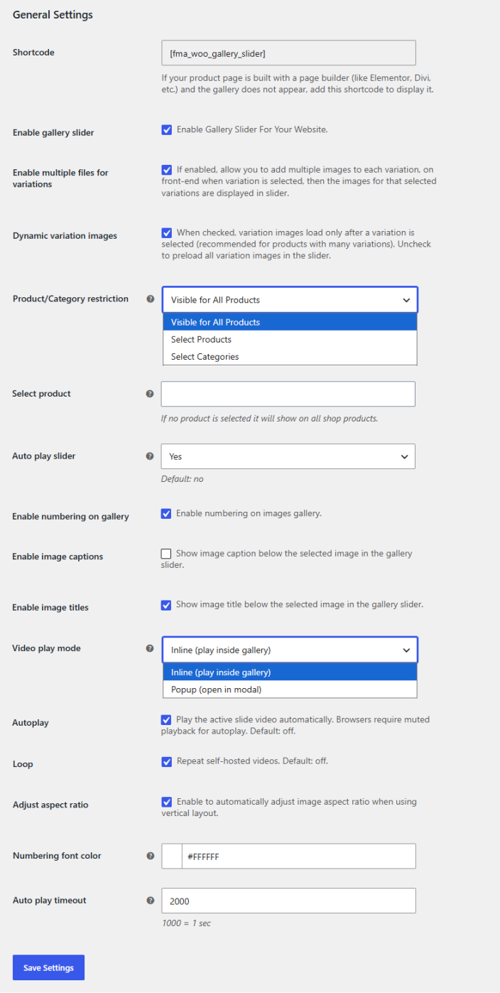
↑ Back to topGo to WooCommerce > Settings > Gallery Slider > General Settings and configure the following settings for the plugin.
- Shortcode: Use the shortcode ([fma_woo_gallery_slider]) to display the gallery slider if your page is built with a page builder like Elementor, Divi, etc.
- Enable Gallery Slider: Enable the product gallery slider for your store.
- Enable Multiple Files for Variations: Click the checkbox to enable multiple images for each product variation. When a specific variation is selected, the slider will display the images for that specific variation.
- Dynamic Variation Images: When checked, variation images load only after a variation is selected (recommended for products with many variations). Uncheck to preload all variation images in the slider.
- Product/Category Restriction: Choose whether you want to restrict the gallery slider. You can choose between the following options:
- Visible for All Products
- Select Products
- Select Categories
- Select Product/Category: Select the specific product(s) or category(s) for which you want to display the slider.
- Auto Play Slider: Select whether you want the slider to autoplay or not.
- Enable Numbering on Gallery: Check to display numbering on gallery images.
- Enable Image Captions: Click the checkbox to show captions below the selected image in the gallery slider.
- Video Play Mode: Choose the preferred mode for playing video. You can choose between the following:
- Inline (play inside the gallery)
- Popup (open in modal)
- Autoplay: When checked, the active slide video will play automatically. Browsers require muted playback for autoplay.
- Loop: Enable loop playback for self-hosted videos.
- Adjust Aspect Ratio: Enable to automatically adjust image aspect ratio when using vertical layout.
- Numbering Font Color: Choose the color for the numbering of gallery images.
- Auto Play Timeout: Set a timer for auto-play after which the image will change automatically.
Gallery Layout Settings
↑ Back to topConfigure different layouts and their settings for the gallery slider. Go to WooCommerce > Settings > Gallery Slider > Gallery Layouts and configure the following:
- Gallery Layout: Choose the preferred layout for the gallery:
- Horizontal Bottom
- Horizontal Top
- Vertical Left
- Vertical Right
- Preview Grid
- Gallery Tiles
- Vertical Scroll
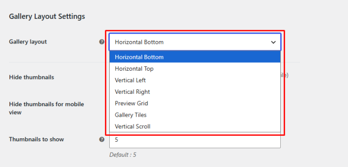
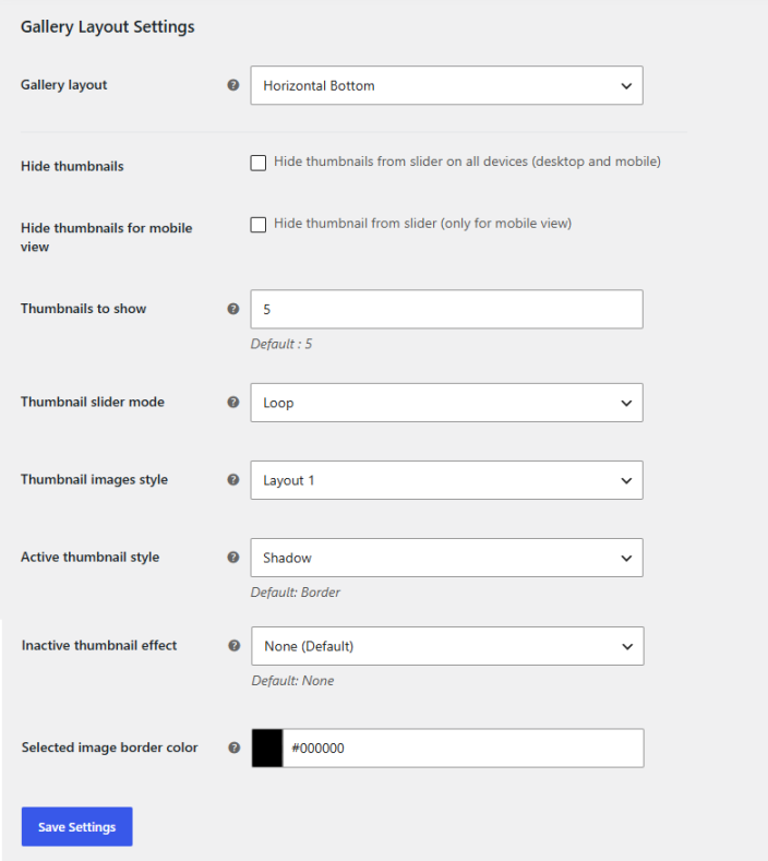
If you choose the gallery layout as Horizontal Bottom, Horizontal Top, Vertical Left, or Vertical Right, you will have the following settings to configure:
- Hide Thumbnails: Check the box to hide the gallery thumbnail from the slider (For Desktop and Mobile)
- Hide Thumbnails for Mobile View: Click the checkbox if you want to hide the thumbnail only for mobile devices.
- Thumbnails to Show: Set the number of thumbnails to be shown.
- Thumbnail Slider Mode: Choose the mode for how the thumbnail will slide:
- Loop
- Slide
- Thumbnail Images Style: Select between the two thumbnail image styles.
- Active Thumbnail Style: Select the style for when a thumbnail is active or hovered over. You can choose between the following options:
- Border (Default)
- Scale
- Shadow
- Underline
- Glow
- Inactive Thumbnail Effect: Set the style for the inactive thumbnail. Your options include:
- None (Default)
- Grayscale
- Fade
- Soft Blur
- Selected Image Border Color: Select the border color for the images.
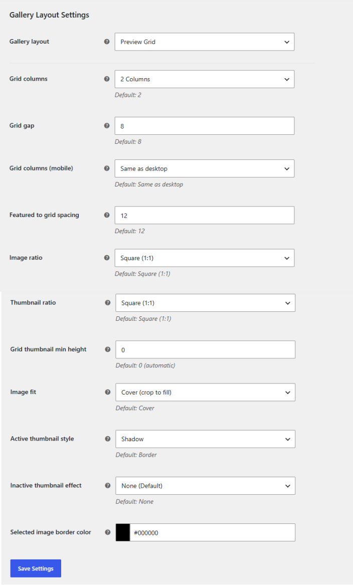
If you choose the gallery layout as Preview Grid, the following settings will appear:
- Grid Columns: Set the number of columns for the thumbnail grid below the featured image. You can choose between:
- 2 Columns
- 3 Columns
- 4 Columns
- Grid Gap: Space between grid thumbnail items in pixels.
- Grid Columns (Mobile): Select the number of columns for mobile devices. You can choose as follows:
- Same as Desktop
- 2 Columns
- 3 Columns
- 4 Columns
- Featured to Grid Spacing: Space between the featured image and the grid below.
- Image Ratio: Select the aspect ratio for the large gallery images. You can choose between the following options:
- Square (1:1)
- Portrait (3:4)
- Portrait (2:3)
- Auto (natural height)
- Thumbnail Ratio: Select the aspect ratio for gallery thumbnails. You can choose between the following options:
- Square (1:1)
- Portrait (3:4)
- Portrait (2:3)
- Original (no crop)
- Grid Thumbnail Min Height: Set the minimum height for the grid thumbnail in pixels.
- Image Fit: Choose how the images will fill their space. You can choose between:
- Cover (Crop to Fill)
- Contain (Show Full Image)
- Active Thumbnail Style: Choose the style for active or hovered thumbnails. Select from any of the available options:
- Border (Default)
- Scale
- Shadow
- Underline
- Glow
- Inactive Thumbnail Effect: Set the effect for the inactive thumbnails:
- None (Default)
- Grayscale
- Fade
- Soft Blur
- Selected Image Border Color: Set the color of the image border.
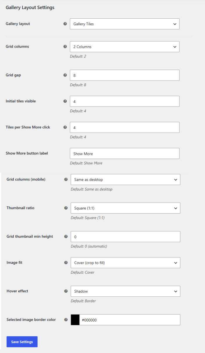
If you choose the gallery layout as Gallery Tiles, the following settings will appear:
- Grid Columns: Choose the number of thumbnail grid columns below the featured image:
- 2 Columns
- 3 Columns
- 4 Columns
- Grid Gap: Space between grid thumbnail items in pixels.
- Initial Tiles Visible: Set the number of initial gallery tiles to be shown before the show more button appears.
- Tiles Per Show More Click: Set how many additional tiles to be revealed when the show more button is clicked.
- Show More Button Label: Add label text for the show more button.
- Grid Columns (Mobile): Choose the number of grid columns for mobile devices:
- Same as Desktop
- 2 Columns
- 3 Columns
- 4 Columns
- Thumbnail Ratio: Select the aspect ratio for the thumbnail. You can choose:
- Square (1:1)
- Portrait (3:4)
- Portrait (2:3)
- Original (no crop)
- Grid Thumbnail Min Height: Enter the minimum height for the grid thumbnail.
- Image Fit: Select how the images will fill their cells. You can choose between:
- Cover (Crop to Fill)
- Contain (Show Full Image)
- Hover Effect: Select the style that will be applied when hovering over a tile.
- Border (Default)
- Scale
- Shadow
- Underline
- Glow
- Selected Image Border Color: Choose the border color for the selected image.
Bullets Settings
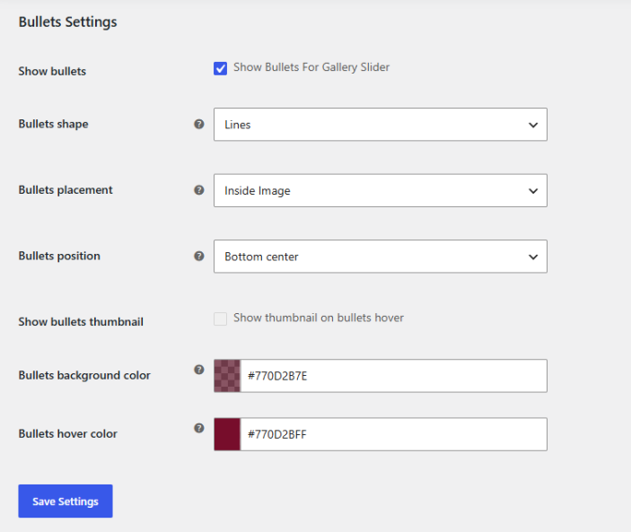
↑ Back to topCustomize the bullets for the gallery slider. Go to WooCommerce > Settings > Gallery Slider > Bullets Settings and configure the following:
- Show Bullets: Check the box to show bullets on the gallery slider.
- Bullets Shape: Select the bullet shape from the dropdown. You can choose between the following options:
- Cicrle
- Box
- Lines
- Counter Bullets
- Bottom Counter Bar
- Bottom Bar
- Counter Bullets Font Color: Choose the color for the font of counter bullets (Applicable when bullet shape is selected as “Counter Bullets” or “Bottom Counter Bar”)
- Bullets Placement: Select the placement for bullets when the thumbnail is hidden. You can choose between:
- Inside Image
- Below Image
- Bullets Position: Choose the position of the bullets when placement is selected as “Inside Image”. You can choose between the following positions:
- Bottom Left
- Bottom Center
- Bottom Right
- Top Left
- Top Center
- Top Right
- Show Bullets Thumbnail: Show bullets thumbnail on hover.
- Bullets Background Color: Select the background color for the bullets.
- Bullets Hover Color: Choose the color for bullets when hovering.
Arrow Settings
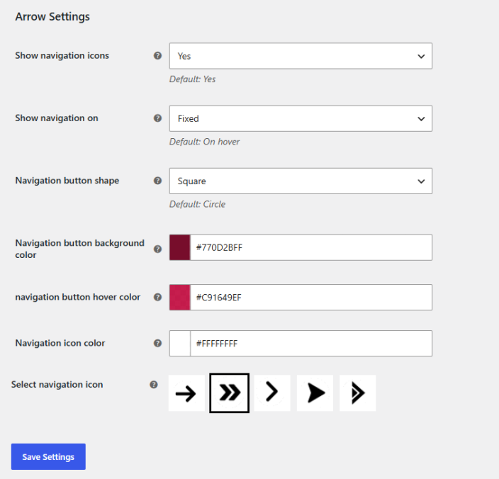
↑ Back to topGo to WooCommerce > Settings > Gallery Slider > Arrow Settings and configure the arrows for the gallery slider.
- Show Navigation Icons: Choose whether you want to display the navigation icons or not.
- Show Navigation On: Select whether you want to display navigation when hovering or keep it fixed.
- Navigation Button Shape: Choose the shape for the navigation button:
- Circle
- Square
- Navigation Button Background Color: Select the background color for the navigation button.
- Navigation Button Hover Color: Set the color for the navigation button on hover.
- Navigation Icon Color: Set the color for the navigation icon.
- Select Navigation Icon: Select the preferred navigation icon from the available options.
Lightbox Settings
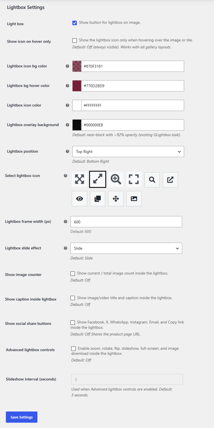
↑ Back to topSet up to display images and videos in a lightbox. Go to WooCommerce > Settings > Gallery Slider > Lightbox Settings and configure the following settings:
- Lightbox: Enable lightbox view.
- Show Icon on Hover Only: Check the box if you only want to show the lightbox icon when hovering over the image or title.
- Lightbox Icon BG Color: Choose the background color for the lightbox icon.
- Lightbox BG Hover Color: Set the background color for the lightbox when hovering.
- Lightbox Icon Color: Set the color for the lightbox icon.
- Lightbox Overlay Background: Set the background color behind the lightbox image (modal overlay). Default: near-black with ~92% opacity (existing GLightbox look).
- Lightbox Position: Choose the position for the lightbox:
- Top Left
- Top Right
- Bottom Left
- Bottom Right
- Select Lightbox Icon: Choose the icon for the lightbox.
- Lightbox Frame Width (px): Set the width of the lightbox frame in pixels.
- Lightbox Slide Effect: Choose the sliding effect for the lightbox.
- Slide
- Fade
- Zoom
- Slide Left
- None
- Show Image Counter: Show current/total image count inside the lightbox
- Show Caption Inside Lightbox: Show image/video title and caption inside the lightbox.
- Show Social Share Buttons: Show social icons like Facebook, X, WhatsApp, Instagram, Email, and Copy link inside the lightbox.
- Advanced Lightbox Controls: Enable zoom, rotate, flip, slideshow, full-screen, and image download inside the lightbox.
- Slideshow Interval (Seconds): Set the interval for the slideshow. Used when Advanced Lightbox Controls are enabled.
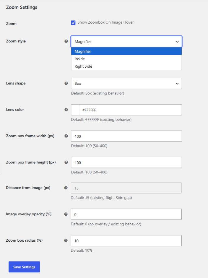
Zoom Settings
↑ Back to topControl how image zoom will work. Go to WooCommerce > Settings > Gallery Slider > Zoom Settings and set up the zoom settings:
- Zoom: Check the box to show zoombox on image hover.
- Zoom Style: Choose the zoom style:
- Magnifier
- Inside
- Zoom Level (%): Choose how much the image enlarges inside the box.
- Image Overlay Opacity (%): Set the opacity for the dark overlay on the product image when zoomed.
- Right Side
- Lens Shape: Select the preferred shape for the zoom lens:
- Box
- Circle
- Lens Color: Set the color for the zoom lens.
- Zoom Box Frame Width (px): Set the width for the zoom box frame.
- Zoom Box Frame Height (px): Set the height for the zoom box frame.
- Distance From Image (px): Configure the gap between the image and the right-side zoom panel. (Applicable when zoom style is selected as “Right Side”)
- Image Overlay Opacity (%): Opacity for the dark overlay behind the image when zoomed.
- Zoom Box Radius (%): Set the radius for the zoom box.
Manage Layouts
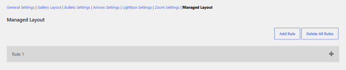
↑ Back to topCreate rules and manage layouts for specific settings. Go to WooCommerce > Settings > Gallery Slider > Managed Layout and add a new rule. For each rule, you can configure all the settings that are stated above.
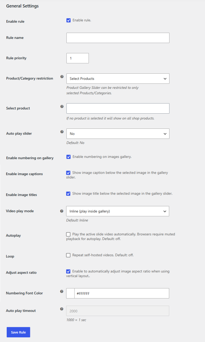
General Settings
↑ Back to top- Enable Rule: Check the box to activate this rule so its settings apply to the selected products or categories.
- Rule Name: Enter a name for the rule to identify it easily in the list of managed layouts.
- Rule Priority: Set the priority number for the rule. When multiple rules apply to the same product, the rule with the higher priority takes effect.
- Product/Category Restriction: Choose whether you want to restrict this rule. You can choose between the following options:
- Visible for All Products
- Select Products
- Select Categories
- Select Product/Category: Select the specific product(s) or category(s) for which you want this rule to apply.
- Auto-Play Slider: Select whether you want the slider to autoplay for this rule.
- Enable Numbering On Gallery: Check to display numbering on gallery images for this rule.
- Enable Image Captions: Click the checkbox to show captions below the selected image for this rule.
- Enable Image Titles: Click the checkbox to show titles below the selected image for this rule.
- Video Play Mode: Choose the preferred mode for playing video for this rule. You can choose between the following:
- Inline (play inside the gallery)
- Popup (open in modal)
- Autoplay: When checked, the active slide video will play automatically for this rule. Browsers require muted playback for autoplay.
- Loop: Enable loop playback for self-hosted videos for this rule.
- Adjust Aspect Ratio: Enable to automatically adjust image aspect ratio when using vertical layout for this rule.
- Autoplay Timeout: Set a timer for autoplay after which the image will change automatically for this rule.
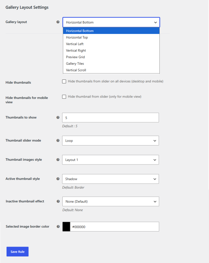
Gallery Layout Settings
↑ Back to topConfigure the layout for the gallery slider for this rule:
- Gallery Layout: Choose the preferred layout for the gallery:
- Horizontal Bottom
- Horizontal Top
- Vertical Left
- Vertical Right
- Preview Grid
- Gallery Tiles
- Vertical Scroll
If you choose the gallery layout as Horizontal Bottom, Horizontal Top, Vertical Left, or Vertical Right, you will have the following settings to configure:
- Hide Thumbnails: Check the box to hide the gallery thumbnail from the slider (For Desktop and Mobile) for this rule.
- Hide Thumbnails for Mobile View: Click the checkbox if you want to hide the thumbnail only for mobile devices for this rule.
- Thumbnails to Show: Set the number of thumbnails to be shown for this rule.
- Thumbnail Slider Mode: Choose the mode for how the thumbnail will slide:
- Loop
- Slide
- Thumbnail Images Style: Select between the two thumbnail image styles for this rule.
- Active Thumbnail Style: Select the style for when a thumbnail is active or hovered over. You can choose between the following options:
- Border (Default)
- Scale
- Shadow
- Underline
- Glow
- Inactive Thumbnail Effect: Set the style for the inactive thumbnail. Your options include:
- None (Default)
- Grayscale
- Fade
- Soft Blur
- Selected Image Border Color: Select the border color for the images for this rule.
Bullets Settings
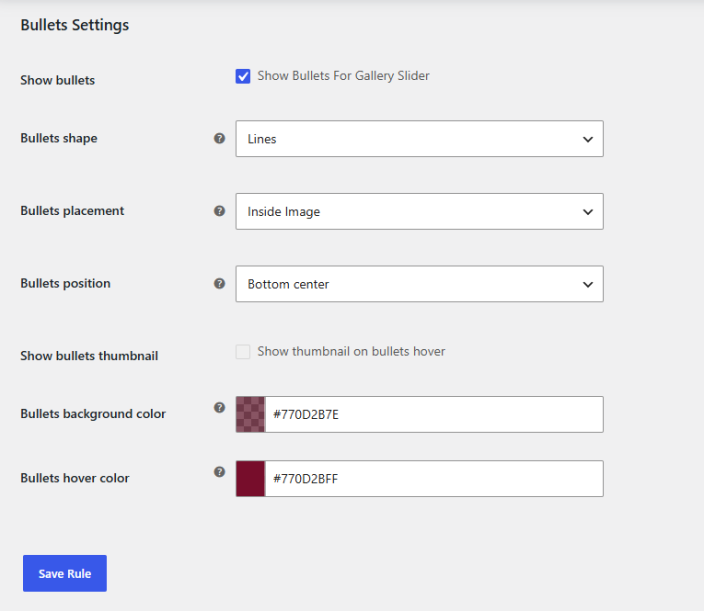
↑ Back to topCustomize the bullets for the gallery slider for this rule:
- Show Bullets: Check the box to show bullets on the gallery slider for this rule.
- Bullets Shape: Select the shape of bullets from the dropdown. You can choose between the following options:
- Cicrle
- Box
- Lines
- Counter Bullets
- Bottom Counter Bar
- Bottom Bar
- Counter Bullets Font Color: Choose the color for the font of counter bullets (Applicable when bullet shape is selected as “Counter Bullets” or “Bottom Counter Bar”)
- Bullets Placement: Select the placement for bullets when the thumbnail is hidden. You can choose between:
- Inside Image
- Below Image
- Bullets Position: Choose the position of the bullets when placement is selected as “Inside Image”. You can choose between the following positions:
- Bottom Left
- Bottom Center
- Bottom Right
- Top Left
- Top Center
- Top Right
- Show Bullets Thumbnail: Show bullets thumbnail on hover for this rule.
- Bullets Background Color: Select the background color for the bullets for this rule.
- Bullets Hover Color: Choose the color for bullets when hovering for this rule.
Arrow Settings
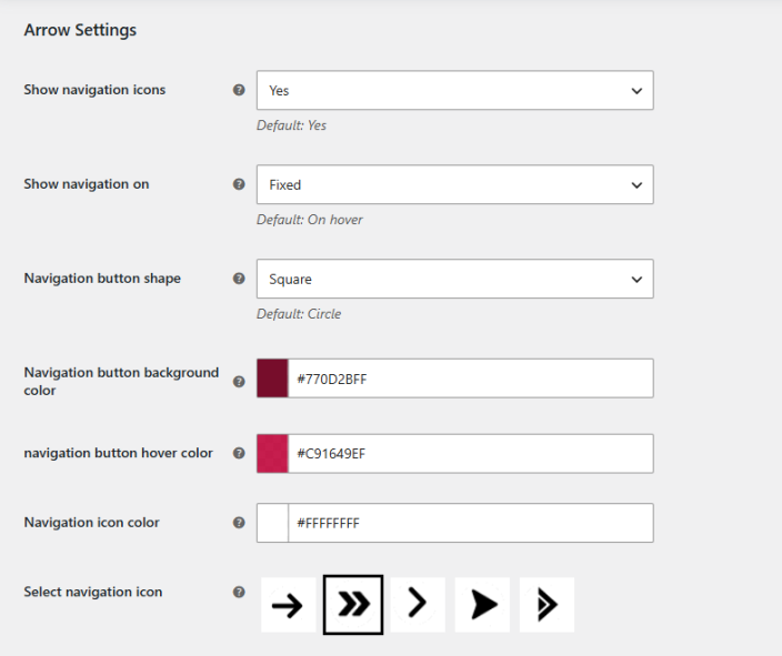
↑ Back to topConfigure the arrows for the gallery slider for this rule:
- Show Navigation Icons: Choose whether you want to display the navigation icons or not for this rule.
- Show Navigation On: Select whether you want to display navigation when hovering or keep it fixed for this rule.
- Navigation Button Shape: Choose the shape for the navigation button:
- Circle
- Square
- Navigation Button Background Color: Select the background color for the navigation button for this rule.
- Navigation Button Hover Color: Set the color for the navigation button on hover for this rule.
- Navigation Icon Color: Set the color for the navigation icon for this rule.
- Select Navigation Icon: Select the preferred navigation icon from the available options for this rule.
Lightbox Settings
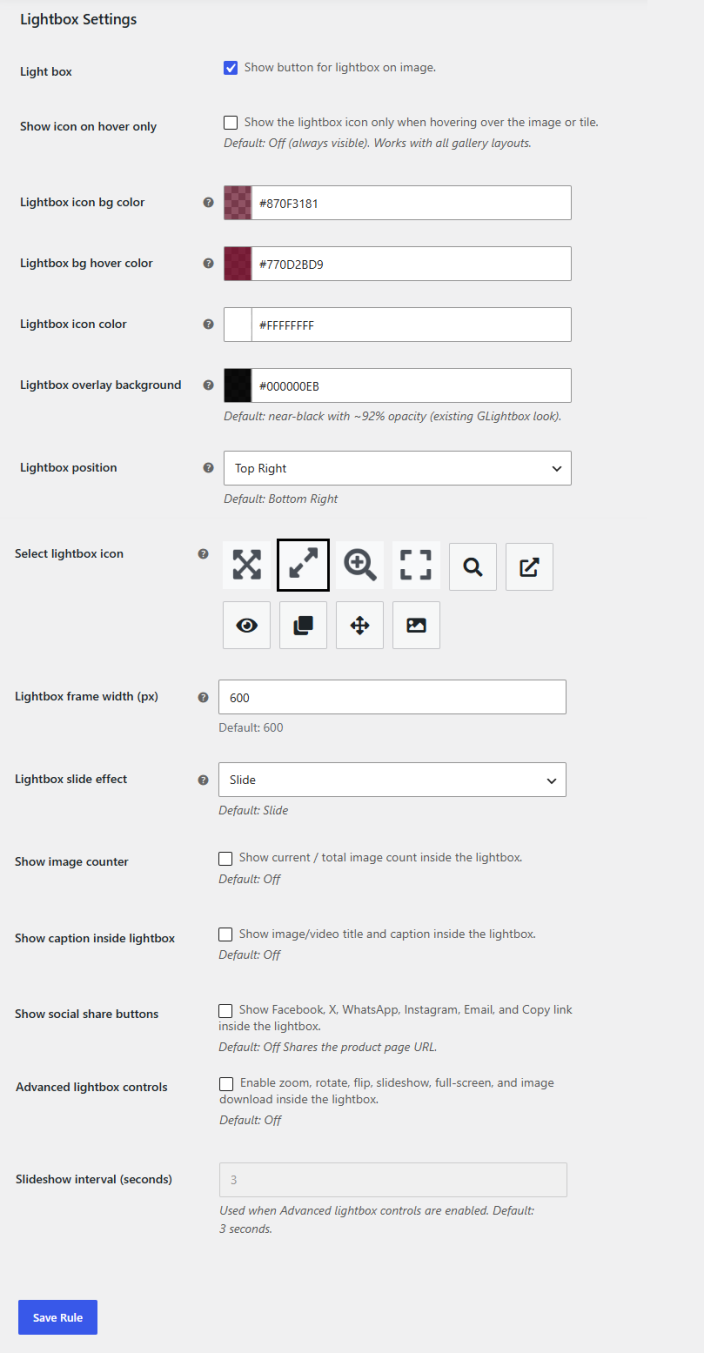
↑ Back to topSet up to display images and videos in a lightbox for this rule:
- Lightbox: Enable lightbox view for this rule.
- Show Icon on Hover Only: Check the box if you only want to show the lightbox icon when hovering over the image or title for this rule.
- Lightbox Icon BG Color: Choose the background color for the lightbox icon for this rule.
- Lightbox BG Hover Color: Set the background color for the lightbox when hovering for this rule.
- Lightbox Icon Color: Set the color for the lightbox icon for this rule.
- Lightbox Overlay Background: Set the background color behind the lightbox image (modal overlay) for this rule. Default: near-black with ~92% opacity (existing GLightbox look).
- Lightbox Position: Choose the position for the lightbox:
- Top Left
- Top Right
- Bottom Left
- Bottom Right
- Select Lightbox Icon: Choose the icon for the lightbox for this rule.
- Lightbox Frame Width (px): Set the width of the lightbox frame in pixels for this rule.
- Lightbox Slide Effect: Choose the sliding effect for the lightbox for this rule.
- Slide
- Fade
- Zoom
- Slide Left
- None
- Show Image Counter: Show current/total image count inside the lightbox for this rule.
- Show Caption Inside Lightbox: Show image/video title and caption inside the lightbox for this rule.
- Show Social Share Buttons: Show social icons like Facebook, X, WhatsApp, Instagram, Email, and Copy link inside the lightbox for this rule.
- Advanced Lightbox Controls: Enable zoom, rotate, flip, slideshow, full-screen, and image download inside the lightbox for this rule.
- Slideshow Interval (Seconds): Set the interval for the slideshow for this rule. Used when Advanced Lightbox Controls are enabled.
Zoom Settings
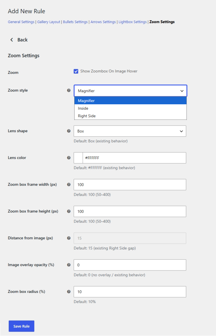
↑ Back to topControl how image zoom will work for this rule:
- Zoom: Check the box to show zoombox on image hover for this rule.
- Zoom Style: Choose the zoom style:
- Magnifier
- Inside
- Zoom Level (%): Choose how much the image enlarges inside the box.
- Image Overlay Opacity (%): Set the opacity for the dark overlay on the product image when zoomed.
- Right Side
- Lens Shape: Select the preferred shape for the zoom lens:
- Box
- Circle
- Lens Color: Set the color for the zoom lens for this rule.
- Zoom Box Frame Width (px): Set the width for the zoom box frame for this rule.
- Zoom Box Frame Height (px): Set the height for the zoom box frame for this rule.
- Distance From Image (px): Configure the gap between the image and the right-side zoom panel. (Applicable when zoom style is selected as “Right Side”)
- Image Overlay Opacity (%): Opacity for the dark overlay behind the image when zoomed for this rule.
- Zoom Box Radius (%): Set the radius for the zoom box for this rule.
Add Videos in Product Gallery
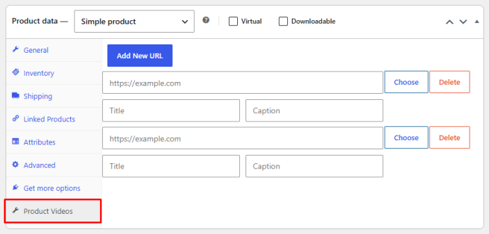
↑ Back to topYou can add videos to the product gallery slider directly from the product edit screen.
- In the WordPress admin panel, go to the Products tab and add or edit any product.
- In the Product Data section, click the Product Videos tab.
- Click Add New URL to add a video.
- You can add videos either by pasting a video URL or by uploading a video file from your computer.
FAQs
↑ Back to top- How do I add a product gallery slider in WooCommerce?
Go to WooCommerce and install the WooCommerce slider product gallery plugin. The plugin lets you display product and gallery images in a slider and add videos to the gallery.
- How do I change the gallery view in WooCommerce?
With the WooCommerce vertical product gallery plugin, you can easily choose the gallery slider view as horizontal and vertical left or right.
- How do I create a WordPress image carousel?
You can create an image carousel in WordPress with the WooCommerce product gallery carousel plugin. Go to WooCommerce > Settings and click the Gallery Slider tab, here you can choose products or categories for which you want to create an image carousel.