Thank you for choosing Heim for your new project! The following documentation will help get you started with installing and configuring the theme. Use the menu on the right to skip to its various sections.
Getting Started
↑ Back to topThe steps below describe how to install the theme, import its demo content (optional), and receive updates.
Installation
↑ Back to topAutomatic:
The theme can be installed directly from your WooCommerce subscriptions dashboard, click the link below and follow the quick-guide:
Manual:
If you prefer to install the theme manually you can follow the steps below:
Note: Make sure to download the theme files from your WooCommerce account before continuing: https://woocommerce.com/my-account/downloads/
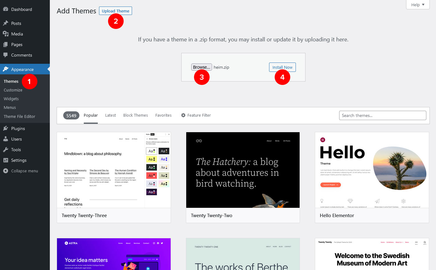
- Log-in to your WordPress admin and navigate to Appearance > Themes.
- Click the Add New button, then Upload Theme.
- Click the “Choose File” button and locate the downloaded heim.zip file on your computer.
- Select the file and click “Install Now”.
- After the installation is complete, click “Activate” to set Heim as the active theme.
Demo Importer
↑ Back to topOnce the theme is activated you will be redirected to the theme’s setup wizard.
Note: To start the theme’s setup wizard manually, navigate to Appearance > Theme Setup in the WordPress admin.
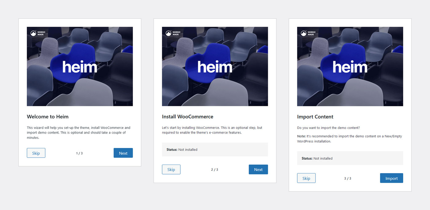
Step 1. Get Started
The first step is the welcome screen, click Next to start the wizard, or Skip if you prefer to use your current WordPress set-up.
Step 2. Plugin Installation
The second step is where WooCommerce gets installed, this is optional, but required for the theme’s e-commerce features and demo content (shop pages etc.).
Note: If the WooCommerce plugin installation failed for some reason you can still install it via the WordPress admin’s Plugins page:
Step 3. Import Demo Content
The final step will import the theme’s demo content, this includes Pages, Posts, Menus, Products, Images, Categories/Tags and various configurations to the theme’s settings.
This is also an optional step, but can be a great starting point for your store.
Updates
↑ Back to topTheme updates are received automatically via the WordPress admin, simply connect your site to its WooCommerce account.
We recommend installing theme updates as soon as they become available.
Block Editor
↑ Back to topThe theme has been integrated with the native WordPress Block Editor (also known as Gutenberg), if you’re new to WordPress or the Block Editor the following article should help get you started.
If you’re a visual learner, try this YouTube link instead.
Block Patterns
↑ Back to topBlock Patterns are predefined content/layouts that can be added to any page via the editor’s “Patterns” menu. This is useful if you only want to display part of the demo content, or mix and match different elements.
The theme’s Block Patterns are available under the “Heim Theme” tab.
Menus & Menu Locations
↑ Back to topMenus can be created and assigned to the theme’s available menu-locations via Appearance > Menus in the WordPress admin. If you’re not familiar with how WordPress menus are created you can take a look at the guide below:
The theme has five available menu locations:
- Header Primary: Located in the Header (this is the main menu).
- Header Secondary: Located in the Header, before the right menu/icons.
- Mobile Primary: Located in the mobile menu.
- Mobile Secondary: Located in the mobile menu, below the “Mobile Primary” location.
- Footer: Located in the footer-bar.
Menu colors are changed from Appearance > Customize > Colors (see the documentation’s “Colors” section).
Multi-Column Menus
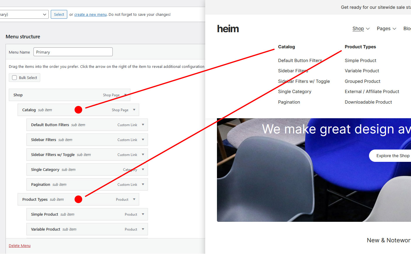
↑ Back to topA multi-column menu is created by entering the class-name megamenu into the CSS Classes field for a top-level menu item (“top-level” means the first menu item that’s displayed in the header, for example “Shop” on the theme’s preview site):
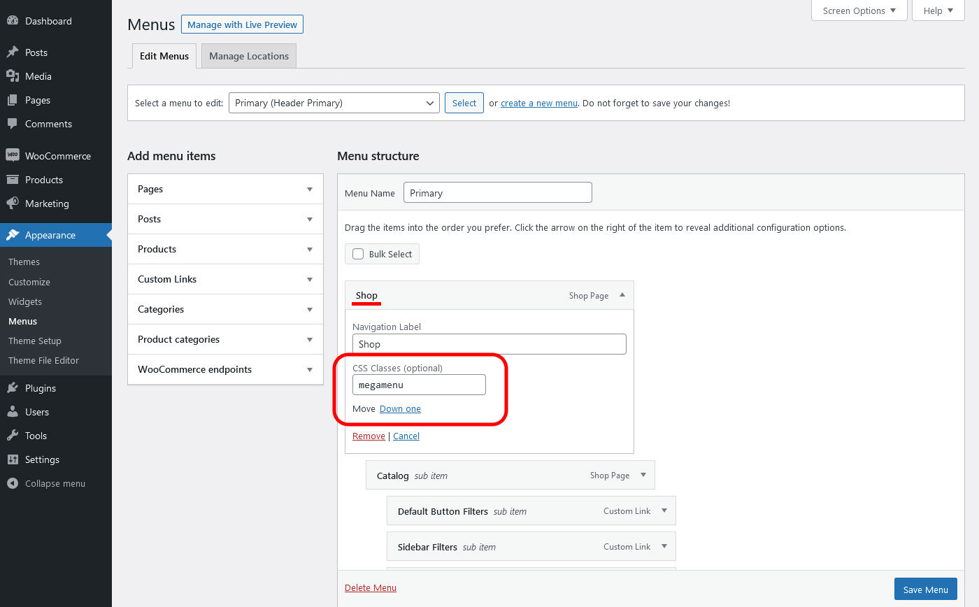
Note: If the CSS Classes field is missing, click the Screen Options tab in the top-right corner of the page and check the CSS Classes option.
After adding the class-name, simply organize your menu items into the hierarchical structure shown below:
Widgets
↑ Back to topWidget areas are available for Shop Filters and the Footer, you can manage widgets via Appearance > Widgets in the WordPress admin.
Shop Filter Widgets
WooCommerce comes with multiple widgets that can be used to filter your products in the shop-catalog.
Additionally, the theme has various options that can be configured to change how the filters are displayed – these are available via Appearance > Customize > Shop.
Footer Widgets
The footer widget area can display up to 5 widget columns, additional settings for changing the footer-widget layout are available on Appearance > Customize > Footer.
Customizer Options
↑ Back to topThe theme’s customization options have been integrated with the WordPress Customizer and are available via Appearance > Customize in the WordPress admin. Below is an overview of the various sections:
Missing an option?
If you’re missing an option, click the link below to send us a feature request and we’ll take it into consideration.
Logo
↑ Back to topBy default a text based logo is displayed in the header, but if you want to display an image instead you can add one via Appearance > Customize > Site Identity.
The following options are also available on this page:
- Add an alternative logo for Mobile.
- Adjust the logo size for Desktop and Mobile.
- Change the Site Title and Tagline.
- Add a site icon (also known as favicon).
Fonts
↑ Back to topThe theme’s font-type and sizes can be changed via Appearance > Customize > Fonts.
Use Google Font:
The Google Fonts library has become hugely popular and now has a wide range of fonts that can be used with the theme, you can take a look at their selection on the Google Fonts website.
To add a font from the Google Fonts library you can follow the steps below:
- Open the Google Fonts website.
- Find the font you want to use and copy or note its name.
- Return to your WordPress site and navigate to Appearance > Customize > Fonts > Font Types.
- Enter the font name exactly as it’s spelled on the Google Fonts website into the theme’s font-option field.
- Click Publish to save the Customizer settings.
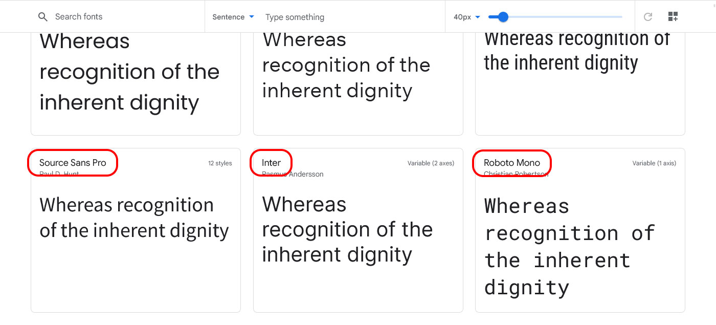
The Google Font should now be displayed on your site, if you’re not seeing it, try clearing your browser’s cache.
Use Standard Font:
If you prefer to use a standard font that’s widely supported across web browsers, enter one of the following font names into the font-option field on Appearance > Customize > Fonts > Font Types:
- Arial
- Verdana
- Tahoma
- Trebuchet MS
- Times New Roman
- Georgia
- Garamond
- Courier New
- Brush Script MT
Change Font Sizes:
Most of the theme’s font-sizes are set dynamically based one a single “base” setting, all elements (Headings, Paragraphs, Buttons etc.) are adjusted to their relative sizes based on this single size.
The Base, Header and Header Sub-menu font-sizes can be changed via Appearance > Customize > Fonts > Font Sizes.
Colors
↑ Back to topThe theme has two color modes (light and dark) that can be used separately, changed with a “switcher” menu, or selected automatically by the color preference/mode of the visitor’s browser.
You can select which mode is used via Appearance > Customize > Colors > Settings.
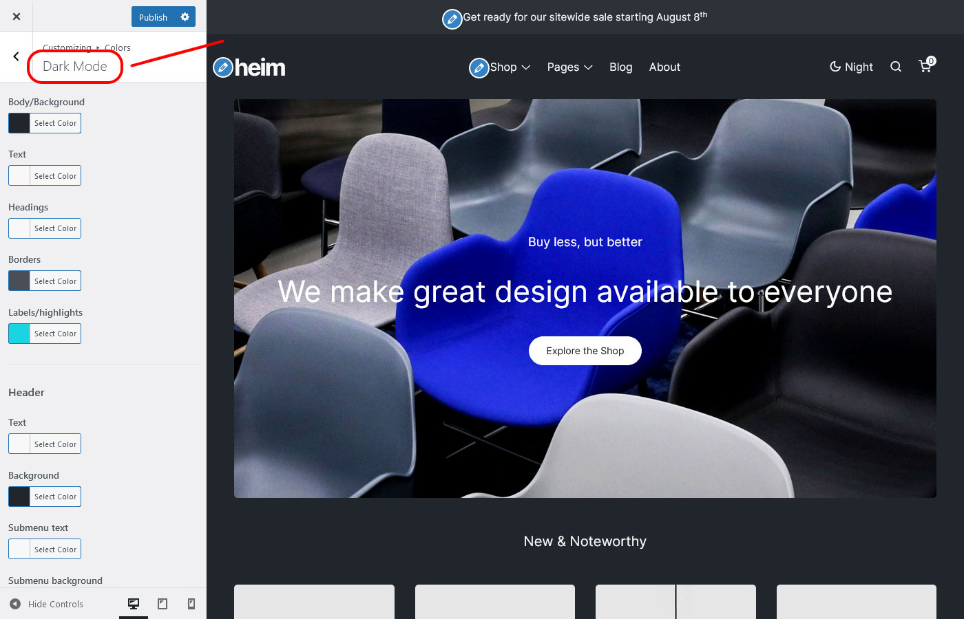
Change Colors:
Colors for the Light color-scheme can be changed from Appearance > Customize > Colors > Light Mode.
Colors for the Dark color-scheme can be changed from Appearance > Customize > Colors > Dark Mode.
Header
↑ Back to topFrom Appearance > Customize > Header you can make the following adjustments to the theme’s header:
- Toggle the “sticky” header behavior.
- Adjust the Desktop and Mobile height.
- Toggle the various menu icons/buttons (color-switcher, search, my-account, cart).
- Add custom suggestions for the search-panel.
- Toggle the mini/side cart panel.
Top Bar
↑ Back to topThe Top Bar above the site’s header can be customized from Appearance > Customize > WooCommerce > Store Notice.
Note that its colors are changed separately from the general color options on Appearance > Customize > Colors.
Mobile Menu
↑ Back to topThe mobile/side-panel menu can be displayed on both Desktop and Mobile, however the main menu will only be displayed on mobile by default.
The menu options listed below can be configured from Appearance > Customize > Mobile Menu.
- Toggle Desktop visibility.
- Toggle product-categories menu.
- Toggle color-mode switcher.
Footer
↑ Back to topThe Footer is divided into two sections, the widget section and the footer bar – widgets are added from Appearance > Widgets (see the “Widgets” section in this documentation for more info), and the footer-bar can be configured from Appearance > Customize > Footer.
The available footer options are listed below:
- Footer text (listed HTML tags allowed).
- Adjust spacing for Desktop and Mobile.
- Change widget columns.
Note that the Footer’s colors are changed separately with the color options on Appearance > Customize > Colors.
Shop
↑ Back to topThe theme has added multiple configuration options for the WooCommerce shop-catalog, you can find the options listed below on Appearance > Customize > Shop:
- Change filters layout.
- Enable toggle for individual filters.
- Toggle buttons for the slide-in filters panel.
- Toggle product “hover” image.
- Change pagination type (standard or “infinite” loading).
- Toggle “sale” labels.
- Toggle “new” labels.
Note that the WooCommerce plugin has additional options for the shop-catalog on Appearance > Customize > WooCommerce > Product Catalog.
Blog
↑ Back to topFrom Appearance > Customize > Blog you can make the following adjustments to the theme’s blog/archive page:
- Toggle the blog heading for category pages.
- Toggle the category menu.
Product Variation Swatches
↑ Back to topSupport for the popular Variation Swatches for WooCommerce plugin has been added so products can display color/image-swatches or labels instead of the standard drop-down menus.
Guides on how to set-up and use the plugin is available in their documentation.
Child Theme
↑ Back to topIf you want to make customizations to the theme, using a child theme is the way to go.
A child theme inherits the functionality, features, and styles of its parent theme. Child themes are a safe way to modify a WordPress theme without actually making changes to the parent theme’s files.
-from the WordPress Developer Handbook
Download the Heim starter child theme below: