Overview
↑ Back to topThe WooCommerce Product Addons plugin is a powerful extension for WooCommerce that allows web store owners to offer additional features or customizations on their products. This can range from simple options such as gift wrapping or personalized messages to more complex product configurations like custom engraving or choice of materials.
It provides a straightforward interface for creating and managing these addons as well as supporting various types of fields including text, select boxes, checkboxes, and radio buttons.Requirements
Elementor Connector for WooCommerce benefits users of WooCommerce Product Addons in several ways:
- Ease of Use: Elementor’s drag-and-drop interface simplifies the process of designing product pages. A dedicated widget for WooCommerce Product Addons allows users to easily incorporate product addons into their designs without needing to write any code.
- Visual Customization: With a dedicated Product Addons widget, users could visually customize the display of product addons directly within the Elementor interface, ensuring a consistent look and feel across the website.
- Real-Time Previews: Elementor allows for real-time previews of changes. With a dedicated widget, users could see how their product addons will look on the front-end as they configure them.
- Increased Efficiency: A dedicated widget would streamline the process of adding and managing product addons, saving users time and effort.
In summary, Elementor Connector for WooCommerce provides a user-friendly, efficient, and visually consistent way to manage and display product addons on a WooCommerce store.
Requirements
↑ Back to topIn order to use these widgets, you’ll need the following:
- WooCommerce
- WooCommerce Product Addons
- Elementor
- Elementor Pro (For adding the Product Addon controls to the add-to-cart widget on single product page templates)
- Elementor Connector for WooCommerce
Add-To-Cart Widget Controls – Addons
↑ Back to top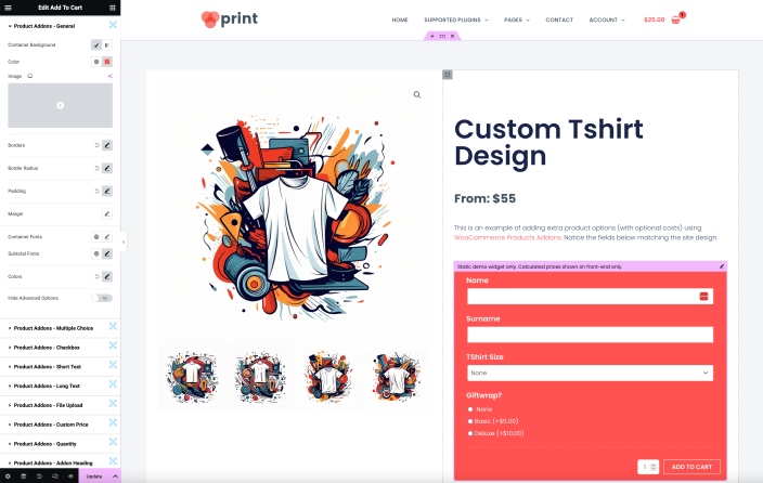
Style Tab
↑ Back to topProduct Addons – General
- Addons Container – This control allows you to set the background of the addons container. You can choose between classic and gradient types. Video type is excluded.
- Borders* – This is a popover toggle control that allows you to set up border styling for various elements such as: Container, Individual Addon(s), Addon(s) Summary, and Addon(s) Subtotal.
- Border Radius* – This is a popover toggle control that allows you to set the border radius for various elements such as: Container, Individual Addon(s).
- Padding* – This is a popover toggle control that allows you to set the padding for various elements such as: Container, Individual Addon(s), Addon Labels, Addon(s) Summary.
- Margin* – This is a popover toggle control that allows you to set the margin for various elements such as: Container, Individual Addon(s), Addon Labels.
- Container Fonts – This control allows you to set the typography for the addons container.
- Subtotal Fonts – This control allows you to set the typography for the addons subtotal.
- Colors* – This is a popover toggle control that allows you to set the colors for various elements such as: Addon Labels, Addon Descriptions, Addon Summary, Addon Subtotal.
- Hide Advanced Options – This switcher control allows you to hide advanced options. The default value is ‘true’, which means the advanced options are hidden by default. You can switch it to ‘No’ to show the advanced options.
Product Addons – Multiple Choice
Select Fields:
- Background – This control allows you to set a background for the select fields. You can choose between a classic or gradient type.*
- Border – This control allows you to set the border style for the select fields.*
- Border Radius – This control allows you to set the border radius for the select fields.*
- Padding – This control allows you to set the padding for the select fields.*
- Margin – This control allows you to set the margin for the select fields.*
- Fonts – This control allows you to set the typography for the select fields.*
- Color – This control allows you to set the color for the select fields.*
Image Fields:
- Background – This control allows you to set a classic background for the image fields.*
- Borders – This control allows you to set the border style for the image fields. The border style can be customized for default, hover, and selected states.*
- Border Radius – This control allows you to set the border radius for the image fields.*
- Padding – This control allows you to set the padding for the image fields.*
- Margin – This control allows you to set the margin for the image fields.*
- Price Label – This control allows you to set the typography for the price label. Note: Only visible on the front-end.*
- Calculated Total – This control allows you to set the typography for the calculated total. Note: Only visible on the front-end.*
- Colors – This control allows you to set the color for the price label and calculated total.*
Product Addons – Checkbox
- Padding – This control allows you to set the padding for the checkbox fields.*
- Margin – This control allows you to set the margin for the checkbox fields.*
- Font – This control allows you to set the typography for the checkbox fields.*
- Colors – This control allows you to set the color for the checkbox fields. It includes a popover toggle to set the color for Label and Price.
- Label – This control allows you to set the color for the label of the checkbox fields. It is available inside the Colors popover toggle.
- Price – This control allows you to set the color for the price of the checkbox fields. It is available inside the Colors popover toggle.
Product Addons – Short Text
- Background – This control allows you to set a classic or gradient background for the short text fields.*
- Border – This control allows you to set the border style for the short text fields.*
- Border Radius – This control allows you to set the border radius for the short text fields.*
- Fonts – This control allows you to set the typography for the short text fields.*
- Color – This control allows you to set the color for the short text fields.
Product Addons – Long Text
- Background – This control allows you to set a classic or gradient background for the long text fields.*
- Border – This control allows you to set the border style for the long text fields.*
- Border Radius – This control allows you to set the border radius for the long text fields.*
- Fonts – This control allows you to set the typography for the long text fields.*
- Color – This control allows you to set the color for the long text fields.
Product Addons – File Upload
- Background – This control allows you to set a classic or gradient background for the file upload fields.*
- Border – This control allows you to set the border style for the file upload fields.*
- Border Radius – This control allows you to set the border radius for the file upload fields.*
- Fonts – Upload Field – This control allows you to set the typography for the upload field.*
- Fonts – Upload Instructions – This control allows you to set the typography for the upload instructions.*
- Colors – This control provides a popover toggle to set the colors for the file upload fields.
- Label – Upload Field – Inside the Colors popover, this control allows you to set the color for the upload field label.
- Label – Upload Instructions – Inside the Colors popover, this control allows you to set the color for the upload instructions label.
Product Addons – Custom Price
- Background – This control allows you to set a classic or gradient background for the custom price fields.*
- Border – This control allows you to set the border style for the custom price fields.*
- Border Radius – This control allows you to set the border radius for the custom price fields.*
- Fonts – This control allows you to set the typography for the custom price fields.*
- Font Color – This control allows you to set the color for the custom price fields.
Product Addons – Quantity
- Background – This group control allows you to set the background of the quantity field. You can choose between a classic color or a gradient. Video backgrounds are not supported.
- Border – This group control allows you to set the border style of the quantity field. You can customize the border’s width, color, and style.
- Border Radius – This control allows you to adjust the border radius of the quantity field. You can specify the radius in different units.*
- Fonts – This group control allows you to set the typography of the text inside the quantity field. You can adjust the font family, size, weight, transform, style, decoration, line-height, and letter spacing.
- Font Color – This control allows you to set the color of the text inside the quantity field. You can choose any color using the color picker.
Product Addons – Heading
- Border – This group control allows you to set the border style of the addon heading. You can customize the border’s width, color, and style.
- Padding – This control allows you to adjust the padding around the addon heading. You can specify the padding in different units.*
- Margin – This control allows you to adjust the margin around the addon heading. You can specify the margin in different units.*
- Fonts – This group control allows you to set the typography of the text inside the addon heading. You can adjust the font family, size, weight, transform, style, decoration, line-height, and letter spacing.
- Color – This control allows you to set the color of the text inside the addon heading. You can choose any color using the color picker.
* The controls are under the Elementor’s style tab and are visible when the ‘Hide Advanced Options’ switcher is set to ‘No’. Some controls allow you to specify values in different units such as pixels (px), percentage (%), or em.