Thank you for choosing Vignette theme to build your WooCommerce website.
Installation
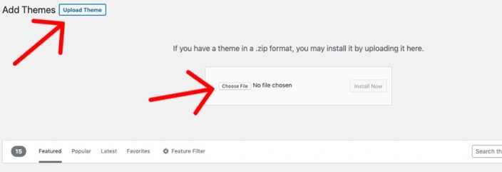
↑ Back to top- In your Dashboard go to Appearance > Themes.
- Click on the Add New button on top.
- Click Upload New button on top.
- In the new interface click Choose File and browse your computer to locate vignette.zip file you downloaded.
- Click Install Now.
- After installation Activate the theme.
Recommended Plugins
↑ Back to top- Icon Block: A simple little block that allows you to add a custom SVG icon or graphic.
- Contact Form 7: The plugin is recommended for creating contact forms.
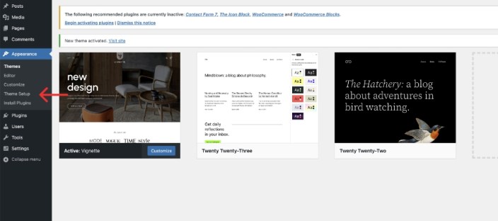
Theme setup wizard
↑ Back to topVignette comes with a setup wizard that enables you to create the demo layout with a just a few clicks.
- After installing the theme, in your Dashboard go to Appearance > Theme Setup.
- The setup wizard will ask you to install and activate necessary plugins, and import the demo content. Please be patient while WordPress imports all the content.
- After the setup ends, all you need to do is assign the menu’s to their respective navigation blocks.
Editing the theme’s elements
↑ Back to topVignette is a full site editing theme, thus you can edit most elements from the front end. In your Dashboard go to Appearance > Editor and there you can select and edit any element you like, change their color, font etc.
You can edit the global styles, to change the elements throughout the websites as shown in the picture below
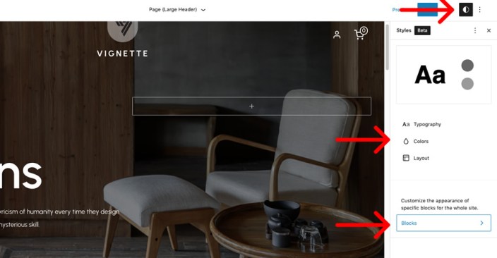
Specific elements can be edited by selecting the template part you want to edit, like large header, small header or footer.
Static front page
↑ Back to topIn case you want to configure the theme manually instead of importing the demo content.
- Create a page and assign Page (Large Header) template to it.
- In your Dashboard go to Settings > Reading and assign the page to display in front and another page to display the latest posts.
- Add blocks and patterns you like to the page.
Blocks and patterns we have used in our demo
↑ Back to top- Partners block pattern.
- Three product carousel sliders.
- Features block pattern.
- Process block pattern.
- Four-column block, each column containing a featured category. In the block settings button is set as an outline and the category description is disabled.
Block patterns
↑ Back to topVignette comes with some pre-designed patterns that you can include in any page or post.
- Partners: Display a title block and some logos.
- Featured products carousel: Displays a carousel with products you can hand pick.
- New products carousel: Displays a carousel with new products.
- On sale products carousel: Displays a carousel with on sale products.
- Features pattern: Cover block with a background image (or video) that highlights some information about your business in three columns.
- Process, text and video: Text in the left and a video (or image) in the right.
- Team members: Display your team members in four columns.
Here’s how you can add a block pattern to a page.
- When editing a page or post click the ‘+’ button to add a new block.
- Click the Browse All button.
- Click the Patterns tab in the blocks section.
- From the dropdown select the patterns that belong to Vignette.
- Select any of the available patterns and it will be added to your page.
Product carousel sliders
↑ Back to topWe have included the ability to include up to three product carousels in any page of your website using shortcodes. Each carousel is a block pattern. Add them to any page or post as explained above.
You can define the number of products displayed in each carousel by selecting the amount of rows in each blocks settings. The carousels use Product Grid block from WooCommerce Blocks plugin. You can replace the block grid of a carousel with another one, say Product Grid from a category to have the carousel display products from only one category.
Page templates
↑ Back to topVignette comes with different page templates to help you achieve a different look for any page.
- Default: This template creates a page with a simple header in the top.
- Page (Large Header): This template uses a large header that has a background image, text and call to action button. You can replace the image or with another one, or a video instead. Used only for the front page of the website.
- Page (Small Header): This template uses a small header that uses the featured image of said page as background.
- Blank: As the name says, this is a blank canvas that you can use any of of the template parts and patterns to achieve a different look.
Pre-designed pages
↑ Back to topIf you import the demo content there will be three pre-designed pages included. Home, About us and Contact.
Template parts
↑ Back to topTemplate parts are pre-designed sections that are included in page templates to organize and add structure to the theme to avoid having to repeat code. To edit a template part in your Dashboard go to Appearance > Editor > Template Parts. Note that when you edit a template part it will change in all sections of your website. You can always reset customizations if you make a mistake.
Template parts included in this theme are Header (Large), Header (Small), Header and Footer.
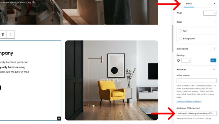
Animate blocks
↑ Back to topVignette enables you to animate any block using css3 animations when entering the screen, by adding classes to that block.
In the Advanced section of any block settings add the ‘animated‘ class. This class will tell the theme this block will animate. You need to combine this with another class to define which animation you will be using like ‘fadeIn‘.
Available animations are:
Fade effect
fadeIn fadeInRight fadeInLeft fadeInUp fadeInDown fadeInUpShort fadeInDownShort fadeInRightShort fadeInLeftShortFlip & Rotate
flip flipInX flipInY rotateIn rotateInUpLeft rotateInUpRight rotateInDownLeft rotateDownUpRight rollIn lightSpeedInRight lightSpeedInLeftBounce
bounceIn bounceInRight bounceInLeft bounceInUp bounceInDownAttention seekers
growIn shake shakeUp wiggle swing tada wobble pulseDelay animations
Add the following classes to delay any animation, measured in milliseconds.
delay-250 delay-500 delay-750 delay-1000 delay-1250 delay-1500 delay-1750 delay-2000 delay-2250 delay-2500 delay-2750 delay-3000 delay-3250 delay-3500Animation speed
Use below classes to slow down animation
slow slower slowestTo animate a page separator like in our demo, in block settings select the separator to display as a wide line and the classes ‘animated widthOut’ to it.