Restrict underage access to the whole website or specific pages using Age Verification Popup for WooCommerce.
- Download the .zip file from your WooCommerce account.
- Go to: WordPress Admin > Plugins > Add New and Upload Plugin with the file you downloaded with Choose File.
- Install Now and Activate the extension.
More information at
Install and Activate Plugins/Extensions.
As soon as the plugin has been installed, you can view the plugin in
WordPress Admin Panel > WooCommerce > Age Restriction Settings. To customize plugin settings, click on
Age Restriction Settings.
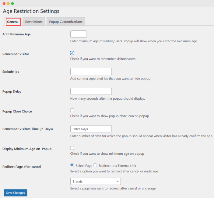
This area allows you to manage the general settings of the plugin and adjust the following options:
- Minimum Age: Use this text field to enter a minimum visitor age limit. Consider this a mandatory field to activate the age verification popup. Leaving this field blank will cause the popup to remain disabled.
- Remember Visitor: Enable the setting to remember the user in the future.
- Exclude IPs: Choose to hide the popup from specific users by excluding their IP addresses. You can add multiple IPs separated by commas.
- Popup Delay: Choose after how many seconds the popup should display.
- Popup Close Choice: Choose to show a close icon on the popup
- Display Minimum Age on Popup: Click here to allow your users to see the minimum age limit mentioned on the popup.
- Redirect – After Cancel: If the user is under the defined minimum age limit, you can redirect them to a relevant page or link. With these settings associate a link or page to the Cancel button. Using the radio buttons, select whether to redirect to a page on your site or any external link.
- Select Page: Define the page to redirect your user to using the dropdown.
- Redirect to an External Link: Define the external link to redirect users.
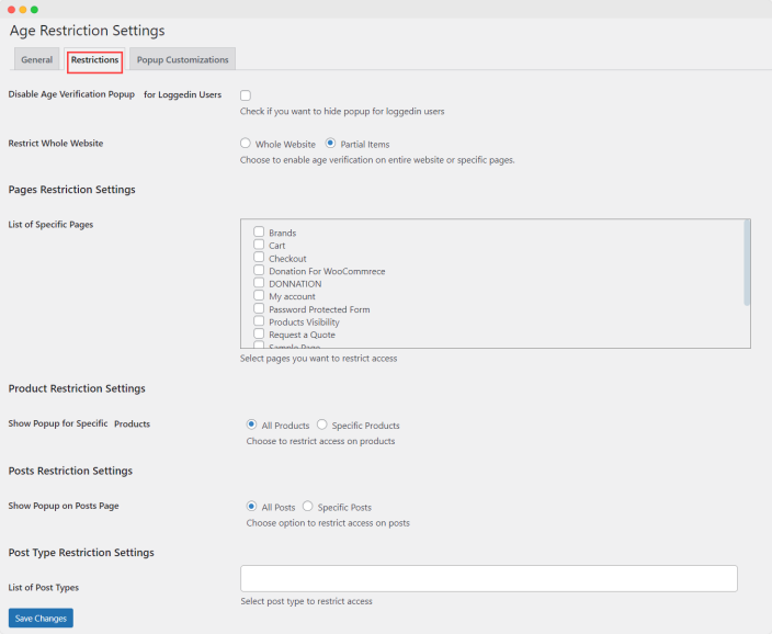
 Use the restriction settings tab to display popups on all or specific products, categories, and pages. You can customize and adjust the following options:
- Disable Popup for Logged-in Users: Choose to hide the age verification popup for users who are logged in.
- Restrict Whole Website: This option will allow you to establish areas that are restricted from underage users:
- Whole Website: It will restrict access to your entire website.
- Partial Items: It will hide selected products from underage visitors.
- Page Restriction Settings: Choose from a list of specific pages to restrict popups.
- Product Restriction Settings: Limit popups for all or specific products.
- Specific Products: Select this option to show a popup only on specific products. If you agree to this option, you will be shown three additional text fields:
- Specific Products: Enter one or more products to restrict.
- Products Categories: Enter one or more product categories to restrict.
- Product Tags: Enter one or more product tags to restrict.
- Post Display Settings: Choose to show popups on all or specific posts. There are two options to choose from:
- All Posts: Select this option to show a popup on all posts
- Specific Posts: Select this option to show a popup only on specific posts.
- Specific Posts: Restrict by specific posts.
- Post Categories: Restrict by specific post categories.
- Post Tags: Restrict by specific post tags.
- Post Type Restriction Settings: Choose post type to restrict access.
 Use these settings to customize your popup. There are two types of settings: Default Settings and Custom Settings. If you select the default settings, you can customize the following settings only. With the Custom Settings options, you can also select colors and text for various popup elements.
Whether you choose Custom or Default settings, the following options will appear in both cases:
Use these settings to customize your popup. There are two types of settings: Default Settings and Custom Settings. If you select the default settings, you can customize the following settings only. With the Custom Settings options, you can also select colors and text for various popup elements.
Whether you choose Custom or Default settings, the following options will appear in both cases:
- PopUp Age Check Method: Enable any of the four age check methods for popups:
-
- Enter DOB: This option requires your user to select their DOB from a calendar on the popup.
- Enter Age: This option requires your user to manually enter their age into a text field on the popup.
- Confirm Age: This option requires your user to click on the “I Am Over (Your defined minimum age)” Button located in the pop-up.
- Check Box: This option requires your user to place a check in the “I am Above Required Age” checkbox.
- Foot Note: Add a legal note or information to the bottom of the form
- Background Image: You can apply an image to the popup background from either the upload files or media library option of the gallery.
- Choose Template: Use these options to set where the popup should be located on a page.
- Center Popup: Will place a square popup in the middle of the page
- Bottom Popup: Will place the popup at the bottom of the page in a banner-like format
- Choose Layout: You can choose the popup layout from 4 intuitive layout options: Layout 1, Layout 2, layout 3, and Layout 4. Each layout has a different placement for the Submit Button and Cancel Button, so you can choose the style you like the most.
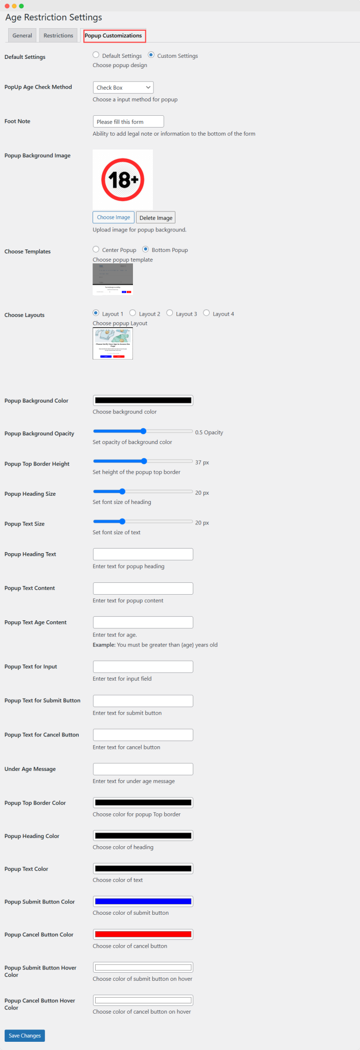
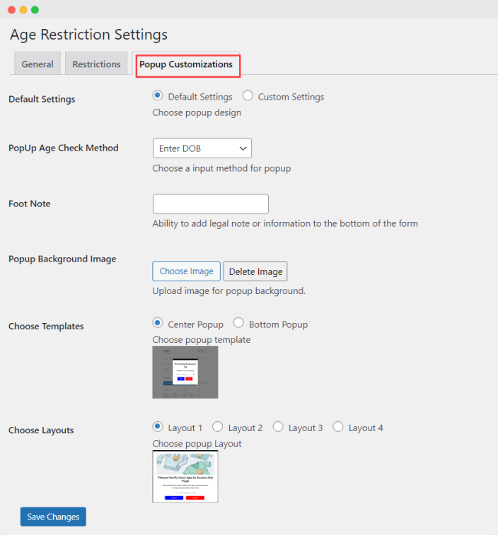 If you select the Custom Settings option, you can customize all of the above as well as the following settings:
- Popup Background Color: Set the background color of the popup by picking a color from the dropdown color spectrum.
- Popup Background Opacity: Use the bar to define the opacity of the background.
- Popup Top Border Height: The bar will help you define a customized top border height. It ranges to support a maximum of 72px.
- Popup Heading Size: Set the font size with this bar to a maximum of 72px.
- Popup Font Size: Set the font size to apply to all text within the popup (excluding the heading) to a maximum of 72px.
- Popup Heading Text: The text entered here will apply as the title of the popup.
- Popup Text Content: This text will be added to the popup as a description under the heading.
- Popup Text Age Content: This textbox allows you to create a personal way of inquiring the user’s age.
- Popup Text for Input: Enter the text that should show before the field where the user will input their age.
- Submit Button Text: Enter the text you would like to show on the submit button.
- Cancel Button Text: Enter the text you would like to show on the cancel button.
- Underage Message: This text will be shown to a user who is under your specified age limit.
- Popup Top Border Color: Set the color of the popup’s top border by picking a color from the dropdown color spectrum.
- Popup Heading Color: Define the color of the popup’s heading by picking a color from the dropdown color spectrum.
- Popup Text Color: Choose the color of the popup’s text by picking a color from the dropdown color spectrum.
- Submit Button Color: Set the color of the submit button by picking a color from the dropdown color spectrum.
- Cancel Button Color: Define the color of the cancel button by picking a color from the dropdown color spectrum.
- Submit Button Hover Color: Choose the hover color that will be shown when the user is hovering over the submit button.
- Cancel Button Hover Color: Choose the hover color that will be shown when the user is hovering over the cancel button.